The Rise and Fall of Lian Li Aluminum PC Cases - Nifty Thrifties

Here in Userlandia: Lian Li and the Case of the Aluminum Computer Case.

When you're hunting for old junk, it's best to keep your expectations low, so that you can be pleasantly surprised. As the Onion warned us way back in 1997, people love retro just a little too much, which can make it hard to find bargains. The truly rare and expensive stuff gets filtered out and shipped to warehouses for listing on online auction sites. The stuff that's good but not mind-blowing gets placed in glass cases at the front of the store, tagged with, let's say optimistic prices sourced from Buy It Now listings. I might be willing to pay $25 for that SCSI slide scanner… if it wasn’t missing its power supply. Nevertheless, you sometimes find gold among the dross. Gold… or other metals.

I visited the Goodwill in Hudson, New Hampshire one frigid February afternoon expecting to find nothing of importance. This store is a bust more often than not, but it’s on my drive from Salem to Nashua, so I might as well stop to investigate. To my amazement, there in the new arrivals section was a new-in-box Lian Li aluminum PC case. Lian Li made some of the highest rated cases of the early aughts, so this was a nice find indeed. The box top was already cut open for easy inspection, and the case looked brand new. All the accessories were included and it was still wrapped in a protective plastic bag. Even the original shipping label was intact. And it was tagged at thirty dollars? That felt awful low. If I’d bought this new in 2003, it would have set me back $180—that’d be $280 today, thanks to our friend inflation. Even now, it'd still cost $100 on a used gear site, and that's not counting $50 for shipping. I wasn’t expecting to spend $30 on a computer case that day, but a deal like that, for a quality PC component like this, doesn't show up very often.

Doesn’t look fancy on the outside…

Maybe they were fooled by the box. With its bold fonts, solid colors, and starburst badge shouting “Pentium 4 Compatible,” the packaging looked like something you'd make in your first-year graphic design class. “C+, solid effort.” Someone at Lian Li decided to cut costs that year, because although they shelled out for color printing… they only had one box design. And they used it for far more models than they should have.

But mint on the inside.

I'm not criticizing their translation—“details are various from different models” might not be perfect English, but it's perfectly clear. You and I both know exactly what they meant to say—which is the problem. Each box had an extra label on the side, with the model number and specs. My Goodwill find was a PC-6077—which you'd never know just from looking at the box, which showed a PC-60. While this strategy probably saved Lian Li some production costs, it probably also caused countless headaches in the stock room at Micro Center. Regardless, I can’t judge a box by its cover. Can this chassis hold up to twenty years of hindsight? Let’s start with its exterior design.

Exterior Design

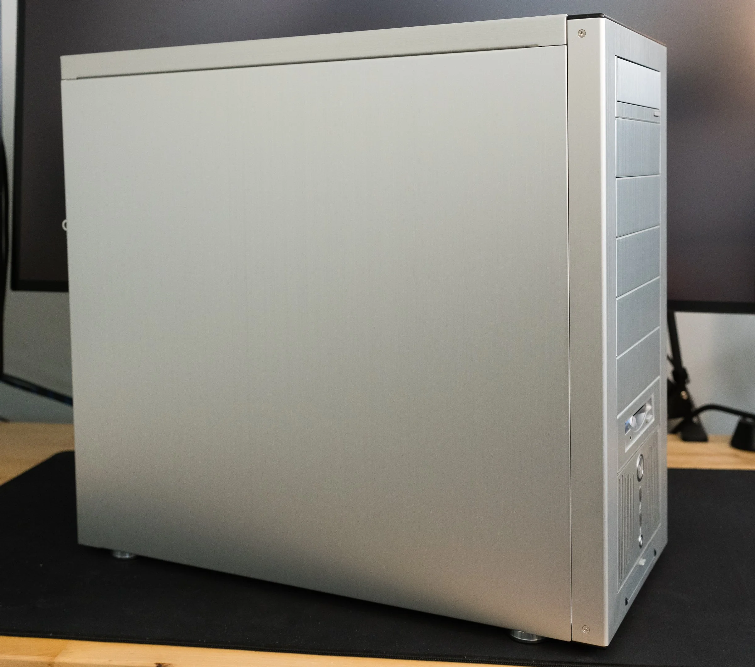
The PC-6077 in all its brushed metal glory.

Lian Li’s trademark silver fuselage still looks great twenty years later. A brushed aluminum finish stands out amongst the ranks of mostly beige, white, and sometimes black painted boxes of the early 21st century. But as unique as it was in the computer market, this style isn’t exactly original. Plop a silver Lian Li case next to my grandpa’s Onkyo stereo system from the 1970s and the resemblance is uncanny. Brushed aluminum was being used in A/V equipment and appliances for years before PC case makers decided it was cool. If the retro hi-fi style wasn’t to your taste, Lian Li also offered their cases in a subtle anodized black finish. Still, if you want people to know you have a fancy aluminum case, that brushed metal look shouted it from the rooftops.

The aluminum case craze started in the year 2000 with the Cooler Master ATC-200 and Lian-Li’s series of cases. Cooler Master claims they made the “first aluminum PC case” with the ATC-200, but corroborating that claim is difficult. Lian Li had started their aluminum rack mount computer case business back in the eighties. But rack frames, rack mount server cases, and rolling server cabinets weren’t on the front page of the Tiger Direct catalog in the Web 1.0 days. The earliest documentation and references I could find for both manufacturers’ consumer aluminum cases are dated sometime in late 1999. My hunch is that Cooler Master’s case debuted in the USA first, while Lian Li was first shipping in Asian markets. In Ars Technica’s Case and Cooling forum, there are posts raving about the ATC-200 dated a few months before the first Lian Li thread. Without more definitive proof—and a manufacturer saying “we did it first” doesn’t count—I’ll give this one to Cooler Master.

Enough history—let’s get back to the case design. And there’s one word I’d use to describe that design: classy. There’s no colorful look-at-me LED or fluorescent lighting. There’s no overwrought curves and flourishes. Touching it feels classy, like the aluminum dashboard trim in a sports car. Even the front bezel is made out of aluminum. Most case bezels are plastic, and factories back then had trouble matching the color between painted metal and plastic. Brushed aluminum dodged that problem entirely. Still, Lian Li couldn’t avoid using some plastic, with satin black strips adorning the top and bottom of the bezel. Shame they weren’t carbon fiber like some other Lian Li models. Still, they complement the brushed metal finish and fit the classy aesthetic. I understand why these are plastic—they’re the part of the bezel that actually clips to the frame. It’s easier and more reliable to make these bits out of plastic, so it’s just the right material for the job.

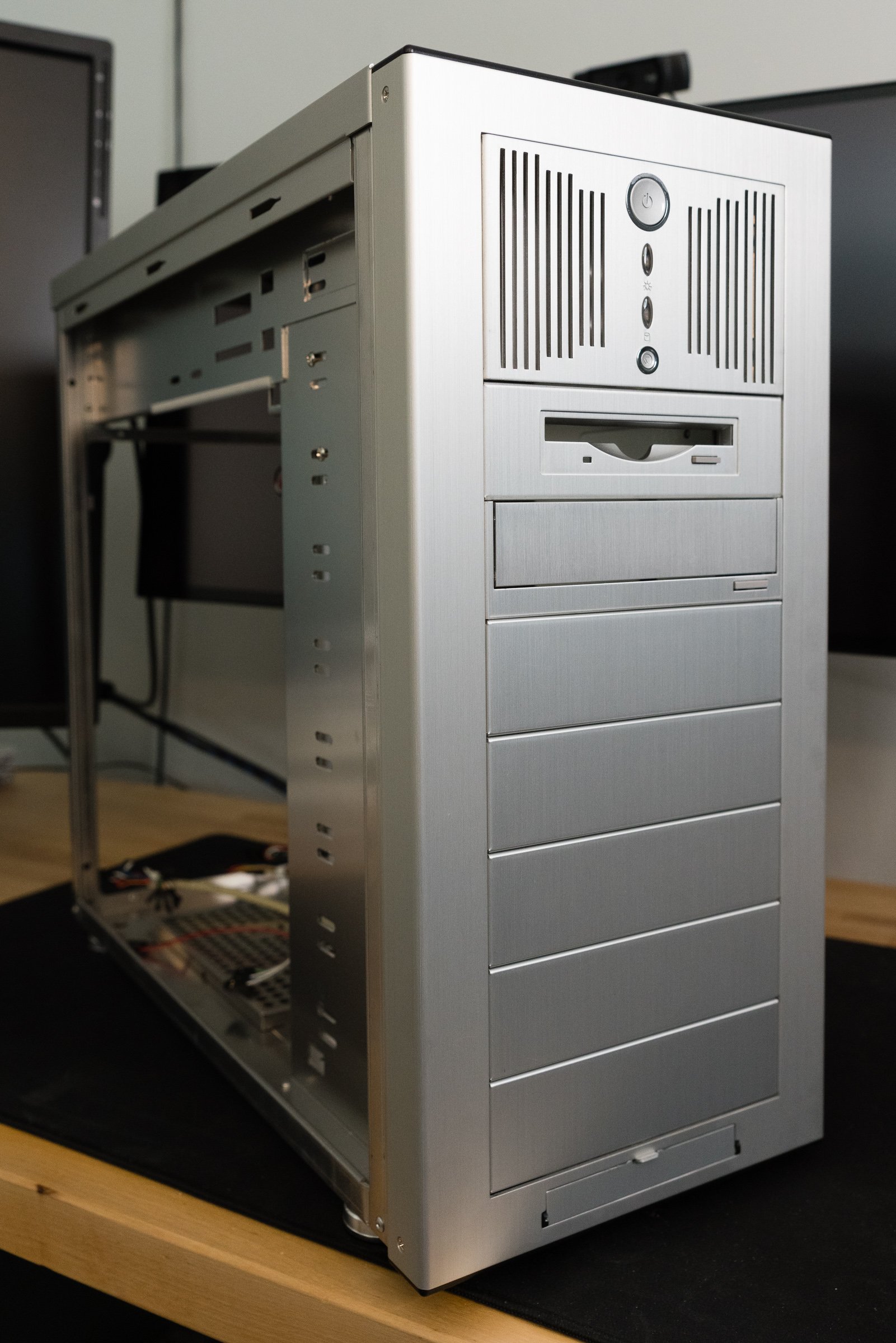
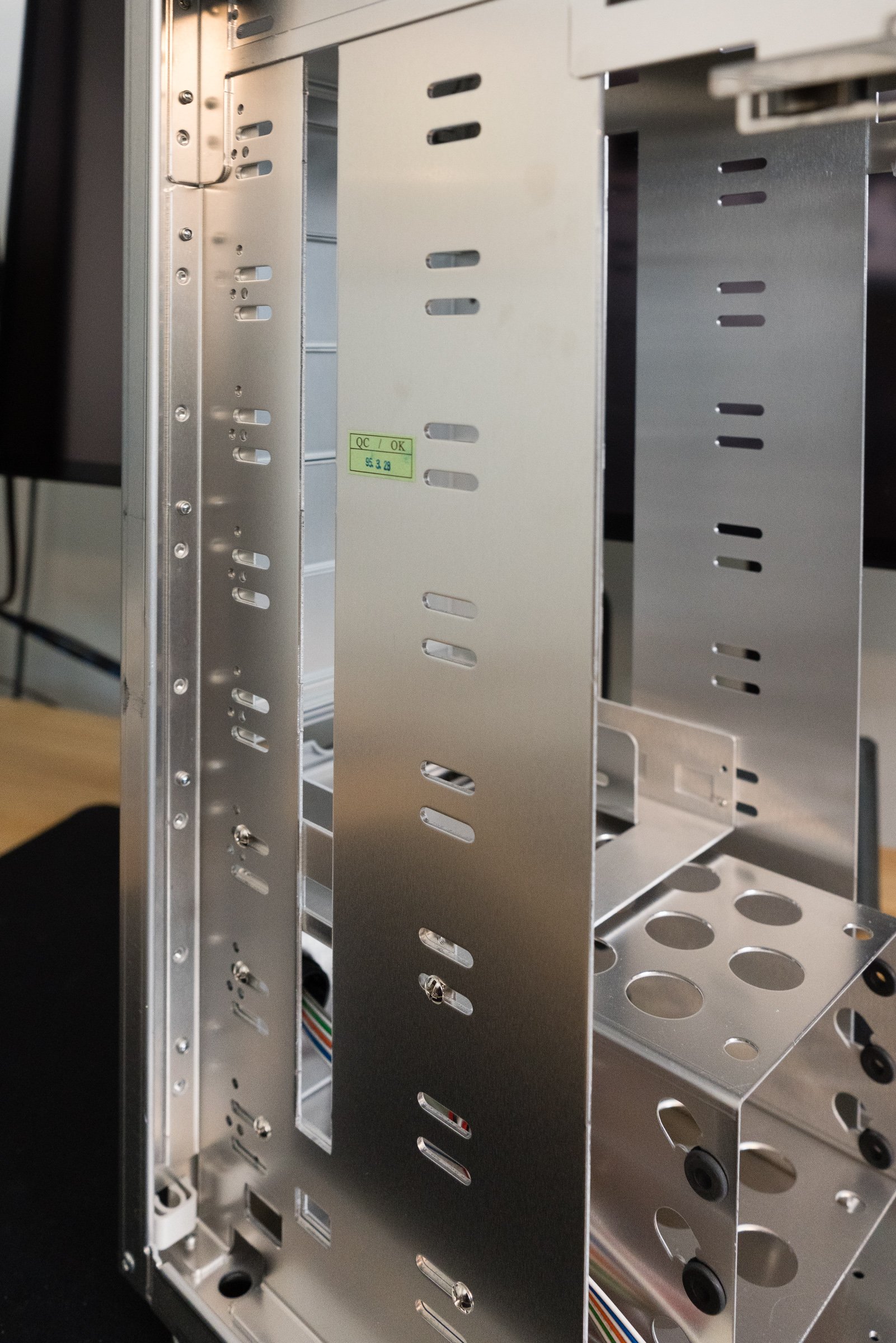
Speaking of the front section, the most interesting design decision isn’t just for looks. An array of nine 5 1/4” drive bays sets this case apart from its competition. Yeah, that’s right—nine 5 1/4s. Most PC cases of the era had several different types of drive bays: external 5 1/4” for optical drives, external 3 1/2” for floppies or other removable media, and internal 3 1/2” for hard disks. Most mid-tower cases arranged these bays in a 4-3-3 setup. To get more than four 5 1/4s you usually had to step up to an enormous full-tower case, like Lian Li’s PC-70 or the Chieftec Dragon.

Using all 5 1/4s wasn’t exactly a new idea. Just like the brushed aluminum finish, this drive bay setup was a retro throwback. The original IBM PC only had 5 1/4” bays, as did many clones. Granted, they were arranged horizontally, but you get my drift. Over the years as hard drives and floppy disks got smaller, PC manufacturers traded some 5 1/4” bays for more 3 1/2” bay. But the all-5 1/4 setup didn’t vanish—it migrated to server builds, where hot-swap drive cages fit perfectly into 5 1/4” bays. Other manufacturers would also experiment with an all-bay setup—the Cooler Master Stacker, Antec Nine Hundred, and Thermaltake Tai Chi, to name just a few.

I actually dig the aesthetics of the uniform bay approach. There’s a nice symmetry to it—take out all the bezels and brackets and the front of the case has an opening perfect for any of the lovely items in Lian Li's catalog full of accessories—or, if you really insisted, something made by another company. Included with the case were aluminum trim covers for optical and floppy drives, which blend their usually beige bezels into the box. If you needed more, they were just an online order away. Fan controllers, hard drive cages, and fan mounts were also on tap, and given enough coin you could build a clean, all-aluminum computer.

You’re free to put anything anywhere, so long as you can mount it.

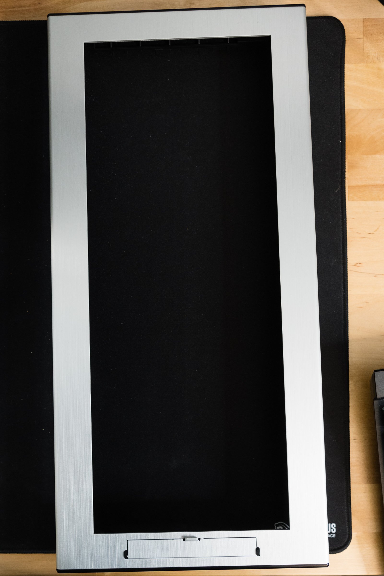
But as classy as my thrift store treasure is, I've discovered a few flaws in its design. First up is the front panel I/O door. USB, FireWire, and audio connectors are hidden behind one of the cheapest feeling mechanisms I’ve used in a long time. It works… technically. but it just flaps around with clanky metal sounds. Despite being made out of aluminum like the optical drive trim plate it doesn’t have the same smooth feel because there’s no levers or springs or anything to dampen the opening. I would have preferred exposed, flush mounted ports instead. At least put a little engineering effort into the door instead of this pitiful excuse for a hinge.

Next, the power and reset buttons are built into the stock 3-in-2 bay hard drive cage. This isn't all bad: you can move it from the standard location at the bottom of the case to anywhere, really. If you’re not happy with the default location at the bottom of the case, you can move it to the top or middle. But that’s the only positive thing I can say about it. Both the power and reset buttons are spongy and noisy. The spring's noise reverberates into the trim plate—and it's a high-pitched little thing, just enough to be annoying instead of a satisfying click. It’s what they’d call “bad switchgear” in the car business. It's amazing how cheap it feels, really—you turn a computer on and off all the time. If you bought this case back in the day, you spent a lot of money on it, and you wanted buttons that felt expensive—or at least normal. Lian Li did such a good job on everything else that this bit of chintziness stands out. There’s plenty to say about the wimpy 80mm fan, but that’s better saved for later when we talk about cooling. This case’s full-tower brother, the PC-7077, offered a 4-in-3 bay cage with a 120mm fan instead—it should have been in this case too. You could order one from Lian Li if you really wanted one, but that shouldn’t have been necessary. The buttons and LEDs should have been built into the top or side of the bezel.

Front panel I/O Door

Last is the unfortunate fact that actually utilizing those 5 1/4” bays gets ugly—literally. Add a single drive or accessory that doesn’t match and now your silvery ingot is blemished with a beige bruise. Opting for the black anodized finish minimized the problem because many aftermarket accessories came in black, but what if you wanted the all-shiny experience? The Lian Li accessories catalog was right there, full of drive kits, fan grilles, and trim covers, but your wallet wasn’t going to like the prices. So if you wanted the brushed metal case, and you cared about aesthetics, you had to go all-in.

Internals and Build Considerations

Of course, aluminum cases aren’t just about aesthetics. Consider the era in which these Lian Li, Cooler Master, and other “premium” boxes debuted. It was the turn of the millennium, and the market for do-it-yourself PC building was growing rapidly. Online parts sellers made it easier than ever to buy the exact components you needed for your ultimate computing machine. LAN parties drove demand for better looking equipment to impress onlookers. Processors and graphics cards were breaking performance records, but they needed better cooling to do so. Enthusiasts who in the past might have upgraded one or two components from a prebuilt system were now building entire PCs from scratch. Consequently, these builders suffered from the numerous design flaws of contemporary case construction. Nerds everywhere cursed as they cut their fingers and scraped their knuckles working inside cases that hadn’t changed much since the eighties. After years of casual casualties, they called for an end to difficult and cramped PC cases.

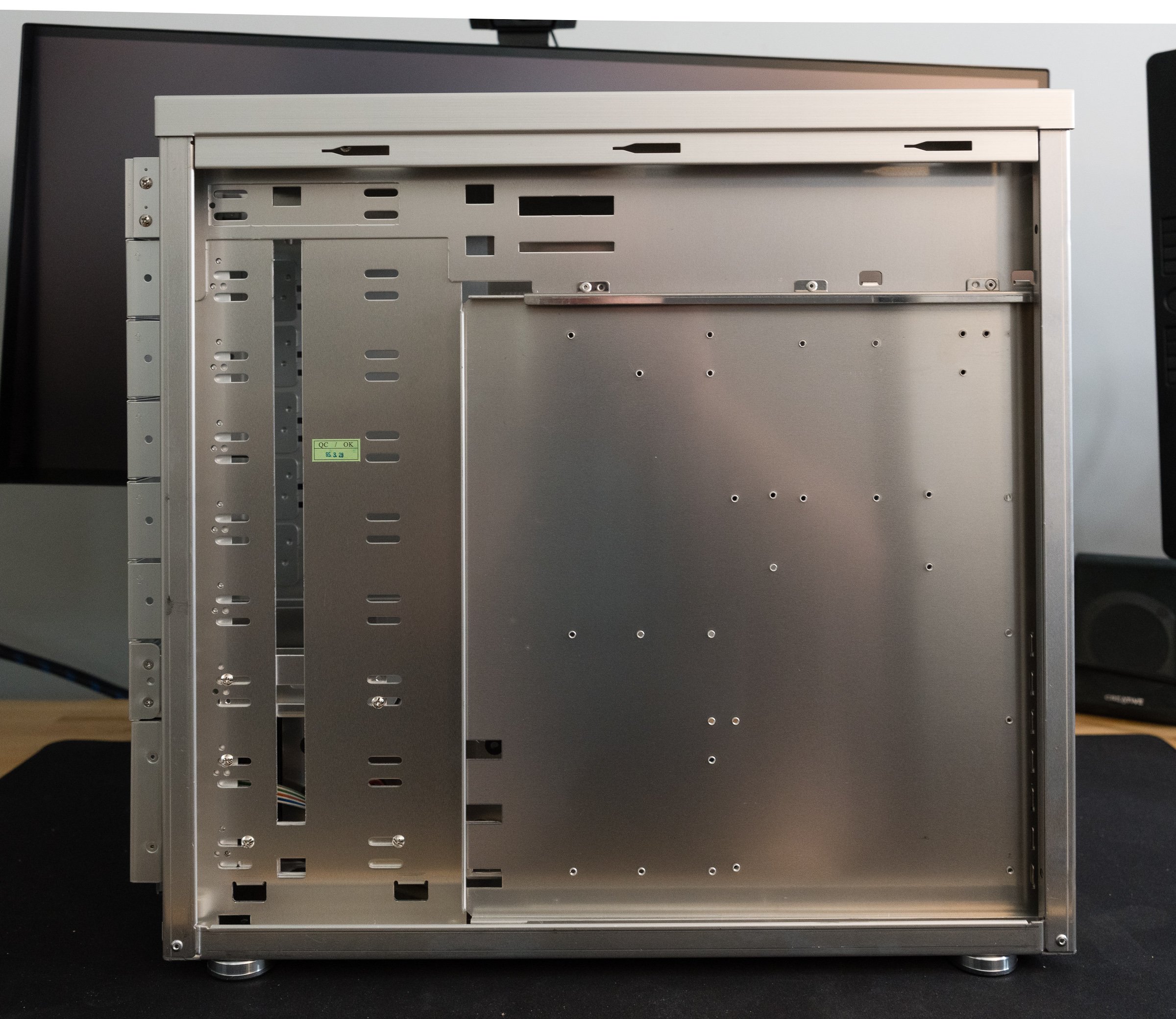
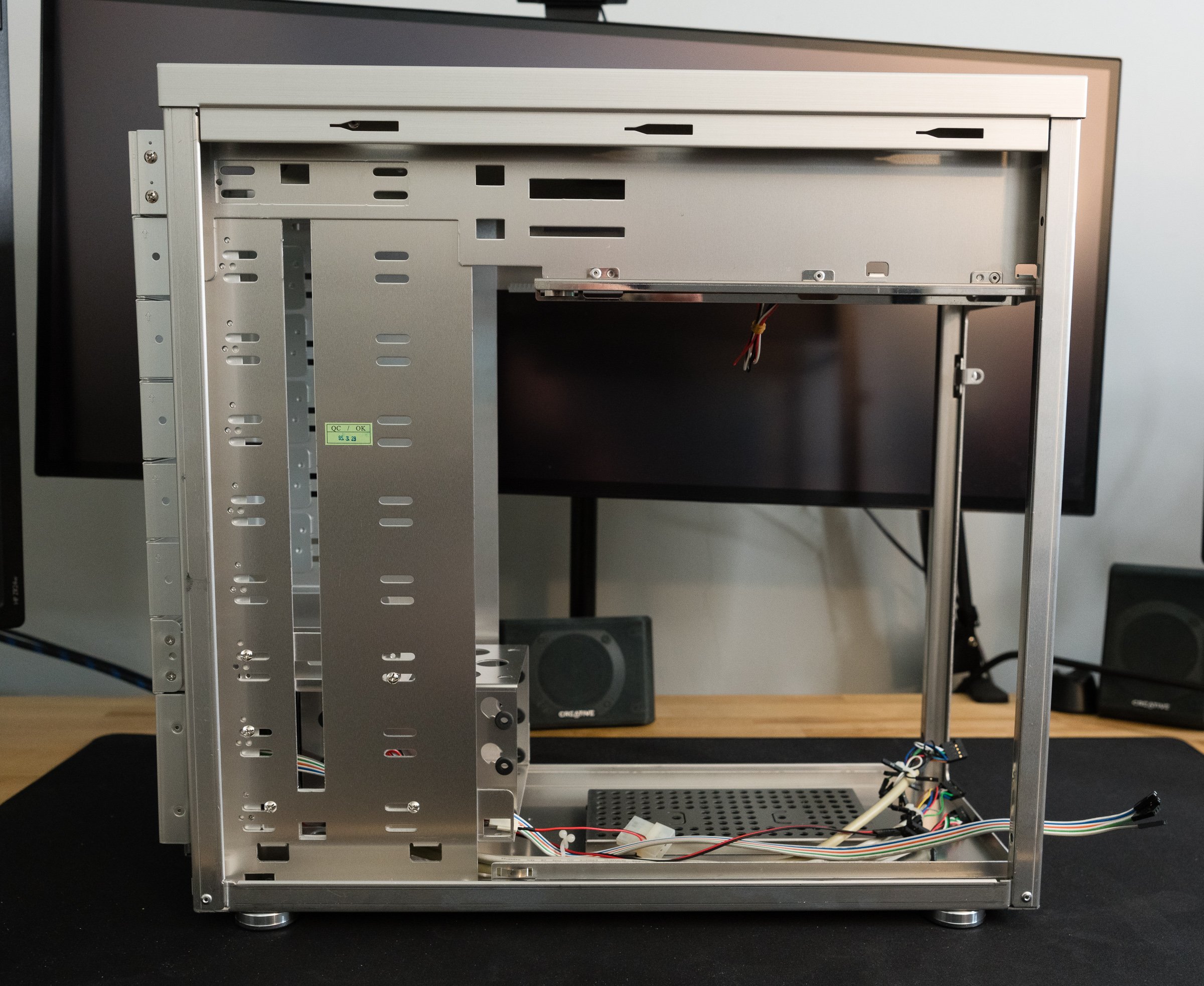
An obscure Zen Buddhist scholar named Steve Jobs once said that design isn’t how something looks and feels, it’s how it works. So if you spent the extra money on one of the new wave of premium PC cases, did you actually get a product that worked, or did it just look nicer? Let's take a look inside and see if beauty is more than bezel deep. First thing to do is pull off that front bezel, which is easy thanks to a convenient cutout along the bottom edge. Many cases of the nineties required the removal of side panels and interior parts to detach their bezels, so this is already a good sign. More nice touches include large thumbscrews that secure the side panels, motherboard tray, and power supply bracket. There’s no trick latches or breakable clips on the side panels—they slide right out with no hitches or hiccups. Anyone who’s struggled with opening an intransigent side panel or shell will appreciate this smooth action.

You might be thinking “Don’t all PCs have removable side panels and bezels?” And that’s true, but you need to consider them in the context of the whole case. These boxes aren’t just supposed to look good—they’re supposed to feel good. You know what feels good after removing your side panels? Finding a slide-out motherboard tray and an external power supply bracket. Assuming you're the sort of person who removes the side panels from your computer cases, anyway. Lian Li didn’t invent any of these features, but they implemented them in a thoughtful way.

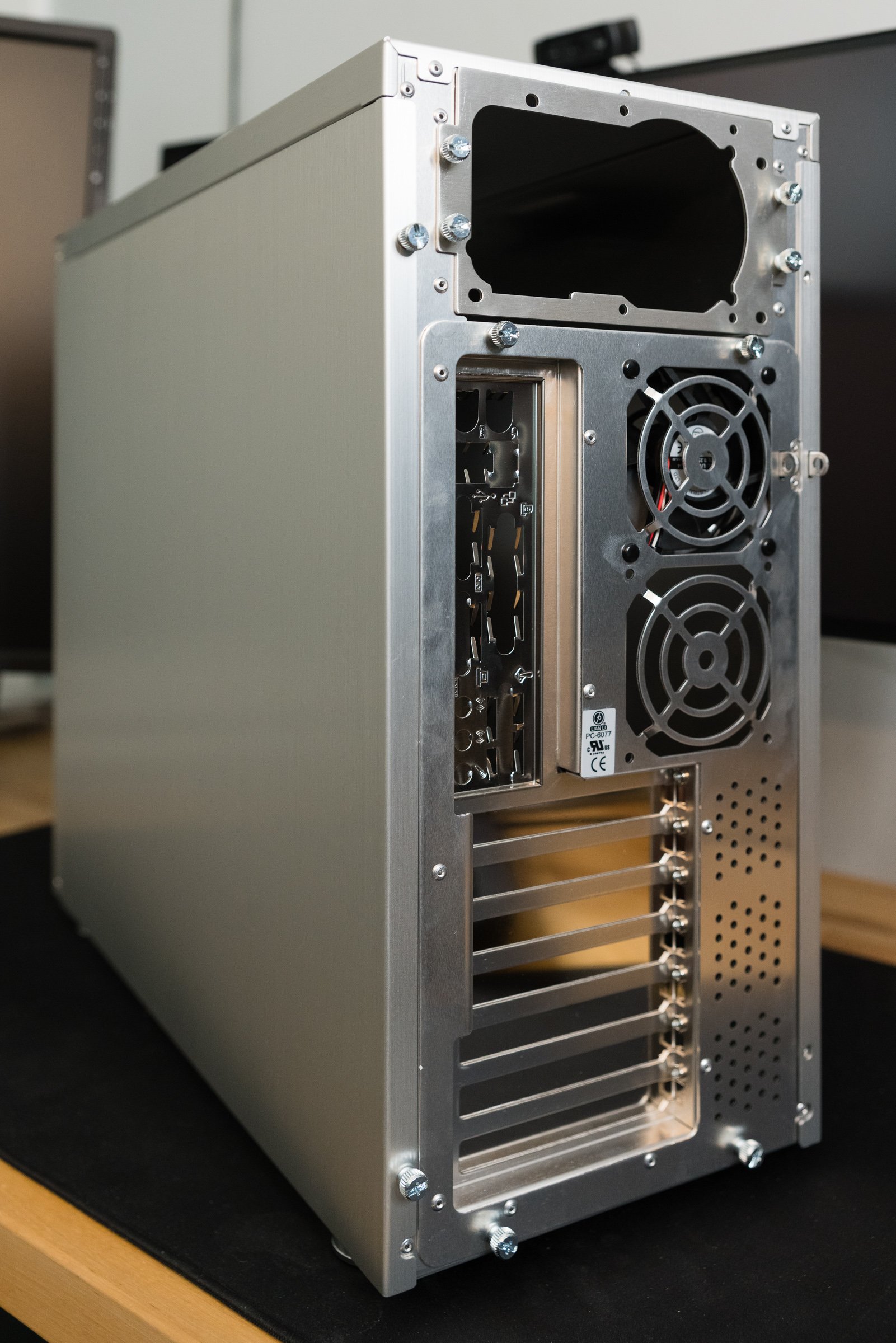
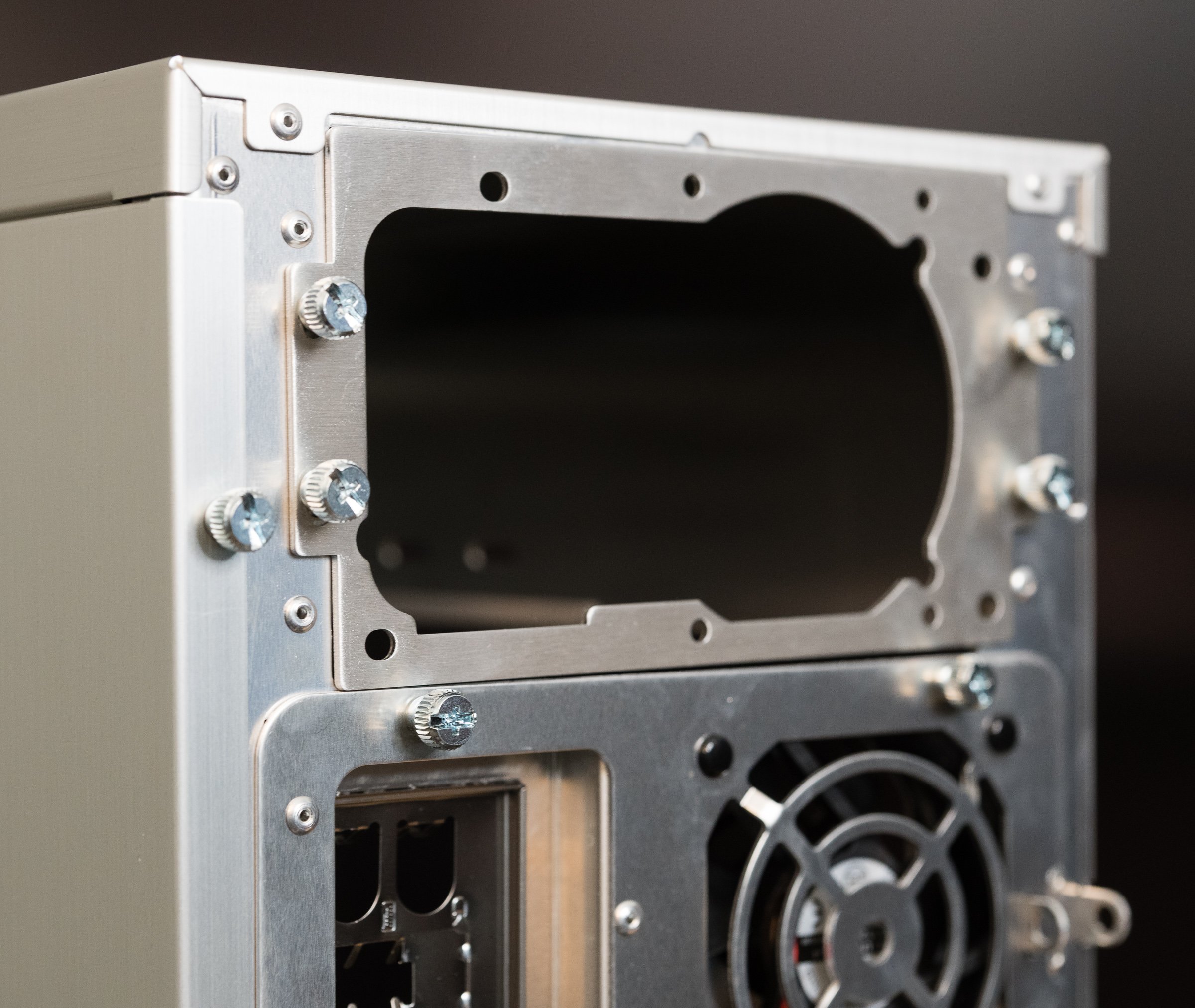
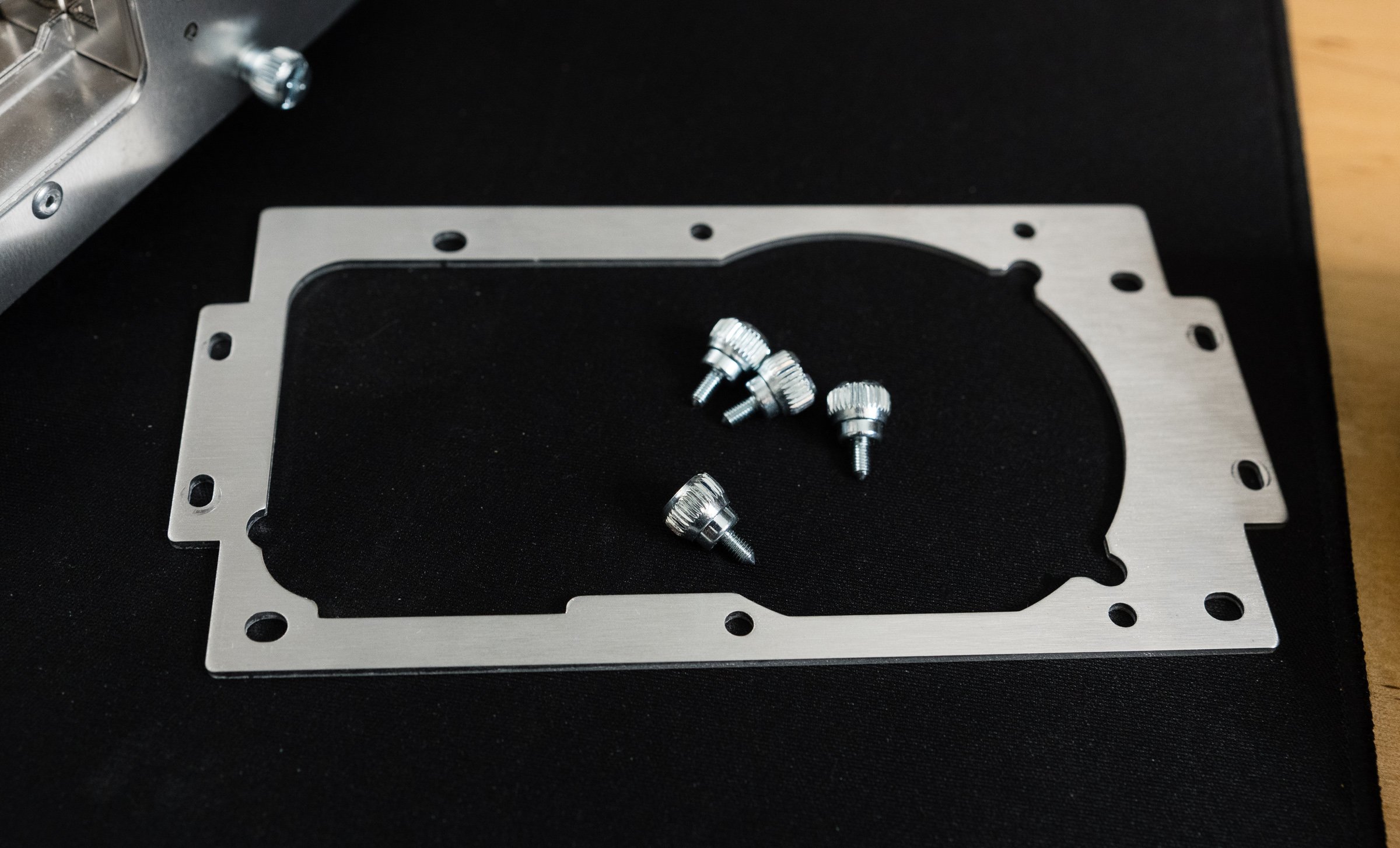
Let’s start with the power supply bracket. In most cases—pun intended—a power supply was fastened directly to the frame with some screws. Sometimes creative hand gymnastics were required—hold the supply with your right hand, turn the magnetic tipped screwdriver with your left, and hope you've screwed it in… and not screwed it up. There might be a little flange that helps hold the power supply in place, but that’s not guaranteed because I’ve repaired several machines that lacked PSU supports. I’m sure there’s lefty builders out there chuckling at this—they had an advantage for once! And that's just for installation. Removal could be even trickier, if you'd added in one of those giant Zalman flower heatsinks or some water cooling. An external bracket neatly solves these problems. After attaching the bracket to the PSU, simply slide it and the cables into the case. Removal is just as easy.

But that power supply bracket is just the opening act—the real star was the slide-out motherboard tray. Though most mid-tower cases had a sensible amount of space inside, you were still working inside a box. Sliding out a motherboard tray is like dropping the engine from a car to replace the cylinder heads—it’s easier to do complex mechanical work in an open space. Less risk of scraping your knuckles on the drive racks when installing a motherboard or CPU if you’re working outside the box. Power supplies and their wiring don’t get in the way of tightening heatsink screws. Did you drop a screw or jumper? No worries—just tilt the tray to one side and grab it. You could even open-air bench test a system if you were feeling frisky. For most users this is a one- or two-time convenience. But then, 'most users' weren't the target market here. The people who bought these cases were tinkerers, and tinkerers loved these trays. Case modders were always moving boards in and out of their project boxes. You don’t want delicate electronics inside your case when you're cutting holes in the side or constructing custom water cooling loops. True, you won't get a tsunami, but a few ounces of coolant in the wrong place can kill a machine—or a very unlucky tinkerer. You did remember to unplug everything first, right?

I can already see the tweets asking  “if removable trays are so great, why have they vanished from most modern PC cases?” My gut says there’s two reasons for their disappearance. First, there’s good old fashioned bean counting. A removable tray is extra complexity of the mechanical and manufacturing varieties, and that’s not free. Like I said earlier: most users aren't tinkerers. If the tray is just a one- or two-time convenience, maybe it's more economical to spend those engineering resources elsewhere. Second, a fixed tray is better for a case’s structural integrity, especially when there’s a cutout for processor heatsink backplates. A few modern cases like the beQuiet Dark Base still have a removable tray, but instead of a slide-out design, it’s reversible. Only a few screws stand between mounting your motherboard on the left- or right-hand side of the case. You know, so you can put your PC on the left- or right-hand side of your desk and still ogle your RGB LED light show.

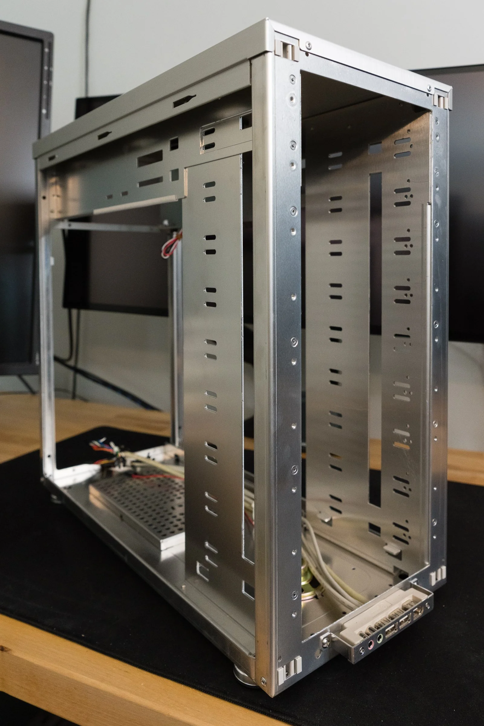
With the motherboard tray and power supply bracket removed, we’re left with the PC-6077’s frame, power supply shield, and the drive bay rack. These are all riveted together, since welding aluminum is more complicated than welding steel. A lack of sharp edges and some strategically placed plastic trim meant no more cut fingers and cursing fits. Hard drives and optical drives are secured by ordinary screws, not tool-less clips or rails. However, the hard drive cage does have rubber grommets to insulate the case from spinning disk vibrations. Aside from being made from aluminum, the construction is on par with other high-end cases of the time.

The PC-6077’s 3-in-2 hard drive cage.

The Pros and Cons of Aluminum

That aluminum structure feels solid and sturdy, but also quite light—which, granted, is the whole point of aluminum. My postal scale weighs the PC-6077 at around thirteen pounds empty. Most steel mid-towers of the era weighed around twenty pounds or more, but that weight savings comes at a price. Aluminum objects have always been more costly to manufacture than steel ones—Wikipedia will tell you more than you want to know about the Hall-Héroult process. But if you’re lugging your liquid-cooled Pentium 4 to the LAN-o-rama every Saturday, you’d happily pay the difference to cut your computer’s tonnage. Lian Li could have made the PC-6077 even lighter if they used more plastic, but the few ounces saved wouldn’t be worth losing perceived quality. That strategy was reserved for their entry level products, like the PC-10 which used a plastic front bezel.

Cost wasn’t aluminum’s only downside. On the one hand, it's ductile, which encourages modifications! On the other hand, it's ductile, which makes it vulnerable to flexing. Anyone who used a PowerBook or MacBook Pro before the unibody era knows just how bendy aluminum computers can be. Just take off the side panels and you can feel them flexing with normal handling. There are plenty of sad posts on forums from people who dented their cases with an errant foot, or dropped them and actually bent the frames. If you want more structural rigidity, you need to add more weight - which defeats the purpose of buying an aluminum case to begin with.

Aluminum’s lower density had another unintended consequence: noise. I've got some experience in voiceover, and I can tell you, mass plays an essential role in soundproofing. A lighter aluminum case absorbs less sound than a heavier steel one. A few overlapping metal pieces inside the case like the power supply frame and drive bay frame aren’t riveted together. Two of the three included fans are mounted using plastic rivets, which are better than screws but worse than isolated rubber mounts. Those rubber grommets I mentioned earlier from the hard drive bays were thin, and easily compromised. All of this adds up to a case that is susceptible to vibrations, sympathetic or otherwise.

None Like It Hot

“But my case doesn’t rattle or vibrate,” you say. Well, that’s great, but there’s another factor that impacts the acoustic qualities of a case: cooling. Whether it's case fans, heatsink fans, or radiator fans, it’s always been a challenge to build the fastest computer that’s also the quietest. What would you say if I told you that Lian Li has your best interests in mind? Why, right on the side of the box it says in big, bold letters that “Lian Li aluminum cases release heat faster than other cases!” Hey, they used a bold font—it must be true! But even if it was set in a different font, it’s still a bold claim by Lian Li. It’s easy to prove that an aluminum case is lighter—just put it on a scale. But proving that an aluminum case cools better? That’s more complicated.

They wouldn’t lie, would they?

Aluminum is a common heatsink material because it’s a good conductor with decent thermal capacity at an affordable price. Car radiators and AC evaporators are made out of aluminum. PCs were already using aluminum heatsinks on various chips—so why not make the case out of aluminum too? Posters on usenet and web forums extolled the benefits of an aluminum case for improving cooling performance, because SpeedFan showed lower temperatures after transplanting their builds into a shiny aluminum tower. “That proves it,” they’d say, like Philip J. Fry watching blurry, grainy videos of Bigfoot.

But as smart as PC nerds like to think they are, sometimes they forget that correlation doesn’t equal causation. These claims are all marketing hype. Aluminum might be a good conductor, but you know what isn’t? Air. Heatsinks need to touch components to actually sink the heat, and there’s usually some kind of thermal compound binding them together. So if the case isn’t touching any hot components, it’s not actually cooling them. I can already hear the next counterpoint: “But wouldn’t the case material absorb heat from hot case air?” I suppose it could, but let’s think about that for a second.

Heatsinks and radiators use mass and exposed surface area to exchange heat with air, and they have a certain amount of thermal capacity before saturation. That capacity can be increased in three ways: more mass, more surface area, or more airflow. There are some cases designed to be passively cooled, like the Streamcom ST-DB4, but the case itself is a giant finned heatsink directly connected to hot components. The PC-6077 doesn’t do any of that, and like a normal steel case its thermal performance is at the mercy of airflow. I don’t know about yours, but my cases obey the laws of thermodynamics.

Cooling wasn’t exactly priority number one for most case makers. Most PC cases of the late nineties had one rear case fan working in tandem with the power supply fan. As these fans exhausted hot air from the interior, fresh air was pulled in from vents at the front of the case. When faced with serious warmth—say, from a Pentium 4 processor and a Nvidia GeForce FX graphics card—this cooling setup couldn’t beat the heat. Consumer PCs needed more fans that could move more cubic feet of air through the case to cool more effectively.

We could shove so many fans in there!

The truth is that Lian Li's claims about releasing heat had nothing to do with the case's aluminum construction. Their cases cooled better because they included more preinstalled fans. More fans means more airflow which means more cooler, in that Tim Allen sort of way. The PC-6077, like most cases of the early aughts, had mounts for multiple intake and exhaust fans. Three 80mm fans were included in the stock configuration: an intake fan up front, an exhaust on the motherboard tray, and an exhaust at the top of the case. The power supply’s fan made four in total. This created a negative pressure system, which was sensible for most builds of the time. But PC enthusiasts back then were just like the PC enthusiasts of today—they wouldn't settle for sensible! Fortunately—for a given value of “fortunately”—the PC-6077 was pretty flexible when it came to cooling. Those beautiful, wide open drive bays were perfect for adding extra fans, and Lian Li was more than happy to sell you drive cages with fan mounts. Oh, and look—there’s one more 80mm mounting spot on the motherboard tray, just perfect for adding another fan!

What about the competition? Cooler Master’s aluminum cases had similar fan mounting options. Chenming’s model 601—which you might know better as the Chieftec Dragon, the Antec SX1030, the Thermaltake Xaser, or the case used by Alienware—had multiple front and rear fan mounts along with side panel fan mounts. So that means they all have fantastic cooling right? Think again. Some cases with lots of fan mounts only had one, maybe two fans installed, and they might not have been installed in optimum positions. A critical examination of these enthusiast cases—including Lian Li’s—show that most manufacturers just shoved fans in their cases with no real consideration for fluid dynamics.

Talk about a choked-off intake.

Look at the intakes—they’re choked by layers of of metal gratings, foam filters, and narrow bezel vents. That’s not all—the intake fans are sandwiched on the other side by hard drive cages! Whatever air that’s lucky enough to make it past the drives has to contend with a jungle of ribbon cables and power wires. At least exhaust fans were positioned near the CPU, and some OEMs were smart enough to install dual 80mm or a single 120mm fan to really suck out the air. But let’s say for the sake of argument that there were no blockages or cables or restrictions. The exhaust fans aren’t in line with the intake fans, which means there isn’t a straight path for air to move through the case. The result is a case riddled with turbulence and dead zones, where fans have to work harder—and therefore louder—to cool your computer.

When it came to acoustics, fans back then were kinda… meh. Pulse-width modulated variable fan speed was still years away. Four 80mm fans spinning at a constant two to three thousand RPM meant these suckers were loud. Good thing there’s plenty of bays in the PC-6077, because you’ll need a fan controller to dial things back when you don’t need maximum power. But be careful, because even ball-bearing fans could make mechanical noise at certain speeds. Multiply the mechanical noises by reverberations in the case, and you’ve got a computer cacophony. Before you know it you’re reading SilentPCReview.com and testing all the various isolation mounts to see which combination worked best.

Thermals are even more important today than they were twenty years ago, and PC case makers have largely caught on to what works and what doesn’t. There’s still duds out there, but it’s pretty easy to filter them out thanks to the Youtube Tech Personality Industrial Complex. The same market pressure that forged the aluminum cases of the early aughts is still pushing manufacturers to make quieter, cooler chassis…es…es with better functionality today.

This Old Tower, Today

So what’s left to do with this like-new PC-6077? The obvious idea is to fill it with vintage parts and make it a Windows XP gaming beast. Yes, an Athlon 64 X2 with a GeForce 6800 Ultra would be right at home, serving up some Battlefield 2 with a side of SimCity 4. Install a Fanbus, a SoundBlaster Audigy control panel, dual CD/DVD burners, and a removable hard drive carrier and you’ve got the classiest gamer box on the block… assuming you still live in 2005.

But what if you wanted to stuff a modern computer inside? Some would cry sacrilege, but I know people who’ve used and re-used their Lian Li cases for over a decade. I don’t think it’s that crazy of an idea, especially for a platform like the PC-6077. Lian Li’s appeal to the 5 1/4 lovers makes it remarkably easy to convert this case into an airflow-focused silver sleeper. Yanking out all of the trim covers and blanking plates gives you plenty of room to do whatever you want. Fit some 120mm fan adapters and replace the stock 80mm fans with Noctuas and you have airflow competitive with most modern cases. If you feel up to the task, there’s enough room to 3D print or fabricate a dual 140mm fan bracket. Fit a mesh front covering into the bezel and you’d make something that could blend right in with modern airflow oriented cases.

You’ll run into other issues, of course. Closed-loop liquid coolers aren’t an option without fabricating a bracket to mount them into the drive bays. You could take a page from the LAN partiers of yore and build a custom open-loop liquid cooling system. Many medium to large sized air coolers will fit within the PC-6077’s confines, like Cooler Master Hypers, Noctua NH-U12s and beQuiet Black Rocks. But the truly massive air coolers, like the Noctua NH-D15, won’t stand a chance. Modular power supplies mitigate the cable management problems somewhat, since you can just omit the cables you don’t need. Still, cleanly routing the PCI Express power, 24 pin ATX, and the EPS 12 volt cables will take some—no, all of your cunning. Stick to NVME solid state drives and you won’t have to worry about any SATA power or data cables. If you plan your build carefully, you could conceal a killer modern system in this twenty year old shell and have a PC that looks like nobody else’s.

The G5’s thermal design was a benchmark for other systems.

Yet the only fully aluminum cases on Lian Li’s website these days are a few small form factor boxes—fully-aluminum tower cases are nowhere to be found. So why did Lian Li stop making cases like this? There’s two factors for the decline of the fully aluminum mid-tower case. First, other companies used steel to build better designs, with more features, for half as much. Meanwhile, Lian Li spent too much time imitating the Power Mac G5, and not enough time innovating. Yes, there was a demand from PC users for cases that looked like the G5 or Mac Pro, because nothing looked like G5 cases. Apple had learned their lesson about hot components and bad acoustics with the Mirrored Drive Doors Power Mac G4, and had gone back to the drawing board to solve their problems with a clean sheet design. Thus the Power Mac G5 got a brand new case design with straight-through airflow and dedicated thermal zones, which made for a quiet, high performance computer. Lian Li’s PC V-1000 might have looked like a G5, but just because something has a cheese grater front panel doesn't mean it works like a G5. The V-series sold well, but Lian Li mortgaged their future by copying Apple.

The second factor that spelled doom—no pun intended—for aluminum cases was the decline of the LAN party. Home internet got fast enough that most people had a good enough time blasting their buddies without departing their desks. If you’re not moving your computer around all the time, you don’t care as much about saving weight. The extra money spent on an aluminum chassis could be spent elsewhere, like on more fans, liquid cooling, or RGB LED lights. After all, who cares about subtlety when you can put on a light show that rivals a Pink Floyd concert? The remaining buyers who valued weight savings could buy even smaller and lighter aluminum Mini-ITX small form factor cases. Mini-ITX has its own compromises, but the finished product saves a lot of space. If you have to move your computer around a lot, why not just make it as small as possible?

To its credit, Lian Li diversified long before the collapse of the market by creating the Lancool series of steel cases in 2009. Lancool catered to cost-conscious buyers while Lian Li continued to sell aluminum boxes to their traditional enthusiast clientele. Even as other manufacturers abandoned the aluminum case market, Lian Li doggedly stuck to it. Unfortunately, Lian Li abandoned their fully aluminum product line in the mid-2010s. Current Lian Li cases like the 011 Dynamic are steel frames with aluminum accents or panels. They still make a few aluminum small form factor cases—check out their collaboration with Dan Cases for some neat mini-ITX designs—but those are now rare exceptions. Most builders who valued the classy looks and functional design of Lian Li migrated to companies like Fractal Design, whose Define, Meshify, and Torrent series of cases are beloved for both gaming PCs and workstations.

Still, it’s remarkable that this old case can competitively cool a modern system with only a few minor upgrades. Someone could have bought a PC-6077 in 2003 and used it for their primary build for twenty years, which isn’t something you can say about most of its contemporaries. It seems like a happy accident that the all-bay design actually made it future-proof despite the obsolescence of 5 1/4” drives. During my research I found all sorts of forum and Reddit posts looking for cases just like this. Storage box builders are settling for used cases to fill with hot swap hard disk cages because the modern case market is leaving them high and dry. Server cases—then and now—are just too expensive and there’s no new mid-towers with lots of 5 1/4” drive bays. That’s why prices are still fairly high on eBay, and why I was shocked to find one at a thrift store. Sometimes fortune smiles upon thee, and this case will serve an honorable role as a vintage powerhouse. That is, once I decide what to put inside it.

Thinking Inside the Jira Text Box

If you work in or around software development, you might be familiar with Atlassian’s Jira. It’s one of the more popular project management applications out there, especially if you work in a Scrum or Kanban-style agile environment. It’s not just for software, of course—I know IT departments and salespeople that use Jira for tracking task progress. Nothing’s stopping you from using Jira for shepherding your comic book creation process, other than its incredible cost and administrative overhead. I’m a relatively new user to Jira, with a year’s worth of experience under my belt. Before that I used Redmine, Bugzilla, and proprietary bug tracking systems. It’s safe to say that I have some experience with issue tracking platforms.

When I started a new job one year ago, a friend of mine warned me about Jira. He’d gripe about how terrible Jira was and how he hated it. I sort of dismissed his complaints, as he hadn’t been suffering under the terrible weight of Redmine, let alone an inscrutable proprietary system. I thought anything had to be better than the terrible proprietary stuff I endured in the past. So I was willing to give Jira an honest shot. And you know what? I don’t hate it. But I don’t really like it, either, and it’s because it’s a bloated Javascript nightmare. There’s dozens of papercuts in its user experience that gradually scar you over time. And just like a papercut, these flaws aren’t going to kill you—but they’ll slow you down and make you so very angry.

One of the most irritating is some user interface designer’s obsession with dead space. Not white space, that stuff is useful, though sometimes abused. No, I’m talking dead space, which distracts the user and actively interferes with your usage of the product. Take something as simple as a text box. You’d think people would know how to make a text box work, but this one must have slipped by the folks at Atlassian. If you have an instance of Jira, go ahead and open up the new ticket window. You’re looking for a rich text text box in that window, like the one for a description. Here’s an image if you don’t have it in front of you.

So if you saw this text box, where do you think you would click on it to start typing? Would it be inside the outlined area of the text box? Maybe the white space below the toolbar. Both are sensible guesses, but before you give me your answer, step back and think about the question. Remember your past experience with text boxes. Your instinct is that you can click anywhere inside the boundaries and start typing. That’s a good example of Fitt’s Law: “The time to acquire a target is a function of the distance to and size of the target.” Or in other terms, a bigger target is easier to hit. I’m already ignoring several problems in this box, like how there’s no clear separators between the toolbar and the editable text area, or the fact that the buttons aren’t even buttons. For the sake of this post we’ll grant these now common-day “cleanliness” design touches, even though I loathe them. But that’s a rant for another day, so back to the subject at hand. Let’s get back to the original question: where do you click to start typing?

If you answered “anywhere in the text box,” congratulations: you’re wrong. It’s not your fault; you’ve been conditioned to click on the box and start typing since you started using a computer. After all, text boxes have been around since the dawn of the GUI, and they’ve generally worked the same way for decades. It’s a fair and reasonable assumption to make. But that assumption is a trap when it comes to Jira, because you have to click in a very specific region of the text box to start typing. There’s no hint where that region is, other than when your cursor transforms into the I-bar. Take a look at this GIF.

Notice where the cursor transforms from the normal pointer to the I-bar. You can only enter text when the cursor enters this invisible zone that takes up a fraction of the text box! There’s no hint or clue for where this zone is—you have to carefully watch the cursor to know where to type. What looks like a big, appealing target is really just a tiny, hard to click strip.

Earlier I called that area outside the magic zone “dead space.” It’s dead because it does nothing inside the box. That doesn’t mean it lacks purpose—a little bit of white space to separate your text from the boundaries makes it easier to read. From a visual design standpoint, that’s a good thing. But most user experience designers would tell the programmers to make the white space a clickable area! Atlassian’s lack of care inadvertently tricked the user and made their life just a little harder.

Compare this to another product most of us have to endure: Slack. There’s a lot of criticisms I can lob at Slack, but at least they managed to make a functional message box. Compare Slack’s behavior when you click in the message box’s white space.

Slack text box

Clicking anywhere in the text box that isn’t a button makes it ready for text input. There’s a few things I could complain about here—namely, buttons should look like buttons, and I’m not really a fan of the toolbar sandwich. But what makes the toolbar sandwich tolerable is that clicking any place that isn’t a button puts the focus on text entry. The penalty for missing or being a little sloppy isn’t harsh. As soon as your cursor goes over the box, it changes to the I-bar, making it immediately obvious that you can type after clicking. It’s a nice, big target that’s hard to miss. It’s a good example of obeying Fitt’s Law. It’s rare that I tell some other app to be more like Slack, but in this case Jira could be a lot more like Slack.

Here’s the real kicker, though: Atlassian manages to do this correctly in other parts of Jira! For example, hot zones for comment text fields behave properly. If you create a ticket that has no text in its Description, then edit the ticket, you can click anywhere in the description text box to activate the cursor. There’s even a nice little horizontal line separating the toolbar area from the text box itself!

Editing an already created issue in Jira

It’s these kinds of inconsistencies that really grind users’ gears. A user expects that their applications will work consistently no matter what mode they’re in. Larry Tesler had a NOMODES license plate for a reason. Our job as user experience designers is to eliminate friction and make our users’ lives easier. They shouldn’t have to think about where to click in a text box to start typing. Atlassian, fix your freakin’ text boxes.

The Mac Studio Report: X Marks the Mac

Note: this is an edited transcript of a live podcast.

Welcome back to another off-the-cuff edition of Userlandia. Off the cuff, because we just had an Apple event today. I didn't do one of these when we had the MacBook Pro announcement, because I knew I was going to buy one and I was going to write a massive review about it. But I'm not going to buy the new Mac Studio, so I'm not going to do a big, giant review of it. So I think it was probably better for me to get some thoughts and other things about it out of the way. It's the late evening here when I recorded this here in the lovely Northeast. So it's been some time since the announcement and I’ve been able to ruminate about various things.

RIP the 27 inch iMac

Today’s announcement was Apple unveiling the new Mac Studio and Studio Display. Now before I get started, I’d like to give a little honor to the 27 inch iMac. I’ve got a bottle of Worcester’s own Polar seltzer, and I’m gonna pour some of this blueberry lemon out in tribute. The 27 inch iMac’s been around for quite a while. Starting at 1440P and then going all the way up to 5k, it had beautiful screens attached to a decent enough computer. But with the announcement of the Mac Studio, it vanished from Apple's website. The 27 inch iMac is no more. In its place is the Mac studio, the Mac that everybody thinks they want: A new headless Mac that will forever separate the iMac’s beautiful screen from the computery guts within.

And, you know, I liked the 27 inch iMac. It was a perfectly fine machine for what it was, and you usually had a really nice value. It had a really nice screen with a usually decent enough computer, but never really a barn burner because it’s compromised by the thermals of the display. Plus, Apple over the years made the sides thinner and thinner and a little more bulbous in the back which didn’t help the thermal performance. The result were iMacs with really loud fans and CPUs that would throttle after a while. And it took the iMac Pro to balance that out by completely redesigning the internal heat removal system. With the Mac Studio, Apple has basically done two things: they've made a iMac without a computer—that's the new Studio Display is. And they also made an iMac without the display, which is the new Mac studio.

It's serving that same sort of high-end iMac user who doesn't necessarily need expansion capabilities. For some users that's a benefit since they don't want to throw away “a perfectly good monitor” when they want to upgrade their computer. And for some other folks, they liked the value that they got when they bought that 27 inch iMac and I just sold the old one and recouped some of the cost. I think there's kind of six and one half dozen of the other when it comes to that. But with the way Apple is moving forward with Apple Silicon, and other things, along with people requesting nicer screens to go along with other Macs, it's hard not to see the 27 inch iMac and saying “well so long, and thanks for all the fish. “

Does that mean that the large iMac form factor is dead for good? I don't know. I personally think an iMac Pro, such as it is, would probably be welcomed by some people, but maybe they're going to hold out until we get whatever 30 inch XDR model is coming down the pike. Who knows. But for the time being, if you are a 27 inch iMac owner, you're either going to be buying a Mac mini and the 27 inch display, or you're going to be buying the Mac studio and the 27 inch display. And whether that works for you or not, I guess we'll have to see what happens on the reviews and everything else come in.

The Mac Studio Design

Why don't we start with addressing the Mac Studio’s design. Those renders had come out a few days before and while they didn't look exactly the same as the finished model, they pretty much predicted what we got. We’ve got a slightly taller Mac Mini with better cooling. It has ports and an SD card slot on the front, which is addressing some complaints people had about the Mini—that you always had to reach behind it to plug stuff in or pop in an SD card. There were similar complaints about various iMacs over the years about the same port arrangement. Why couldn't they put it on the side, we asked? Well, now you don't have to go around the back to go and plug stuff in. I’m all for that—it's nice to have front panel ports. Practicality seems to be the name of the Mac Studio’s game. There's USB A ports. There's 10 gigabit ethernet. There's four Thunderbolts on the back, which is perfect for monitors. And while you’ll need dongles for the front USB C ports, that's becoming less of an issue as time goes on. So I think people will be pretty happy with the ports.

Of course, in the run-up to this, everybody was asking, “oh, will this finally be the mythical xMac?” If we want to have mid-to-high-end performance without having to buy a big iMac, is this finally it? Some grognards, and probably myself, will come along and say “it can't be an xMac without slots.” Well… maybe I won't say that. I've always been of the opinion that the xMac was supposed to be a headless iMac and then scope creep came in and people kept saying, oh no, it needs to have slots and an upgradable GPU to truly be an xMac. The beautiful thing about the xMac is that it could be anything to anybody at any time. The goalposts just keep shifting and we have no idea what anybody actually means.

With the way things are going these days with systems becoming more and more integrated—and not just on Apple's side, either—it makes sense that the Mac Studio is the machine that you want to buy if you want performance and you don’t need extremely specialized cards. Ultimately the writing has been on the wall for systems on a chip, Apple's integrated GPU, and other strategies. Apple may do something more traditionally expandable but that's clearly going to be in the Mac Pro realm of things. So when it comes to this machine, they're just stuffing as much power into as small of a form factor as possible.

Now I'm not the only one to make the observation that this machine is basically the G4 Cube, except a lot more powerful, a lot quieter, and less chance of seams going through the sides. When you're looking at the people using the Mac Studio in the launch video, it looks like the personal workstation that the Cube was meant to be. It doesn't have the pretense of the Cube—it's not saying, “oh, I’m an object of art.” It's a well-designed and it fits in with your work, but this machine is a machine designed to do work. It’s not designed just to be beautiful. They've put function a bit ahead of the form. Especially when it comes to the function of cooling and performance, when the G4 Cube had no fans.

This machine is much smaller than the Cube, yet it has two very large—and probably very quiet—fans. The 16 inch MacBook Pro is already quiet, so we should expect similar performance here. After thinking about it for a while, I realized that the Mac Studio is functionally the 2013 Mac Pro reborn. I prefer calling it the Darth Mac instead of the trash can Mac, because I think the concept of that Mac was fine. It was a machine engineered around external expansion, geared towards heavy GPU compute with a pretty powerful processor inside of it. The difference here, of course, is that you can't replace the processor, you can't replace the video cards and you certainly can't put more RAM or NVME SSDs into it either. But if you put the two next to each other? You can say, yeah, this is that cylinder Mac Pro at a more affordable price point.

If you look at the Darth Mac, it was introduced at $2,999. The Mac Studio starts at $1999, which is $1000 cheaper, with a heck of a lot more performance under the hood. And the M1 Ultra configs are competitive with the old dual GPU options. Of course, the downside is you probably can't shove as much RAM into it, but I don't have the cylinder Mac Pro’s specs currently in front of me to confirm that. If you don’t need PCI Express cards, you could swap out your fleet cylinder Pros with Mac Studios using just a few Thunderbolt adapters. Unlike the cylinder’s trick thermal tunnel design, the Studio is a Mini that's been beefed up in terms of cooling. It’s designed to cool a specific amount of heat, but that’s OK because we're clearly going to have room in the market for a model above this. And I think had Apple kept a machine with slots along with the cylinder Mac Pro, I think the cylinder would have been a lot better received. Thankfully they did that at the end when they said “oh yeah, by the way, we know about the Mac Pro—we'll come back to that another day.”

So that's just giving people permission to not freak out and go “aaah, slots are going away again!” But with the 27 inch iMac dead, and this machine here, there is a very big gap in power between the M1 Mini and this. I genuinely thought that we would have had an M1 Pro machine to start the lineup with at $1299 or even $1499. It’s one thing to say “okay, the M one mini is not enough. I need more monitors. I need more RAM, but I don't need a gigantic GPU or anything like that.” And I think they're missing a trick by not having that there. On the flip side, the M2 Mini may solve that problem for us. It wouldn’t surprise me if the M2 Mini supported 32 gigs of RAM and gain an extra monitor connection to support up to three monitors. That’s what those lower-end 27 inch iMac customers are asking for. So if it turns out that we get an M2 Mini in the summer or fall time, and it includes all those things, then I guess they just have to wait a couple months.

Chips and Bits: the M1 Ultra

I understand why Apple started with the M1 Max and the M1 Ultra, because that high-end market has been waiting. They're going to go and spend all the money they’ve been saving. Users with big tower Mac Pros will probably be okay waiting for another six months to hear whatever announcement Apple is going to make about the Mac Pro. Though the entry point is the Max, the Studio was designed around the Ultra. The M1 Ultra model is a little heavier because they've put a beefier heat sink into it. It’s hopefully designed to run at that 200-ish watts of full-blast power all day long.

We knew about the Ultra because the rumors talked about the leaked duo and quadro versions of the M1 Max. And what we got in the Ultra is the duo. Put together not as a chiplet like AMD, but instead with an interposer. We've seen TSMC interposer come up here and there. People at first thought Apple would use it for HBM memory. Instead they just kept doing their standard on-package memory construction while using the interposer to connect the two processor dies together. That interconnect means we don't have to worry about latency or anything between two chiplets. There's benefits to AMD’s method, namely that if one chiplet is good and one chpilet is bad, it's easier to manage yields. Whereas with the interposer I’m pretty sure both dies have to be good to make a valid processor. Whether apple will ship M1 ultras that have one whole block disabled remains to be seen, I guess we’ll have to see how they'll manage yields on it.

Another question with this method is whether performance will scale linearly. If Apple keeps throwing more cores and more memory channels at problems, especially where GPU is concerned, will that let Apple compete with an RTX 3080 or 3090. That graph comparison they showed was against a 3090, which is very ambitious. As we saw with M1 Max benchmarks, they started reaching some limitations when adding more cores. Some of it’s due to software optimization, of course. But still, if they manage to treat all the cores as one monolithic unit and the GPU manages to get access to all 800 gigs per second…still what a number, right? That’s crazy.

I don't think Apple necessarily needs to beat the 3090 as long as they can trade blows and come up just short and other benchmarks. The fact that they can do as well as they are and still have access to all of the memory is pretty good. If you've got workload that's greater than 24 gigs of VRAM, this might be the machine for you, I suppose, but the fact that they're able to get as close as they are while using less power is impressive., I don't know. I have a 3080TI I in my 5950X workstation. If I don't undervolt that card, it’ll bounce against its 400 watt power limit all day long. If Apple manages to get very close to 3090 performance while using, say, 120 or 150 watts of GPU, I’d call that pretty good.

But the other thing to keep in mind when comparing to something like a 3080 or a 3090, is that this is performance that people will largely be able to buy. Because people aren't buying Apple graphics cards to go mine Bitcoin or Ethereum, they’re buying them to do work. I suppose people could go and buy these machines to be miners. They would be fairly efficient, but I don't see it working from a density standpoint. I haven't done specific price breakdowns on comparing a 3090 to anything else, Keep in mind that if you can manage to get one at retail, you're going to be spending $2,200 on a 3090 that doesn't even include the computer. So if you wanted to build a 5950 X plus 3090 system, you're going to be spending a lot of money to do that.

I put together something that was a little more in line with the base price Mac Studio. If you want just to match the lower end—let's say a 3070 and a 5900X—your whole chassis cost is going to be in the range of about $2,300 to $2,400. And you're going to put another $1,200 to $1,300 on top of that to do a 3090. You're going to be very close to the cost of a Studio. So, if you're thinking about doing work and you've been worried about picking up graphics cards, you can say “well, I can just go buy this whole computer here.” And that won’t help you if you're just upgrading from a 2080TI to a 3090. Still, if you're looking at it from a “I need to buy something to do work” standard, that's going to be harder to argue with. Even through all these production problems that everybody's been having, it's still fairly reasonable to get a hold of 14 and 16 inch MacBook Pros.

And that's what these machines are. They're headless 16 inch MacBook Pros that have additional performance options. The fact that you can just go and buy them in a store is very much a mark in their favor. That said, as of this recording, GPU supply is getting better. I've noticed just over the past week that 3080, 3080TI, 3070TI, and so on have actually been showing up on sites like Newegg, where you can just go and buy them and not have to deal with the Newegg Shuffle. You might have a problem trying to buy one in the afternoon or whatever, but I've been watching every day and it's been getting easier and easier to just go and add something into your cart without getting it completely yanked away from you.

The downside of course, is that prices have not yet adjusted to that reality. If you want to buy a 12GB 3080, you're going to be spending $1200 or $1300. 3080TIs are the same deal. You're going to be spending $1,400-1,500 ballpark. 3070TIs would be around $900. That's what you're going to be contending against. So if you're within the Apple ecosystem and you've got GPU reliant stuff that can run on Metal, it's something to keep in mind if you're thinking about switching to Windows. If you run CUDA, these won’t be very helpful. You'd have to port yourself over to Metal.

The Studio Display

For some people, the more interesting half of the announcement is the Studio Display, which comes in at $1599, which is I believe $300 more than the LG UltraFine 5K. If you want to get the stand that pivots up and down, that's an extra 400 bucks on top. A Nanotexture coating costs another 300 bucks. So you could theoretically spend $2299 on just one of these monitors. On the flip side, if you want to use a VESA mount, there's no extra charge for that. Just make sure you know what you want up-front. There had been rumors that the display would have an A-series chip built into it, and it's going to run an OS and on and on. And I think a lot of people don't realize that monitors these days are pretty smart. They have SOCs and other things inside them. Those SOCs just tend to be smaller, cheaper, less expensive ones to do image processing and drive the on-screen display.

But it's clear that the A-series inside is more about enabling other features. Things like Hey Siri, Spatial Audio, TrueTone, et cetera. And they're actually decent speakers which look very similar to the ones in the new iMac. Those iMac speakers are actually good sounding speakers compared to the junk that's in the LG and Dell monitors that I have laying around. The webcam looks similar to ones we’ve seen in iPhones. Add Center Stage along with better image quality and it embarasses the ancient camera in the LG UltraFine. It would certainly outclass what’s in a MacBook Pro or the kind of stuff that you buy on Amazon. Of course, they're showing people hooking three of these monitors up to one machine and it’s a bit silly that you've got three webcams now. Will they allow stereo support? Can you have a steroscopic 3D webcam? Or maybe you could say, “oh, I'll pick the webcam that has the best angle on me.” Who knows. We'll see if you can actually choose both of them. There's also a USB hub built in. One of the ports should have been a USB A port, but I’ll never stop beating that horse.

It does look nice.

It is a 5k panel which looks to be pretty much the same or similar to the 5k panel that we've known for a long time now. That means it's not 120 frames per seecond, which I know people are grumpy about. I think for this particular monitor, it's a case where the trade-off is being made for prioritizing resolution over frame rate. And right now with Thunderbolt’s specs, you're not going to get a full say 5k 120 FPS over one of the 40 gigabit duplex connections. You might be able to get 5k 120 over the 80 gigabit half-duplex connections, but then you would give up items like the USB ports, the webcam, and the speakers. For some people, those are important features that matter more than frame rate.

I still think apple should introduce a 4.5k external monitor. I get why they're not. It's very hard to compete with the $400-ish 4k productivity monitors that are out there. But I do think a smaller 4k XDR monitor would make sense. That’s for someone who wants 120 FPS mini-LED, so on and so forth. You can say “well, I don't need as much display space, but I do want different image quality.” That would probably work. There was no mention of support for any kind of HDR, obviously, because the backlights and stuff are not intended for that. If they did support HDR, that would mean even more bit depth than other data to worry about. Which again, encroaches on bandwidth a little bit.

I can understand why they made the trade-offs they did, and that probably won't satisfy some people who might have different priorities than others. But given that the LG 34 inch ultra-wide 5k2k monitor that I own generally retails for about $1299, getting the extra vertical real estate along with other features probably justifies that $400 tax. I can’t buy one because I wouldn’t be able to use it on my PC. And there's also no built-in KVM switch support or support for multiple video inputs, which is disappointing.

The Right Spec

So now let's talk about what these machines mean from a value standpoint—what's the right spec? If you had to buy one of these today, what would you choose? Let's take an easy comparison. The $1999 base model is exactly the same as the 14 inch M1 Max MacBook Pro. The difference is that the $1999 model has no monitor, no keyboard or trackpad, has more ports, and has 10 gigabit ethernet built-in. Compare that to the laptop, which is $2899. You're spending $900 on the monitor. You're losing some ports, but you're going to get probably similar performance. Honestly, the studio will probably perform better because it has better cooling, a better heat sink, and will remain just as quiet. If this is intended to be a desk machine, you'd probably be okay with it, especially if you already own a few monitors.

Now, if you have a 27 inch iMac, that becomes more troublesome because, well you can't use that 27 inch iMac as a monitor. My advice would be to sell that machine as soon as you can and get as much money for it as possible and put that towards another monitor. That would probably put you in line to what a 27 inch mid-range iMac would cost. At least most people I know who were buying the 27 inch iMacs were usually paying $2,500 for that. You could go and buy that $1999 machine and buy a 27 inch 4k monitor. But you're going to be running it at either a scaled resolution or 2x 1080, and most people I know don't like 2x 1080.

On the other hand, you've got the $2399 Studio model, which has a one terabyte SSD and a full 32 core GPU. Compare that against the $3499 16 inch MacBook Pro that you can just walk into an Apple store and buy. That’s a considerable difference. The two machines share the same specs, except the Studio gets more ports, the 10 gig ethernet, and everything else. You're just not getting that 16 inch monitor and that's saving you $1,100. That's $1,100 that you can put towards another monitor. Between these two, I would spend the extra little bit of money and get the one terabyte 32 gig one. And you would probably use that machine for five years and it would more than make the money back if you were using it to do actual work.

The one box I would tick.

The one option box I would tick.

Of course, something that’s not mentioned in that price is that there’s no keyboard and no mouse or trackpad included in that price. It’s another way it’s just like the Mac Mini. So if you already have a mouse and keyboard, you're good. If you want to buy a Magic Keyboard and a Magic Tackpadad, you better pony up 300 bucks on top of your Studio’s price to actually use your new computer. Or, you could go and use whatever keyboard you like. If you're buying one of these machines, you're probably a mechanical keyboard nut, and you probably have your own custom board that you've been typing on. I thought it was funny that Apple’s demo video showed people using MX Masters and other pointing devices. They know their audience—it might make sense to just let them spend the money the way they want. If they want to spend it on an Apple accessory, great. If not, whatever. For 27 inch iMac buyers, I would say, wait a little bit. If your machine is several years old, the winning move might be to sell it and put the money towards a monitor.

A Mac Studio plus a Studio Display is going to be about $3,600. You probably spent $2500 to $3,600 on your 27 inch iMac when you kitted it out initially. It’s a tough call—you might spend more money, but you don't have to buy the Apple Studio Display—you can use whatever monitors you want. So if you want to go and buy the LG Ultrawide, you can save a few hundred bucks. If you've got a LG UltraFine 5K, you can save a few hundred bucks. Otherwise, it looks like you're going to be spending some money. On the flip side, in a few years you won’t have to throw that nice monitor away or sell it along with your computer. You can just go and buy a new Mac Studio, plug it in, and there you go.

A PC and Mac Pro Comparison

Now, what if you compare this to a PC? Now with PCs, there's all sorts of things you say, like, “I found this pre-built machine for less money.” From my point of view, I've been building PCs for the past 20-odd years. I went to PCPartPicker and put together an AMD 5900X with a 30,0 regular—not TI—and an 850 watt power supply, 32 gigs of RAM, and a quality one terabyte SSD with an ASUS B550 motherboard. I came up to about $2,400. It's a slightly less—really more like $2340—but it was very close. And the reason why it's so close is because GPU prices are still sky high. A prebuilt PC from someone like Dell or HP is probably still going to be around a $2,000 ballpark. You might save 200 or 300 bucks, but you’re not going to get the same performance for half the price. And as far as the M1 Ultra goes, if you want to do a 5950X plus a 3090, again, it's going to be very close, especially because you're going to have to upgrade the power supply. I used a Noctua cooler, which you can get for a hundred bucks, and I use that in my own 5950X machine. But if you want a big, high-powered radiator, you’ll probably spend even more money. Putting a 3090 into this same build would add $1,300 at MSRP—and that's not including negotiating with a reseller or whatever they're deciding to call themselves these days. So if you're looking for that kind of performance, you're not going to be building a machine for half the price of the M1 Ultra, especially with the way the market is. 5950X prices have come down a little bit and you're going to save around 200 bucks because Intel has finally gotten their act together a little bit. But if you're building an AMD build like that, you're going to be in a smilar price range.. All that's said and done my recommendation, the $2199 1TB SSD model.

I think most people aren't GPU limited, and they care more about RAM. So this gets you 32GB of RAM and more storage, and you’re probably not going to miss those six GPU cores. You’ll be happy with it on your desk, it’ll run great for five years, and you'll hopefully sell it for 6-700 bucks when it’s all said and done. I’d avoid the M1 Ultra unless you know you need that GPU or CPU compute power. And even then that's a real big price increase for the increased horsepower. But you're going to ask me, “Dan, my needs aren’t being met by this. What can I do?” Well we know the Mac Pro is coming—they told us themselves at the end of the event.

That just raises further questions! Are they going to put in the rumored quad Max chip? I don’t think they’ll call it an M1, since the Ultra was pronounced the end of the line. They could call it something like X1—Like Mega Man! We’ll do Mega Man X naming conventions. A problem with the M1 Ultra is Apple’s way of doing RAM on package. If you need 128 gigs of RAM, you have to get the Ultra, even if you don’t need all the cores or GPU power. That is a problem that they need to solve for a Mac Pro, because this doesn't scale. Assuming if you do a quad, you could probably have 256 gig, maybe even 512 if we have higher density LPDDR5 modules. Pro users who are used to the 1.5 terabyte maximum in the current Mac Pro will demand a better solution, and Apple's going to have to find some way to match that. And I'm not sure there'll be able to do it with the on-package method. On the other hand, it’s hard to see them going back to DIMMs after touting the on-package performance. So it could be that we could end up with an Amiga situation. We could have chip RAM and fast RAM again! On-package memory that's devoted towards the GPU and then logic board memory that's devoted towards CPU. But then we're right back to where we were a couple of years ago, and all of Apple's unified memory architecture starts going out the window. It's a legit problem. I'm sure they have a solution that they're working for on it right now.

But we'll just have to see. The other thing pro users want are PCI Express slots, and I can't see Apple making the mistake of ditching slots again. After their big mea culpa with the 2019 Mac Pro, they’ll have a solution for keeping PCI express slots. They’re probably not going to put eight of them in there and they're not going to have gigantic MPX modules. A new Mac Pro is going to have regular PCI Express slots that you can put regular interface cards into for Pro Tools and such. The question is can they manage making the Mac Pro into something that can scale from the quad up to something even more? I really think they've got the CPU and GPU power nailed, they just need the rest of the package. Apple need to have the ability to have more GPU power, more RAM, and more storage that can scale to high levels. That's all stuff that I know that they have the capability of doing, the question is how are they going to execute it? And we don't really know that right now.

Speaking of monitors, the 6K 32 inch Pro Display XDR it's going to be replaced. Are they going to replace it with an even bigger, meaner monitor? I can see them sacrificing the USB hub and using the unidirectional thunderbolt mode to make a monster 8K display. I can see them doing that with Mac Pro-level machines, but the demands of having even say a 5k 120 or a 6K 120 along with higher bit depth for HDR are significant. That's just a lot of pixels to have to push, especially if you don't use display stream compression, which so far Apple has not mentioned at all.on these types of things. I suppose they could just punt and say “Hey, you want the 8K monitor? You need to use two Thunderbolt cables.” That’s not an elegant design, though.

Final Thoughts

So did Apple meet the expectations of the community and its customers? My gut says yes. I can imagine a lot of people are going to buy and enjoy these machines and do a lot of great work with them. I don't think they're going to satisfy everybody. Some people are already griping that, “oh, it doesn't have slots. Doesn't have replaceable this. It doesn't do that.” Sure, whatever. I have to say that I do like them bringing back the Studio name, especially for the Studio Display. Maybe we should bring back other dead names. Let’s call the Apple Silicon Mac Pro the Power Mac, eh? Ah, a man can dream.

I also don't think this machine is really going to quell any of the complaints that other people have about repairability. It's a logic board and everything's soldered onto it. That can be a problem for some people. Unlike the Mac Pro, it’s still the same problems that we have with a laptop or a Mini. The long arc of computing history has been towards integration. More and more stuff gets integrated. We don't buy sound cards anymore. Well, most of us don't, and if we need something, we're fine with external DACs.. Even on the PC side, more and more stuff is getting integrated into our motherboards, like network cards. Apple is just ahead of the curve here. I have a feeling we’re going to see more of this style of integration on the PC side as well. The ATX standard is getting really long in the tooth, especially as far as thermal management goes. Whether that'll change remains to be seen.

But as the event hype dies down, we can look at this from sort of a higher level standpoint. The Mac Studio really kind of is the machine that Steve and everybody else thought of when NeXT came together. It is a personal workstation that’s very punchy and you can do a lot of really cool things with it. It's small, it's unobtrusive, it doesn't get in your way. It does have expandability, for the most part. You can't put stuff inside of it, but you can still attach a lot to it. There's a lot of Thunderbolt and USB ports. Looking at Apple's strategy over the past year, this really feels like Apple is going for the throat when it comes to the Mac. Obviously we've watched these events and they have all these sparkly videos with special effects and marketing hype. But at the end of the day, the machine's performance speaks for themselves. And even just the base $1999 Studio with M1 Max is a very respectable machine for people doing a lot of content creation and 3d visualization. That’s a very accessible price point for that kind of power. It’s plug and play and you're pretty much ready to go, and I can respect that.

We’ll have to wait for reviews to get the full picture. I don't expect the entry-level Mac Studio to be that much better than the 16 inch MacBook Pro. It'll be better in some ways, but ultimately it's just a cheaper way of getting that level of power if you don't need it to be in a portable form. Consider a Power Mac from 20 years ago, a 1999 Power Mac both in terms of price and the year that it came out. Back then, $2,000 didn't buy you a lot of Power Mac—it bought you a base, entry-level machine. Whereas this is not really entry-level, this is definitely extremely powerful. But ultimately the thing that speaks loudest are the people that I know who had been holding out, and holding out, and holding out are finally buying something. Somebody who was nursing along a 2012 Mac Pro went out and bought one. Same with another friend who was waiting things out with a 2012 Mini. I think that speaks a lot about this new Mac.

For the longest time, people said “Oh, Apple can't do an xMac. Oh, they can't do a mid range desktop because nobody will buy it.” I think the reality was that the value had to be there. And I think this is a case where even if Apple's not going to sell 10 million of these Macs a year, they're still valuable things to have in the lineup. I think they realize that sometimes you do have to make a play for market share. And as far I can see this is a play not just for market share in terms of raw numbers, but market share of saying, “we have this available, we can do this. We're not ignoring you, the customer.” You can only ignore somebody for too long before they look elsewhere. And I think we're really seeing the fruits of that big refocus meeting that was four years ago at this point.

The Mac Studio is shipping in just a couple of weeks, and we'll be seeing plenty of people writing reviews and benchmarks. As I said earlier, I’m not buying one, since I already have a machine of similar power and my desktop is a Windows machine. I have no need for a Mac desktop. So while it's not for me, I think it’ll make its target audience very happy.

The Apple IIe - Computers Of Significant History, Part 2

Here in Userlandia, an Apple a day keeps the Number Muncher at bay.

Welcome back to Computers of Significant History, where I chronicle the computers crucial to my life, and maybe to yours too. If you’re like me and spent any time in a US public school during the eighties or nineties, you’ve likely used a variant of the Apple II. As a consequence, the rituals of grade school computer time are forever tied to Steve Wozniak’s engineering foibles. Just fling a floppy into a Disk II drive, lock the latch, punch the power switch... and then sit back and enjoy the soothing beautiful music of that drive loudly and repeatedly slamming the read head into its bump stops. Sounds like bagpipes being repeatedly run over, doesn't it? If you're the right age, that jaw-clenching, teeth-grinding racket will make you remember afternoons spent playing Oregon Trail. ImageWriter printers roared their little hearts out, with their snare drum printheads pounding essays compiled in Bank Street Writer onto tractor feed paper, alongside class schedules made in The Print Shop. Kids would play Where in the World is Carmen Sandiego at recess, and race home after school to watch Lynne Thigpen and Greg Lee guide kid gumshoes in the tie-in TV show. Well, maybe that one was just me. Point is, these grade school routines were made possible thanks to the Apple II, or more specifically, the Apple IIe

The Apple IIe.

Unlike the BBC Micro, which was engineered for schools from the start, the Apple II was just an ordinary computer thrust into the role of America’s electronic educator. Popular culture describes Apple’s early days as a meteoric rise to stardom, with the Apple II conquering  challengers left and right, but reality is never that clean. 1977 saw the debut of not one, not two, but three revolutionary personal computers: the Apple II, the Commodore PET, and the Tandy Radio Shack 80—better known as the TRS-80. Manufacturers were hawking computers to everyone they could find, with varying degrees of success. IBM entered the fray in 1981 with the IBM PC—a worthy competitor. By 1982, the home computer market was booming. Companies like Texas Instruments, Sinclair, and Atari were wrestling Commodore and Radio Shack for the affordable computer championship belt. Meanwhile, Apple was still flogging the Apple II Plus, a mildly upgraded model introduced three years prior in 1979.

Picture it. It's the fall of 1982, and you're a prospective computer buyer. As you flip through the pages of BYTE magazine, you happen upon an ad spread. On the left page is the brand new Commodore 64 at $595, and on the right page is a three year old Apple II Plus at $1530. Both include a BASIC interpreter in ROM and a CPU from the 6502 family. The Apple II Plus had NTSC artifact color graphics, simple beeps, and 48K of RAM. True, it had seven slots, which you could populate with all kinds of add-ons. But, of course, that cost extra. Meanwhile, the Commodore had better color graphics with sprites, a real music synthesizer chip, and 64K of RAM. Oh, and the Commodore was almost a third of the price. Granted, that price didn’t include a monitor, disk drive, or printer, but both companies had those peripherals on offer. Apple sold 279,000 II Pluses through all of 1982, while Commodore sold 360,000 C64s in half that time. In public, Apple downplayed the low-end market, but buyers and the press didn’t ignore these new options. What was Apple doing from 1979 until they finally released the IIe in 1983? Why did it take so long to make a newer, better Apple II?

Part of it is that for a long time a new Apple II was the last thing Apple wanted to make. There was a growing concern inside Apple that the II couldn’t stay competitive with up-and-coming challengers. I wouldn’t call their fears irrational—microcomputers of the seventies were constantly being obsoleted by newer, better, and (of course) incompatible machines. Apple was riding their own hype train, high on their reputation as innovators. They weren’t content with doing the same thing but better, so they set out to build a new clean-sheet machine to surpass the Apple II. To understand the heroic rise of the IIe, we must know the tragic fall of the Apple III.

The Apple III.

When Apple started development of the Apple III in late 1978, IBM had yet to enter the personal computer market. Big Blue was late to the party and wouldn't start on their PC until 1980. Apple had a head start and they wanted to strike at IBM’s core market by building a business machine of their own. After releasing the Apple II Plus in 1979, other Apple II improvement projects were cancelled and their resources got diverted to the Apple III. A fleet of engineers were hired to work on the new computer so Apple wouldn’t have to rely solely on Steve Wozniak. Other parts of Apple had grown as well. Now they had executives and a marketing department, whose requirements for the Apple III were mutually exclusive. 

It had to be fast and powerful—but cooling fans make noise, so leave those out! It had to be compatible with the Apple II, but not too compatible—no eighty columns or bank-switching memory in compatibility mode! It needed to comply with incoming FCC regulations on radio interference—but there was no time to wait for those rules to be finalized. Oh, and while you’re at it... ship it in one year.

Given these contradictory requirements and aggressive deadlines, it's no surprise that the Apple III failed. If this was a story, and I told you that they named the operating system “SOS," you'd think that was too on the nose. But despite the team of highly talented engineers, the dump truck full of money poured on the project, and what they called the Sophisticated Operating System, the Apple III hardware was rotten to the core. Announced in May 1980, it didn’t actually ship until November due to numerous production problems. Hardware flaws and software delays plagued the Apple III for years, costing Apple an incredible amount of money and goodwill. One such flaw was the unit's propensity to crash when its chips would work themselves out of their sockets. Apple’s official solution was, and I swear I'm not making this up, “pick up the 26-pound computer and drop it on your desk.” Between frequent crashes, defective clock chips, and plain old system failures, Apple eventually had to pause sales and recall every single Apple III for repairs. An updated version with fewer bugs and no real-time clock went on sale in fall 1981, but it was too late—the Apple III never recovered from its terrible first impression.

Apple III aside, 1980 wasn’t all worms and bruises for Apple. They sold a combined 78,000 Apple II and II Plus computers in 1980—more than double the previous year. Twenty five percent of these sales came from new customers who wanted to make spreadsheets in VisiCalc. Apple’s coffers were flush with cash, which financed both lavish executive lifestyles and massive R&D projects. But Apple could make even more money if the Apple II was cheaper and easier to build. After all, Apple had just had an IPO in 1980 with a valuation of 1.8 billion dollars, and shareholder dividends have to come from somewhere. With the Apple III theoretically serving the high end, It was time to revisit those shelved plans to integrate Apple II components, reduce the chip count, and increase those sweet, sweet margins.

What we know as the IIe started development under the code name Diana in 1980. Diana’s origins actually trace back to 1978, when Steve Wozniak worked with Walt Broedner of Synertek to consolidate some of the Apple II’s discrete chips into large scale integrated circuits. These projects, named Alice and Annie, were cancelled when Apple diverted funds and manpower to the Apple III. Given his experience with those canned projects, Apple hired Broedner to pick up where he left off with Woz. Diana soon gave way to a new project name: LCA, for "Low Cost Apple", which you might think meant "lower cost to buy an Apple.” In the words of Edna Krabapple, HAH! They were lower cost to produce. Savings were passed on to shareholders, not to customers. Because people were already getting the wrong idea, Apple tried a third code name: Super II. Whatever you called it, the project was going to be a major overhaul of the Apple II architecture. Broedner’s work on what would become the IIe was remarkable—the Super II team cut the component count down from 109 to 31 while simultaneously improving performance. All this was achieved with near-100% compatibility.

Ad Spread for the IIe

In addition to cutting costs and consolidating components, Super II would bring several upgrades to the Apple II platform. Remember, Apple had been selling the Apple II Plus for four years before introducing the IIe. What made an Apple II Plus a “Plus” was the inclusion of 48 kilobytes of RAM and an AppleSoft BASIC ROM, along with an autostart function for booting from a floppy. Otherwise it was largely the same computer—so much so that owners of an original Apple II could just buy those add-ons and their machine would be functionally identical for a fraction of the price. Not so with the IIe, which added more features and capabilities to contend with the current crop of computer competitors. 64K of RAM came standard, along with support for eighty column monochrome displays. If you wanted the special double hi-res color graphics mode and an extra 64K of memory, the optional Extended 80 Column Text card was for you. Or you could use third-party RAM expanders and video cards—Apple didn’t break compatibility with them. Users with heavy investments in peripherals could buy a IIe knowing their add-ons would still work.

Other longtime quirks and limitations were addressed by the IIe. The most visible was a redesigned keyboard with support for the complete ASCII character set—because, like a lot of terminals back then, the Apple II only supported capital letters. If you wanted lowercase, you had to install special ROMs and mess around with toggle switches. Apple also addressed another keyboard weakness: accidental restarts. On the original Apple II keyboard, there was a reset key, positioned right above the return key. So if your aim was a quarter inch off when you wanted a new line of text, you could lose everything you'd been working on. Today that might seem like a ridiculous design decision, but remember, this was decades ago. All these things were being done for the first time. Woz was an excellent typist and didn't make mistakes like that, and it might not have occurred to him that he was an outlier and that there'd be consequences for regular people. Kludges like stiffer springs or switch mods mitigated the issue somewhat, but most users were still one keystroke away from disaster. 

The IIe’s keyboard separated the reset key from the rest of the board and a restart now required a three finger salute of the control, reset, and open-Apple keys. Accidental restarts were now a thing of the past, unless your cat decided to nap on the keyboard. Next, a joystick port was added to the back panel, so that you didn't have to open the top of the case and plug joysticks directly into the logic board. A dedicated number pad port was added to the logic board as well. Speaking of the back panel, a new series of cut-outs with pop-off covers enabled clean and easy mounting of expansion ports. For new users looking to buy an Apple in 1983, it was a much better deal than the aging II Plus, and existing owners could trade in their old logic boards and get the new ones at a lower price.

A Platinum IIe showing off the slots and back panel ports.

Apple might have taken their time to truly revamp the II, but 1983 was a good year for it. Computers weren’t just playthings for nerds anymore—regular people could actually use them, thanks to a growing commercial software market. Bushels of Apple computers were sold just to run VisiCalc, but there were even more untapped markets than accountants and bookkeepers. By 1983, both the mainstream and the industry press had figured out how to explain the benefits of a microcomputer in your home and/or business. Word processors, databases, and—of course—games were all valid reasons to buy a computer, and sales exploded as a result.

Consider Apple’s sales numbers before and after the IIe’s introduction. Ars Technica writer Jeremy Reimer researched estimated sales figures for various microcomputers, and we’ll use them for the sake of argument. For all of Apple’s hype, they sold just 43,000 Apple II and II Plus computers from 1977 to 1979. Radio Shack, meanwhile, sold 450,000 TRS-80s during the same three years. Commodore sold 79,000 PETs. Atari waltzed into the market and sold 100,000 home computers in 1979. One difference is that the Apple II series had a higher average selling price than most of these computers—a TRS-80 kit with monitor and tape deck cost $599 in 1977, while an Apple II without monitor or drives cost $1239.

But this was a time of rapid advancement and innovation, and a hot start was no guarantee of long-term success. The TRS-80 family’s strong start gradually faded away despite newer models with better capabilities, and Tandy shifted to IBM compatibles in 1985. Likewise with Commodore and the PET, which Commodore largely abandoned after the C64 took off like a rocket. IBM sold 1.3 million PCs in 1983 and would only sell more from there. Apple sold 400,000 IIes in 1983, and a million more in 1984, all with excellent accessory attachment rates and monstrous margins. Shipping that many computers with Woz’s original board design would’ve been impossible because Apple’s quality control processes didn’t scale with manufacturing. Between the IIe’s reduced board complexity and new self-test routines, Apple could both build and test computers faster than ever before. With something like a 60% margin on the IIe’s wholesale dealer price, it was wildly profitable—and that was before upgrades and add-ons. With margins like these, Apple could afford to negotiate with schools, and sometimes even give away computers to seal deals.

Not mentioned: Help provided from Xerox.

The IIe wasn’t the only computer Apple introduced on January 19, 1983. Apple management—especially Steve Jobs—were all-consumed with dethroning IBM as the premier choice for business computing, and the Apple II just wasn’t part of those plans. A complex and powerful machine, the Lisa was the talk of the tech press thanks to its graphical interface and forward-thinking document oriented software suite. It was supposed to change the world of computers and singlehandedly make all text-based workstations obsolete. Yet even Apple had to know that, at ten thousand dollars each—in 1983 dollars, no less—the Lisa would be extraordinarily difficult to sell, even though its advanced graphical interface was unlike anything on the market. Another drawback was Apple’s new FileWare floppy disk drives. These drives, codenamed Twiggy—yes, after the British supermodel—were notoriously unreliable. Apple sold around ten thousand Lisas during its lifetime. Meanwhile, the IIe kept on keepin’ on, much to the chagrin of executives who wanted to change the world. Apple finally cracked its next generation computer conundrum with the Macintosh, and they were also hard at work building the Apple IIc and designing the IIGS. Soon the IIe would retire with the original Apple II and the II Plus. Or would it?

An Apple for the Teacher

My memories of the Apple IIe are bound together with its role as an educator. A computer was in every classroom at Highland Elementary School, and as far as my classmates and I were concerned a computer was as fundamental to learning as a textbook or a chalkboard. Like millions of other kids who were tutored by Apples, we had no clue about who designed these machines, or the cutthroat markets that forged them. A school computer was an Apple, just like a school bus was yellow, because that was the way things were. It never crossed our minds to ask why we had Apples at school instead of Commodores or IBM PCs.

By the time Apple launched the IIe, their computers had already found a foothold in American schools. This was largely thanks to the efforts of the Minnesota Educational Computer Consortium, or MECC. Minnesota might not be the first place you think of when it comes to computer leadership, but by the late seventies MECC had brought mainframe and minicomputer access to schools across the Gopher state. Like Silicon Valley and Route 128, Minnesota had a bustling technology and computer center. Control Data Corporation was headquartered in the suburbs of Minneapolis. 3M was a major supplier of materials and media for computers, and the University of Minnesota was full of programmers. When the 1977 trio of microcomputers that all ran BASIC came to their attention, MECC saw an opportunity. MECC’s library of software—called courseware—was written in BASIC for mainframe and minicomputers. Some Minnesota schools already had terminals to access said mainframes, but mainframes were expensive—very expensive. Mainframes also required a staff for maintenance, and they took up a lot of space. Microcomputers solved all these problems—individual teachers could manage them, and they were small and cheap enough to place in every classroom, or even a lab. Since all the new microcomputers used BASIC, it would be straightforward to port MECC’s courseware to a micro—the question, of course, was which one. 

Outfitting the entire state school system with microcomputers wasn’t as easy as picking a company and giving them a million dollar order. Rules of acquisition aren’t just for Ferengi—laws dictate how you can spend public money. The first step was acquiring a few computers to experiment with porting their software. MECC was already excited about the new Apple II, specifically for its color video capabilities. They asked if Apple would be willing to cut them a special price for five computers, and Apple obliged. When it came time for the formal bidding process, MECC opened up bids to all comers, but some bidders were better than others. Dale LaFrenz, former president of MECC, recalled as much in a 1995 oral history with the Charles Babbage Institute.

Yes, we got bids from Apple. We also got bids from other companies. Some of the companies, particularly Radio Shack, were not enamored with this process and thought it was kind of hokey—the process being the bid process and the state requirements—and so they weren’t real particular about how they responded. We told Radio Shack, “You know, if you don’t respond in the right way, we can’t accept your bid,” and they weren’t willing to change. The Atari people and Commodore people were late and there were very stringent rules—if you aren’t in by noon on the appointed day, you are [out]. Well, the fact is that the sentiment of the evaluation committee representing Minnesota education was toward the TRS-80.

How different would educational computing have been in America if Radio Shack hadn’t blown off MECC? The bid was theirs for the taking, but for whatever reason, they let it slide. Apple jumped through the hoops, won the bid, and sold 500 computers to MECC. Those 500 computers were crucial to expanding access to Minnesota students, but they were also the base upon which MECC built a software empire. Instead of spending years figuring out what to do with their new computers, MECC ported that existing library of mainframe software to the new Apple II. Word quickly spread and other states and districts knocked on MECC’s door. This ready library of software made the Apple II an easy choice for schools, and launched a virtuous cycle of educational Apple sales. People bought Apples because they could buy MECC courseware, and other developers wrote educational software because the market was Apple. MECC was so successful that by 1983 they transitioned to a private corporation owned by the state of Minnesota, and the Gopher State profited handsomely.

MECC’s early software would be updated and revised and ported to other platforms over the course of the early eighties, but the Apple II would always be its bread and butter. The IIe especially was a crucial ingredient to MECC’s ongoing success as a software powerhouse. MECC’s most popular and memorable titles were either introduced on the IIe or had their definitive versions released for it. Updated classics like the graphical versions of Oregon Trail and Odell Lake required 64K of RAM, which meant a IIe in almost all circumstances. Newly designed games like Number Munchers, Word Munchers, and Spellevator were designed from the ground up for 64K machines. These are the games most people in my age group would have played on their classroom IIe machines in the late eighties on to the early nineties. Though MECC diversified into other platforms, they were still publishing Apple IIe compatible titles well into the nineties.

Apple also updated the IIe during its lifetime, first with the Enhanced IIe in 1985 and then the Platinum IIe in 1987. Internally an Enhanced IIe featured an updated 65C02 processor and new ROMs that brought bug fixes and character updates from the IIc back to the IIe. One such “update” was the MouseText character set, which was used to construct a Mac-ish display using characters instead of bitmaps. Add the mildly updated internals with a mildly refreshed keyboard and you’ve got some mild enhancements. The Platinum IIe was so named due to its new exterior case color, which was a shade of gray that Apple's designers had named "platinum" the year before. The optional Extended 80 Column card was now standard equipment, which brought the total memory up to 128K. The keyboard layout was updated to match the IIGS, which included a standard numeric keypad. Improvements in density meant that eight 8K RAM chips on the logic board were replaced with two 32K RAM chips—Moore’s law in action!—and both ROMs were consolidated to a single chip.

In 1990, the Apple II seemed like a computer Apple just couldn’t kill. They sold over 300,000 across three model lines because schools kept buying the IIe and, to a lesser extent, the IIGS. Schools didn’t want to lose their investment in software, and when a IIe broke, it was easier and cheaper to just replace it with another one instead of a Macintosh or a IIGS. A Platinum IIe retailed for $800, and schools got even better pricing than that. Though the more powerful and advanced IIGS was still a thing, Apple much preferred it when you bought a Macintosh, thank you very much. The new for 1990 Macintosh LC was thought to be the Apple II killer. But even when Apple offered the Macintosh LC to schools at a 50% discount, $1700 was still too expensive for most districts. So they kept on buying the Apple II even if they procured a Mac or two with a CD-ROM drive that might get carted around or parked in the school library.

Still, 1991 and 1992 saw declining sales, and Apple officially discontinued the IIe in November 1993. It outlived its more powerful sibling, the IIGS, by a whole year. Though you could buy a machine labeled IIe for nearly eleven years, it’s hard for me to say that Apple sold the “same” machine for that time. It's the Microchip of Theseus question—does a ROM update, a memory increase, and a new case color really make for a “new” model? Still, the heart of the computer—the 6502 processor, the slots, the logic chips designed by Broedner and his team—was still the same.

Mr. Jobs Goes to Washington

Content warning: this next segment discusses federal tax law. Sensitive readers might want to put on some music for a few minutes.

In today’s world of budget Chromebooks, the idea of the premium-focused Apple dominating the educational market seems quaint. Computers aren’t just one per classroom anymore. Schools are networked now, with devices relying more and more on web services provided by companies like Google and Microsoft. That’s the difference between personal computing and information technology—most teachers could manage a single computer, but you can’t expect them to manage a fleet of cloud-connected services. MECC might have gotten Apple’s foot in the door, but Apple secured their dominant position in schools the same way Microsoft and Google did: good old-fashioned American politicking.

Not every state had an organization like MECC that could advocate for computers in the classroom, so Apple altruistically advocated for them—because we all know how altruistic corporations are. Steve and Steve—Jobs and Wozniak—were true believers. They'd both been using computers since they were young, and wanted to give kids across America the chance to share in the experience. But Steve Jobs also had dollar signs on his eyeballs. And that's why Apple was so eager to work with MECC to supply those 500 computers to Minnesota in 1978, even though that was almost 7% of their sales that year.

Because Kids Can’t Wait to help make Steve Jobs more money.

But getting a computer in every classroom was easier said than done. Even though the microcomputers of the late seventies cost a lot less than their minicomputer brothers, that still didn't mean they were cheap. And obviously, Apple couldn't afford to just give free computers to every single American school. Compounding the cost of computer components were the complexities of complying with the conglomeration of codes that comprise America’s state-based education system. The solution was obvious: federal legislation. If Apple could get a law passed in time for the launch of the IIe, they could capture the educational market with the help of good old Uncle Sam.

As part of the Smithsonian's History of Computing project, Steve Jobs told the story of how he and then-California congressman Pete Stark worked together to draft a bill granting a corporate tax deduction to companies that donated computers to public schools. According to Jobs, there were already tax breaks for companies donating scientific equipment to colleges and universities. But those breaks didn’t apply to primary and secondary schools, which limited the financial benefits for donating computers. Under the proposed law, Apple would donate 100,000 computers, which would cost Apple about $10,000,000 after the tax break. Without the tax break, Jobs figured the plan would have cost Apple around $100,000,000. The bill’s details and failures were more complex than Jobs’ characterization, and I actually dug through Senate Finance Committee and House Ways and Means Committee records to figure out how it worked.

California Congressman Pete Stark.

Stark designed House Resolution 5573 to allow a company donating computer equipment to deduct its cost to manufacture plus 50% of the difference between the cost and the retail price. The total deduction value per computer would be capped at twice the cost. Let’s say you have a computer that retails for $1300, and it costs $500 to make. Under these rules, Apple would receive a $900 deduction—a pretty significant valuation. Multiply that by 100,000 computers, and you’re talking real money. The bill also increased the total amount of money the company could deduct from their taxable income using this method from 10 to 30 percent. Remember, these are deductions, not credits, so it’s not a straight gift. But based on the average corporate tax rate of 42 percent in 1982, the net effect would have been about $90,000,000 over the course of five years.

Jobs personally met with senators and congresspeople to convince them of the need to get more computers in classrooms, forgoing professional lobbyists. Stark’s bill, known as the Computer Equipment Contribution Act of 1982, passed the House with an overwhelming majority of 323 yea to 62 nay, but it died in the senate. Jobs’ recollection of some of the facts was a bit off—he claimed Bob Dole as “Speaker of the House” killed the bill during “Jimmy Carter’s lame duck session.” Bob Dole was a lot of things—professional endorser of Viagra and Pepsi, guest-star on the NBC sitcom Suddenly Susan, space mutant—but he was never speaker of the House. And the 97th Congress’ lame duck session was called by Ronald Reagan in 1982, two years after Carter left office. Dole was chairman of the Senate Finance Committee in 1982, and their report requested a few changes. First, it broadened the definition of educational institutions to include libraries and museums, and it also increased the time period to claim the deduction from one year to three years. But the biggest change of all was reducing the maximum amount of the deduction from 200% of the cost to 150%, and kept the 10% taxable income cap. This change could have reduced Apple’s tax break by 75%. To make matters worse, the other changes could potentially have benefited Apple's competitors.

The US Senate in 1982 was under Republican control for the first time in nearly thirty years, and it was embroiled in all sorts of filibusters and procedural delays. This was especially true in the lame duck months after midterm congressional elections. While Bob Dole’s finance committee was responsible for the changes to the bill, it did recommend that the Senate put the bill to the vote. It’s more likely that majority leader Howard Baker and majority whip Ted Stevens declined to put it on the floor or honor the request to waive certain debate rules. Without some experienced lobbyists on hand to push for their bill, Jobs’ and Wozniak’s dreams of donating thousands of computers went up in smoke. Another angle to this story is the Minor Tax Bills article from the April 1983 edition of Congressional Quarterly Almanac, which is a contemporary take on the events. It turns out Apple itself stopped supporting the bill after the Senate changes, because that would have made the donation plan too costly. But this paragraph got a sensible chuckle thanks to forty years of hindsight.

While the bill was promoted as a boost for technological education, some members objected that it was little more than a tax subsidy for Apple. They pointed out that once the donated computer was in place, a school would be constrained to buy more equipment from Apple, rather than another computer company, if it wanted to expand the use of the machine.

Oh, if only they knew. Even though Apple failed to secure a federal subsidy, they did get a consolation prize at the state level. Around the same time the federal bill fell apart, California Governor Jerry Brown signed a law introduced by California assemblyman Charles Imbrecht that gave a company donating a computer to schools a 25% tax credit against its retail value. In January 1983, Apple announced its Kids Can’t Wait program along with the Apple IIe. Every public school in California with more than 100 students was eligible for a bundle of an Apple IIe computer, a disk drive, a monitor, and a copy of the Apple Logo programming package valued at $2364. Given that the tax credit is based on the retail price, if every one of California’s 9,250 public schools took Apple up on the offer, the total retail value of all those packages would be around $21,867,000. That results in a maximum possible credit of $5,466,750! Apple estimated their cost of the program at around $5,200,000, which included the cost of the hardware, software, dealer training, and dealer incentives. I haven’t been able to find a record of exactly how many schools took delivery, but Steve Jobs claimed every school took him up on the offer. Even if only eighty percent of California schools took Apple’s deal, that would have been over $4.3 million dollars worth of credits on a program estimated to cost $5.2 million. It had to be the cheapest marketshare Apple ever bought.

Apple and congressman Stark did try their national bill again in 1983, but this time it didn’t even make it past the House committee. Sometimes governments don’t move as fast as Silicon Valley would like, but in time other states and the federal government would end up with their own tax breaks and incentives to bring more computers into the classroom. And thanks to the lessons learned from these attempts, Apple’s later teams that sold the Macintosh to colleges were more adept at dealing with governments. By the mid-eighties, Apple was synonymous with education due to the efforts of local educators, governments, developers, and enthusiastic users. They even advertised on TV with music videos set to Teach Your Children by Crosby, Stills, Nash, and Young. It seemed like there was no stopping Apple as they sold millions of computers to schools across the globe.

The Head of the Class

The Apple IIe’s long and prolific career as an educator is remarkable for technology with a reputation for a short shelf life. It’s theoretically possible that a first grader who used an Apple IIe in 1983 could use a IIe in 1993 as a high school sophomore. It’d be unlikely, because the Apple II platform was phased out of high schools before middle or elementary schools, but if you told me you were that kid, I’d believe you. The IIe weathered stronger, tougher competition because the hardware was stout and the software library vast. Still, even a high quality textbook goes out of date eventually.

My hometown of Pittsfield, Massachusetts and its public schools hung on to the Apple II well into the nineties, with the venerable system finally being replaced in the 1995-96 school year. Three of the four walls of my middle school’s computer lab were lined with all-in-one Macs from the LC 500 series, and one lonely row of Apple IIe computers remained. Kids who drew the short straws for that week’s computer lab session were stuck in the 8-bit penalty box, forced to endure the same titles they had in grade school while luckier classmates got the latest in CD-ROMs. After winter break, the computer lab rang in 1996 by supplanting the last remaining 8-bit machines with shiny new Macintosh LC580s. Some places held on even longer—I’ve read reports of grade school classrooms still using the Apple II at the turn of the millennium.

Reid Middle School may have retired their remaining Apple II systems by the fall of 1996, but some vestiges of the old computers lingered on. One day when fixing my seventh grade math teacher’s Macintosh LC II, I noticed something unusual: an Apple II 5 1/4 inch disk drive was attached to it! I knew that Macs didn’t use those old floppies, so I opened up the case to see what, exactly, the drive was connected to. I pulled out the card attached to the machine’s processor direct slot and saw the words “Apple IIe Card” silkscreened on the board. This little piece of hardware was Apple’s way of convincing conservative education customers that yes, a Mac could fit right in. Using tech derived from the IIGS, Apple managed to shrink an entire Apple IIe to the size of a postcard. Moore's Law strikes again. A host Macintosh could run Apple II programs from floppies or a hard disk, and a special Y-cable allowed you to attach external drives and joysticks. It wasn't quite emulation, or virtualization either—if you’re familiar with Amiga bridge boards or Apple’s DOS compatibility cards, it was kind of like that. For the low price of $199, you could make that shiny new Macintosh LC compatible with your vast array of Apple II programs and ease the pain of putting an old friend out to pasture.

The Apple IIe PDS card.

The IIe card was introduced in March 1991, and sales of actual Apple IIe computers plunged. According to Apple, half of the LCs sold in schools came equipped with a IIe card, but actual sales numbers for these cards aren’t really known. The IIe card combined with the ongoing cost reductions in Macs meant the Apple II’s days were numbered. In 1991 Apple sold just 166,000 Apple IIe and IIGS computers—almost half of the previous year—and 1992 declined further to 122,000. Only 30,000 IIes were sold in its final year of 1993. Apple sold the IIe Card until May 1995, and you might think that was the last anyone would hear about the Apple II. Well, it turns out that yes, people still wanted to run Apple II software, and two engineers within Apple wrote a software IIGS emulator. This unofficial project, named Gus, was one of Apple’s few standalone emulators, and it could run both IIGS and regular Apple II software with no extra hardware required. Targeted towards schools, just like the IIe card, Gus kept the old Apple II platform shuffling on for those who made enough noise at Apple HQ.

Most product managers would kill to have something like the IIe—it was a smashing success no matter which metric you cite. Yet Apple always seemed to treat the machine with a quiet condescension, like a parent who favors one child over another. “Oh, yes, well, IIe certainly has done well for himself, but have you seen what Mac has done lately? He’s the talk of all of the computer shows!” The IIe sold a million units in 1984, but it wasn’t good enough for Mother Apple, who kept putting the Mac front and center. Even when the Mac suffered its sophomore slump in 1985 Apple seemed to resent that the boring old IIe sold almost another million units. Macintosh sales didn’t surpass the Apple II until 1988, and Apple didn’t sell a million Macs until 1989. Yes, yes, I know about transaction prices, but that’s not the point—without the Apple II to pay the rent, the Mac wouldn’t have been able to find itself.

I don’t want to judge the Apple II or its fans too harshly, because it’s a crucial piece of personal computing. But I also don’t think Apple was fundamentally wrong about the prospects of the Apple II—they just whiffed on the timeline. The core problem was the 6502 and later 65C816 architecture. Even though faster variants of the 65C816 used in the IIGS were available, the 6502-based architecture was a dead end. Maybe that would have been different if Apple had committed to the architecture with something like the Macintosh. But Western Design Center was a tiny design house operation which wasn’t on the same scale as Motorola, who not only designed their own chips, they fabricated them. Apple’s needs for things like protected memory, supervisors, floating point units, and so on would have meant a move away from 6502-based architectures eventually. A new CPU platform was coming whether Apple II users liked it or not.

The divide between the Apple II and Macintosh is endlessly fascinating to me. Could Apple have made the Apple II into something like the Macintosh? Maybe. The IIGS, after all, runs an operating system that mimics the Mac’s GUI. But what separates the two platforms is more of a philosophical divide than a technical one. The Apple II always felt like a computer for the present, while the Macintosh was a machine for the future. Wozniak designed the Apple II as a more reliable, practical version of his TV terminal dream. The Macintosh was a statement about how we would interact with computers for the next thirty years. Unlike the Xerox Star and the Lisa, an average person could buy a Macintosh without taking out a second mortgage. Other consumer-grade machines with graphical interfaces wouldn’t be out until 1985, and the Mac had the benefit of Steve Jobs’ Reality Distortion Field that let him get away with pretty much everything.

I don’t think Apple expected the IIe to live as long as it did. The IIGS was supposed to replace it—Apple even offered kits to upgrade the innards of a IIe to a IIGS! But the venerable computer just kept chugging along. Unlike the Commodore 64, which was just wearing out its welcome, the Apple IIe aged gracefully, like a kindly teacher who’s been around forever but never quite managed to make the jump to administration. By the 90s, Apple didn’t need the Apple II to survive, so they just quietly kept selling it until they could figure out a way to move everybody to Macintoshes without a boatload of bad press. Maybe it didn’t go as quickly as they would have liked, but they eventually got it done.

What accelerated the IIe's retirement, aside from just being old, was the proliferation of multimedia CD-ROMs and the World Wide Web. The Web was an educational tool even more powerful than a single personal computer, and unfortunately there weren't any web browsers for the IIGS, let alone the IIe. Computers were changing, and computer education was finally changing along with them. Now computer literacy wasn’t just about learning to program; it was learning about networking, linking, and collaboration. A school’s computer curriculum couldn’t afford to sit still, but even after all these years some things stay the same. Oregon Trail is still teaching kids about dysentery, just with newer graphics, nicer sound, and better historical accuracy. Carmen Sandiego is still trotting the globe, both on Netflix and in games.

The IIe was too personal for this new interconnected world, but that’s OK. It did its job and the people behind the first educational computing initiatives could retire knowing that they made a difference. Those classroom Apples taught a generation of children that computers weren’t mean and scary, but friendly and approachable instead. True, any other computer of the day could have risen to the challenge—look at our British friends across the pond with their beloved Beeb. But the IIe managed to be just enough machine at just the right time to bring high technology into America’s classrooms, and its true legacy is all the people it helped inspire to go on to bigger and better things.

Dropbox Drops the Ball


You never know when you’ll fall in love with a piece of software. One day you’re implementing your carefully crafted workflow when a friend or colleague DMs you a link. It’s for a hot new utility that all the tech tastemakers are talking about. Before you know it that utility’s solved a problem you never knew you had, and worked its way into your heart and your login items. The developer is responsive, the app is snappy, and you’re happy to toss in a few bucks to support a good product. But as time goes on, something changes. The developer grows distant, the app eats up all your RAM, and you wonder if it’s still worth the money—or your love.

That’s my story with Dropbox, the app that keeps all your stuff in sync. I still remember the day—well, my inbox remembers the day. It was June 2nd, 2010, when my coworker Stephen strolled into my cubicle and said “Hey, I started using this Dropbox thing, you should check it out.” Stephen has a habit of understatement, so from him that's high praise. Minutes later I registered an account, installed the app, and tossed some files into my newly minted Dropbox folder. It was love at first sync, because Dropbox did exactly what it said on the tin: seamlessly synchronize files and folders across computers with speed and security. A public folder and right-click sharing shortcuts made it easy to share images, files, and folders with anyone at any time. I could shuttle documents back and forth from work without relying on a crusty old FTP server. This utility was a direct hit to my heart.

How Dropbox Beat Apple at File Sync

Of course, remote file sync wasn’t a new concept to me—I’d used Apple’s iDisk for years, which was one of many precursors to Dropbox. Mac users could mount an iDisk on their desktop and copy files to Apple servers with just the classic drag and drop. Applications could open or save files to an iDisk like any other disk drive. Yet despite this easy-breezy user interface, the actual user experience of iDisk left a lot to be desired. Let’s say you have a one megabyte text file. Your Mac would re-upload the entire one meg file every time you saved it to an iDisk, even if you only changed a single character. Today, "ooh we had to upload a full meg of text every time" doesn't sound like any sort of problem, but remember: iDisk came out in 2000. A cable modem back then could upload at maybe 512 kilobits per second—and yes, that's kilobits, not kilobytes. So a one-character change meant at least a sixteen-second upload, during which your app would sit there, unresponsive. And this was considered super fast, at the time—not compared to the immediate access of your local hard disk, of course, but trust me, dial-up was much, much worse. The sensible thing was to just download the file from your iDisk to your hard drive, work on it, and then copy it back when you were done, and that was no different than FTP.

Needless to say, Apple felt they could do better. Steve Jobs himself announced major changes to iDisk in Mac OS 10.3 Panther at the 2003 WWDC Keynote.

“We’ve enhanced iDisk significantly for Panther. iDisk, as you know, is for our .Mac customers. The hundreds of thousands of people that signed up for .Mac. And iDisk has been a place where you can manually upload files to the .Mac server and manually download them. Well, that’s all changing in Panther, because in Panther we’re automatically syncing the files. And what that means is that stuff that’s in your iDisk will automatically sync with our servers on .Mac—in both directions—and it does it in the background. So what it really means is your iDisk becomes basically a local folder that syncs. You don’t put stuff in your iDisk to send it up to .Mac, you leave it in your iDisk. You can leave a document in your iDisk, open it up, modify it, close it, and the minute you close it, it will sync back up to .Mac in the background automatically.

So you can just leave stuff in your iDisk, and this is pretty cool. It’s a great way to back stuff up, but in addition to that it really shines when you have more than one computer. If I have three computers here, each with their own iDisk, I can leave a copy of the same document in the iDisk of each one, open up the document in one of those iDisks, change it and close it, and it’ll automatically sync back through .Mac to the other two. It’s really nice. In addition to this, it really works when you have untethered portables. You can be out in the field not connected to a network, change a document in your iDisk, the minute you’re connected whether you walk to an AirPort base station or hook back up to a terrestrial net, boom—that document and its change will automatically sync with .Mac.”

It’s hard not to hear the similarities between Steve’s pitch for the new iDisk and what Drew Houston and Arash Ferdowsi pitched for Dropbox. But even with offline sync, iDisk still had speed and reliability issues. And even after Apple finally ironed out iDisk’s wrinkles, it and iCloud Drive still trailed Dropbox in terms of features. Apple had a five-year head start. How could they lose to Dropbox at the "it just works" game?

Houston and Ferdowsi’s secret sauce was Dropbox’s differential sync engine. Remember that one meg text file from earlier? Every time you overwrite a file, Dropbox compares it against the previous version. If the difference is just one byte, then Dropbox uploads only that byte. It was the feather in the cap of Dropbox’s excellent file transfer performance. Its reliability and speed left iDisk in the iDust. Yet all that technowizardry would be worthless without an easy user experience. Dropbox’s deep integration into Windows Explorer and the Macintosh Finder meant it could integrate into almost any file management workflow. I knew at a glance when file transfers started and finished thanks to dynamic status icons overlaid on files and folders. Clumsy network mounts were unnecessary, because Dropbox was just a plain old folder. Best of all, it was a cross platform application that obeyed the rules and conventions of its hosts. I was so smitten with its ease of use and reliability that I moved a full gig of files from iDisk to Dropbox in less than a week.

Dropbox fulfilled iDisk’s original promise of synchronized web storage, and its public launch in September 2008 was a huge success. A free tier was available with two gigs of storage, but if you needed more space you could sign up for a fifty-gig Dropbox Plus plan at $9.99 per month. Today that same price gets you two terabytes of space. And Plus plans weren't just about storage space—paying users got more collaboration features, longer deleted file recovery times, and better version tracking. And yes, I realize that I'm starting to sound like an influencer who wants to tell you about this fantastic new product entirely out of pure unsullied altruism. Trust me, though—that’s not where this is going. Remember: first you fall in love, then they break your heart. Dropbox's core functionality was file syncing, and this was available to freeloader and subscriber alike.

Dropbox Giveth, and Dropbox Taketh Away

This isn’t an uncommon arrangement—business and professional users will pay for the space and version tracking features they need to do their jobs. But in March 2019, Dropbox dropped the number of devices linked to a basic free account from unlimited… to three. The only way to raise the device limit was upgrading to a Plus plan. Three devices is an incredibly restrictive limit, and basic tier users were caught off guard. My account alone had seven linked devices: iPhone, iPad, MacBook Pro, desktop PC, two work computers, and work phone. Dropbox’s intent with this change was clear—they wanted to shed unprofitable users. If a free user abandons Dropbox, that’s almost as helpful to their bottom line as that same user paying to upgrade.

Speaking of their bottom line, Dropbox Plus plan pricing actually went up to $11.99 per month soon after the device limit change. To keep a $9.99 per month price, you have to commit to a one year subscription. There’s also no options for a lower priced tier with less storage—it’s two terabytes, take it or leave it. In comparison, Apple and Google offer $9.99 per month with no yearly commitments for the same two terabytes. Both offer 200 gigs for $2.99 per month, and if that’s still too rich they offer even cheaper plans. Microsoft includes one terabyte of OneDrive storage when you subscribe to Office 365 for $6.99 a month, and if you’re already an Office user that sounds like a sensible deal. If you’re a basic user looking for a more permanent home, the competition’s carrots look a lot better than Dropbox’s stick.

Even paying users might reconsider their Dropbox subscriptions in the wake of behavior that had left user-friendly far behind, and was verging on user-hostile. Free and paying users alike grumbled when Dropbox discontinued the Public folder in 2017, even though I understand why they cut it. People were treating the Public folder as a webhost and filesharer, and that was more trouble than it was worth. But compared to the device limit, killing the public folder was a minor loss. Photo galleries suffered the same fate. Technically savvy users were annoyed and alarmed when they noticed Dropbox aggressively modifying Mac OS security permissions to grant itself levels of access beyond what was reasonably expected. And even if paying users didn't notice the device limits or the public folder or the photo album or the security misbehaviors... they definitely noticed the new Dropbox client introduced in June 2019.

Dropbox Desktop

This is what Dropbox thought people wanted. From their own blog.

A zippy utility was now a bloated Chromium Embedded Framework app. After all, what's a file sync utility without its very own Chromium instance? While the new client introduced many new features, these came at the cost of resources and performance. Dropbox wasn’t just annoying free users, it was annoying paying customers by guzzling hundreds of megabytes of RAM and gobbling up CPU cycles. With an obnoxious new user interface and, for several months, irritants like an icon that wouldn't let itself be removed from your Dock, the new client made a terrible first impression.

The Apple Silicon Compatibility Kerfluffle

The latest example of Dropbox irritating customers is their lateness in delivering a native client for Apple’s new processors. Apple launched the first ARM-based Macs in November 2020, and developers had dev kits for months before that. Rosetta emulation allows the Intel version of Dropbox to run on Apple Silicon Macs, but emulation inflicts a penalty on performance and battery life. With no public timelines or announcements, users grew restless as the months dragged on. When Dropbox did say something, their response rang hollow. After hundreds of posts in their forums requesting an ARM-native client, Dropbox support replied with “[Apple Silicon support] needs more votes”—definitely not a good look. Supporting an architecture isn't a feature, it's part of being a citizen of the platform! Customers shouldn't have to vote for that like it's "add support for trimming videos," it's part of keeping your product viable.

Niche market software usually takes forever to support new architectures on Mac OS or Windows, but Dropbox hasn't been niche since 2009. I expect better from them. I’ve worked for companies whose management let technical debt like architecture support accumulate until Apple or Microsoft forced our hands by breaking compatibility. But our userbase was barely a few thousand people, and our dev teams were tiny. Dropbox has over fifteen million paying users (not counting the freeloaders), a massive R&D budget, and an army of engineers to spend it. The expectations are a bit higher. After multiple Apple-focused news sites highlighted Dropbox’s blasé attitude towards updating their app, CEO Drew Houston said that they hoped to be able to support Apple Silicon in, quote, "H1 2022.” More on that later.

Compare Dropbox’s response to other major tech companies like Microsoft and Adobe. Microsoft released a universal version of Office in December 2020—just one month after Apple shipped the first M1 Macs. The holy trinity of Adobe Creative Suite—Photoshop, Illustrator, and InDesign—were all native by June 2021. Considering these apps aren’t one-button recompiles, that’s a remarkably fast turnaround. On the other hand, this isn’t the first rodeo for Microsoft and Adobe. Both companies lived through the PowerPC, Mac OS X, and Intel transitions. They know firsthand that botching a platform migration costs goodwill. And goodwill is hard to win back.

Dropbox is young enough that they haven’t lived through Apple’s previous architecture changes. Apple announced the start of the Intel transition in June 2005, and shipped Intel Macs to the public in January 2006. Dropbox's public launch wasn't until September 2008, and their app supported both Intel and PowerPC from the start.  Before the Apple Silicon announcement, the closest thing to a “transition” that Dropbox faced was Apple dropping support for 32-bit apps in Mac OS Catalina. Fortunately, Dropbox was prepared for such a move: they'd added 64-bit support to the client in 2015, two years before Apple hinted at the future demise of 32-bit apps at WWDC 2017. When Catalina arrived in 2019 and axed 32-bit apps for good, Dropbox had nothing to worry about. So why is it taking so long to get Dropbox fully ARMed and operational—pun intended?

One culprit is Dropbox’s GUI. Dropbox uses Chromium Embedded Framework to render its JavaScript UI code, and CEF wasn’t Apple Silicon native until July of 2021. My issues with desktop JavaScript frameworks are enough to fill an entire episode, but suffice it to say Dropbox isn’t alone on that front. Some Electron-based apps like Microsoft Teams have yet to ship ARM-native versions on the Mac despite the OpenJS Foundation releasing ARM-native Mac OS artifacts in Electron 11.0 in November 2020. I get it: dependencies are a bear—or, sometimes, a whole family of bears. But this is a case where some honest roadmapping with your customers earns a lot of goodwill. Microsoft announced Teams’ refactoring to Edge WebView2 back in June, so we know something is coming. Discord released an ARM-native version in their Canary nightly build branch back in November. Compare that to Spotify, which also uses CEF. They too fell into the trap of asking for votes for support on issues raised in their forum. Even so, Spotify managed to get a native beta client out in July and a release version in September. CEF isn’t Dropbox’s only dependency problem, but it’s certainly the most visible. I’m sure there’s plenty of Dropbox tech support people, QA engineers, and software devs who aren’t happy about the current state of affairs, and I’ve got plenty of sympathy for them. Because I’ve been in that situation, and it stinks. Paying customers shouldn’t have to complain to the press before they get an answer from the CEO about platform support.

The Cautionary Tale of Quark

Dropbox should heed the tale of Quark and its flagship app, QuarkXPress. Back in the nineties, most Mac users were printing and graphic arts professionals, and QuarkXPress was a crucial ingredient in their creative soup. Apple announced Mac OS X in January 2000, and the new OS would feature badly needed modernizations like preemptive multitasking and protected memory. But—and this might sound familiar—existing apps needed updates to run natively under the new OS. To expedite this, Apple created the Carbon framework for their long-time developers like Adobe, Microsoft, Macromedia... and Quark. Carbonizing was a faster, easier way to update apps for Mac OS X without a ground-up rewrite. Apple needed these apps for a successful OS transition, so it was in everyone’s interest for developers to release Carbon versions as fast as possible.

The Carbon version of XPress 5.0 previewed in Macworld.

How long did it take developers to release these updates? Remember, Mac OS 10.0 came out in March 2001, and it was very raw. Critical features like disc burning and DVD playback were missing in action. Even if some users could live without those features, it was just too slow to be usable day-to-day. It wasn't until the 10.1 update in September 2001 that you could try to use it on a daily basis, instead of poking at a few apps, saying "cool" and and then going back to OS 9 to get some work done. So Microsoft’s release of Office v.X for Mac in November 2001 was timed perfectly to catch the wave of new 10.1 users. Adobe wasn’t doing the whole Creative Suite thing at the time, so apps were released on their own schedules. Adobe’s Carbon conversions started with Illustrator 10 in October 2001, InDesign 2.0 in January 2002, and Photoshop 7.0 in March 2002. Macromedia was one of the first aboard the OS X train, releasing a Carbon version of Freehand in May 2001. Dreamweaver, Fireworks, and Flash all got Carbon versions with the MX Studio suite in the spring of 2002. Even smaller companies managed it—Extensis released a Carbon version of their font manager Suitcase in November 2001!

One year after the launch of Mac OS X, a working graphic designer could have an all OS X workflow, except for, you guessed it... QuarkXPress. How long would Quark make users wait? Well, in January 2002, they released QuarkXPress 5.0… except it wasn't a Carbon app, and it only ran in classic Mac OS. Journalists at the launch event asked about OS X, of course, and Quark PR flack Glen Turpin promised the Carbon version of QuarkXPress would be here Real Soon Now:

“The Carbon version of QuarkXPress 5 will be the next upgrade. There’s one thing we need to do before the Carbon version of QuarkXPress 5 is released: We need to launch QuarkXPress 5.0 in Europe.”

Would you believe that Quark, a company notorious for slow and unpredictable development, never shipped that promised Carbon update for version 5.0? Quark customers had to wait until QuarkXPress 6.0 in June 2003 for an OS X native version. Users who'd bought 5.0 had to upgrade again. And users who'd stayed with 4.x got charged double the price of a 5.0 upgrade—and yes, that's for upgrading to 6. Ask me how I know. Quark’s unfashionable lateness to the OS X party was another log in the chimney fire of failing customer relations. Despite Quark's many virtues, they charged out the ear for upgrades and tech support, and their leadership was openly hostile to customers. Quark CEO Fred Ebrahimi actually said that if you didn't like Quark's support for the Mac, you could, and I quote, “Switch to something else.” He thought that meant QuarkXPress for Windows. What it actually turned out to mean was Adobe InDesign.

The moral of the story is that customer dissatisfaction can reach a tipping point faster than CEOs expect. You can only take users for granted for so long before they decide to bail. Quark squandered fifteen years of market leadership and never recovered. Dropbox isn’t the only cloud storage solution out there, and they’d be wise to remember that. Google Drive and Microsoft OneDrive have native ARM clients in their beta channels. Box—not Dropbox, just plain old Box—released a native client in November 2021. Backblaze also has a native client, and NextCloud’s next release candidate is ARM native too.

When I was writing this episode, I had no idea when Dropbox would finally deliver an ARM-native client. The only clue I had was Houston’s tweet about the first half of 2022. At the time, I thought that “first half” could mean January. It could mean June. It could mean not even by June. Your guess would have been as good as mine. In my final draft I challenged Dropbox to release something in the first quarter of 2022. Imagine my surprise when just before I started my first time recording of this episode, Dropbox announced an upcoming beta version supporting Apple Silicon. This beta was already in the hands of a small group of testers, and was released to the public beta channel on January 13. I had to make a few… minor revisions to this after that. There’s still no exact date for a full final version—I’ll guess, oh, springtime. Even though that challenge wasn’t published yet, I still wrote it, and pretending I didn’t would be dishonest. I am a man of my word—you got me, Dropbox. Still, that doesn’t make up for poor communication and taking your users for granted. You still got work to do.

My Future with Dropbox and Comparing the Competition

Before my fellow nerds start heckling me, I know Mac users aren’t the majority of Dropbox’s customers. Windows users significantly outnumber Mac users, and their business won’t collapse if Mac users leave en masse. But like dropping client support for Linux, it’s another sign that Dropbox is starting to slip. You have to wonder what woes might befall Windows customers in due time. After all, Dropbox has yet to ship ARM binaries for Windows, which is a problem if you're using an ARM Windows device like a Microsoft Surface or virtualizing Windows on ARM. If you really want to access Dropbox on an ARM Windows device, you’re forced to use Dropbox’s tablet app, and that’s not quite right for a cursor and keyboard environment.

Amidst all this anguish about clients, I do want to emphasize that Dropbox’s core competency—hosting, storage, and syncing—is still very good. After all, the client might be the most visible part of a cloud-based storage system, but there's still… you know… the cloud-based part. People are willing to put up with a certain amount of foibles from a client as long as their content syncs and doesn't disappear, and Dropbox's sync and web services are still top of the line. Considering how long it took Apple to get iCloud Drive to a reasonable level of service, that competency has a lot of value. External APIs bring Dropbox integration to other applications,  and if you've still got a standalone 1Password vault, Dropbox will still be useful. All these factors make it hard to disentangle Dropbox from a workflow, and I get why people are waiting and won’t switch unless absolutely necessary.

So what’s the plan? For now, I’ve switched to Maestral, a third party Dropbox client. Maestral runs natively on Apple Silicon and consumes far less resources than the official client. While Maestral syncs files just fine, it does sacrifice some features like icon overlays in the Finder. I also signed up for Apple’s 50 gigabyte iCloud plan, and in my mixed Mac and Windows environment it works pretty well. And it’s only a fraction of the price of Dropbox. iCloud’s syncing performance is satisfactory, but it still lags when it comes to workflow. Take a simple action like copying a share link. Apple’s share sheet is fine as far as interfaces go, but I don’t need to set permissions all the time. Just give me a simple right click option to copy a public link to the file or folder, please. As for Google Drive, their client software has been an absolute disaster every time I’ve used it, regardless if it’s on Mac or Windows. Microsoft OneDrive seems reasonable so far, but I haven’t subjected it to any kind of strenuous tests. If push comes to shove, I’ll probably go all-in on iCloud.

This is complete overkill when most of the time you just need to copy a public link.

I miss what Dropbox was a decade ago, and I’m sad that it might end this way. It’s not over between us yet, but the passion’s dying. Without a serious turn-around, like a leaner native client and cheaper plans, I’ll have a hard time recommending them. It’s not my first software heartache, and I doubt it'll be my last, but I’d hoped Dropbox would be different. Naive of me, maybe, but Dropbox won’t shed any tears over me. Maybe the number of people I've signed up for their paid service balances out my basic account use over the years. Enthusiasm for Dropbox has all but dried up as they’ve prioritized IPOs and venture capital over their actual users. It’s that old Silicon Valley story—you either die the hero, or live long enough to become the venture capital villain. In the meantime, I’m sure there’ll be another cute utility that’ll catch my eye—and yes, that sounds flirtatious and silly. I began this episode with a “boy meets program” metaphor, but everybody knows that fairy tales are just that—fairy tales. Relationships take work, and that includes customer relationships. If one half isn't upholding their side, maybe it's time to move on.

It's not impossible that Dropbox could win me back... but it's more likely that I'll drop them.

Happy Twentieth Birthday, iMac G4


What is a computer? A miserable little pile of… yeah, yeah, I’ve done that bit before. These days it’s hard for a new personal computer to truly surprise you. When you scroll through a site like Newegg or Best Buy, you’ll see the same old story. Laptops are the most popular form factor, flanked by towers on one side and all-in-one slabs on the other. Old-style horizontal desktops are D-E-D dead, replaced by even tinier towers or micro-PCs. The Raspberry Pi 400 brought the wedge-shaped keyboard computer combo back from the dead, which I appreciate. But seeing a brand new design, something no one else has done before? That’s a rare opportunity indeed.

Hop in the time machine and let’s visit twenty years ago today: January 7th, 2002. The place: a foggy San Francisco, California, where the Moscone Center opened its doors to the journalists and attendees of Macworld San Francisco. This day—keynote day—was a very special day, and Apple CEO Steve Jobs would present all kinds of new and shiny things. Steve warmed up the audience with the announcements of iPhoto and the 14 inch iBook, which was all well and good. As well paced and exciting as these keynotes were, everybody in the audience was waiting impatiently for Steve’s magic words: they wanted One More Thing. I can only imagine how it felt in person, but mortal geeks like me could stream it via QuickTime in all of its MPEG glory. I was virtually there, watching as Steve launched an all-new computer. That was my first exposure to the brand new iMac G4: a pixelated, compressed internet live stream. But even a video crushed by a low bitrate couldn’t obscure this reveal.

A black podium slowly rose from the center of the stage. My brain, poisoned from years of pop culture, imagined an orchestra swelling with beats from Also Sprach Zarathustra. From within the monolith came a snow white computer that could have been plucked right off the set of 2001. A 15 inch liquid crystal display stood above a spherical base; its panel framed by a white bezel with a clear acrylic ring that reflected the stage lighting like a halo. As the podium turned I caught a glimpse of the silver cylinder that connected the two together. Oohs and aahs flowed from the crowd as Steve gently moved the display with only his fingertips. He pulled it up and down, then tilted it forwards and backwards, and even swiveled from side to side. I didn’t think a screen could perform such gymnastics—it was like the display weighed nothing at all, yet when Steve let go it stayed firmly in place with no wobbles or wiggles.  CRTs could swivel and pivot, but adjusting the height usually required plopping it on a stack of old encyclopedias. Other LCDs could only tilt forwards or backwards, including Apple’s pricey Cinema Displays.

Official Apple photo of the iMac G4.

I didn’t have to suffer with low-quality video for long. Apple posted some high-resolution beauty shots of the iMac on their website after the show. Photos couldn’t convey the monitor’s range of motion, but they could show off its unique design. When you look at the gumdrop-shaped iMac G3, you can see its evolutionary connection to the all-in-one Macs that came before it. Those computers were defined by a CRT stacked on top of disk drives and circuit boards, and the cases around these elements were shaped accordingly. iMac G3s were smoother and rounder, but you can see their evolutionary resemblance to a Power Mac 5500 or a Macintosh SE. An iMac G4 looks like a completely different species in comparison. It shares more visual design DNA with a desk lamp than the Macintosh 128K.

While iMacs are all-in-one computers, the iMac G4 feels the least all-in-one of them all. A literal all-in-one LCD computer puts everything into one chassis, but the iMac G4 is more of a spiritual all-in-one. Distinct  components, like the display and the base, are tied into a cohesive whole thanks to the articulating arm. Jony Ive and his design team wanted to emphasize the natural thinness of an LCD display. So they let the thin display stand on its own, and all the computery bits were housed in a separate hemispherical base. Unusual for sure, but this form did have a function—it allowed for that lovely 180 degree swivel with no risk of bumps. Reviewers and users alike praised the original iMac for its friendliness and approachability, but the new model seemed even more personable.

Steve Jobs really thought Apple was on to something with the iMac’s new design. The new iMac was, quote, “The opportunity of the decade to reshape desktop computers.” Jobs, John Rubinstein, Jony Ive, and the rest of Apple’s hardware and industrial design teams knew that flat panel displays would radically change desktop computers. For a long time LCDs were found only on laptops or other portable devices because they were very expensive. Their advantages—less eyestrain, less power draw, thinness—came with disadvantages like slow refresh rates, poor color quality, and small sizes. Panel makers kept iterating and improving their product during the 1990s, slowly but surely chipping away at their limitations while bringing down costs. By the turn of the millennium, flat panels were finally good enough to make a play at the desktop.

Gateway Profile Official Photograph

IBM NetVista X40. Official IBM Photo.

The new iMac wasn’t the first all-in-one desktop LCD computer, much like the Macintosh 128K wasn’t the first all-in-one CRT computer. Both the Gateway Profile in 1999 and IBM NetVista X series in 2000 beat Apple to the flat-panel punch. Gateway chose to layer laptop components behind the LCD, turning a nominally thin display into a thick computer. It was still thinner than a CRT all-in-one, but it was slower and more expensive. IBM took a different route with their NetVista X40. Sculpted by ThinkPad designer Richard Sapper, the NetVista X40 evokes Lockheed’s F-117 stealth fighter with its angular black fuselage. Eschewing Gateway’s method of mounting everything behind the LCD, Sapper instead put the big, bulky items in a base and smoothly blended it into the display, forming an L-shaped pedestal. Place it next to the iMac G4 and you can see how Ive and Sapper came to the same conclusion: let each element be true to itself. Where their executions diverge is in the display’s range of adjustability—you can only tilt the NetVista X40’s display forwards or backwards. If you wanted height or swivel adjustments, you needed to shell out two hundred bucks for a Sapper-designed radial arm. Think of the desk-mounted monitor arms you can buy today, except this one suspends the whole computer above your desk.

Steve Jobs called out these competitors indirectly during the keynote by reciting the flaws of slab-style all-in-ones. Glomming the drives and electronics behind the display makes for a thick chassis, negating the thinness of a flat panel display. All those components in a tight space generated a lot of heat, which affected performance of both the computer and display. Side-mounted optical drives had to run slower, and thinner drives couldn’t burn DVDs either. Previous LCD all-in-ones also placed their ports on the side of their displays, forcing unsightly cables into your field of vision. The new iMac’s design solved all these problems while having a more functional neck than the NetVista X40.

But there was another all-in-one LCD computer that influenced the new iMac, and it came out years before Gateway and IBM’s attempts: The Twentieth Anniversary Macintosh. Coincidentally, this is also the 25th anniversary of the Twentieth Anniversary Macintosh, which was also announced on a January 7, but that was in 1997. Nicknamed the TAM, it was the swan song for Robert Brunner, Apple’s chief designer during the 1990s. Brunner’s Industrial Design Group—including Jony Ive—had been experimenting with flat-panel all-in-one designs since 1992 in a project called Pomona. Designers from inside and outside Apple contributed ideas that all shared the same core concept: Apple’s future was an all-in-one flat panel Macintosh. One of these ideas was a Mac sketched by Eric Chan and modeled by Robert Brunner. This design was inspired by and named after Richard Sapper’s Tizio desk lamp, which goes to show how referential all these designers are. You might have seen it before—it was on the cover of the May 1995 issue of Macworld. Tizio was a jet-black Mac with an LCD display attached to its base via an articulating arm—sounds familiar, doesn’t it? After reviewing many wildly different design concepts like Tizio and a Mac shaped like a vintage television, the team settled on a Brunner-designed Mac that resembled a Bang and Olufsen stereo. Jonathan Ive then transformed Brunner’s models into an actual case design, code named Spartacus.

The Twentieth Anniversary Macintosh. Official Apple photo.

When members of the industrial design team finished the first Spartacus prototype in November of 1995, they envisioned it as a $3500 computer. Sure, that’s a premium price, but it was in line with Apple’s other premium products. But when Apple marketing executives saw the twentieth anniversary of the company looming on the horizon, they saw Spartacus as an opportunity. These executives decided to make Spartacus a limited edition collector’s computer, with a maximum production run of 20,000 units. The price ballooned to an outrageous $7499, and for an extra $2500 it would be delivered to your door in a limousine and set up by a tuxedoed technician. All the pomp and circumstance was the wrong way to market this otherwise interestingly designed computer, and the TAM flopped hard.

But the TAM’s outrageous price and marketing stunts are separate from its actual worth as a computer or as a design. From a technical point of view, it was a Power Mac 5500 that borrowed parts from a PowerBook 3400 and crammed them all into a case that looked more like hi-fi equipment than a computer. But the legacy of the Twentieth Anniversary Mac was more than just the computer itself—the process that gave us the TAM also gave Jony Ive and his team valuable experience with materials like aluminum and curved plastic surfaces, as well as new computer aided design techniques. Now that Apple was in a better place at the turn of the millennium, Industrial Design surely wanted another shot at a definitive LCD all-in-one Macintosh. I can imagine a meeting between Jony and Steve where Steve asks “if you could do it again, what would you do differently?” Fortunately, Jony Ive knew the TAM and its history inside and out—remember, he designed the production model. With a second chance to create a definitive LCD all-in-one, Ive and his team took the lessons they learned since designing the TAM and vowed to do it right this time.

iMac G5. Official Apple Photo

During the iMac’s reveal, Jobs predicted that the iMac G4’s beauty and grace would redefine desktop computers for the next decade. Like wishing on a monkey’s paw, Steve’s prediction came true—just not in the way he thought it would. After only two years on the market, the beautiful and graceful iMac G4 was replaced by the iMac G5. The complicated gooseneck was out and a simple aluminum stand was in. All the computer components and the display were crammed into a two inch thick white plastic case. Apple pitched this new design as bringing the iPod’s style to the desktop, but anyone who paid attention two years ago saw this white computer as a white flag. Apple had given up on their radical design and retreated to the safety of a slab. I don’t hate the iMac G5—it’s not an unattractive machine, but I can’t help but feel a little sad about what we lost in the iMac G4.

The M1 iMac with a VESA mount. Official Apple Photo.

Twenty years later, today’s iMacs carry the torch of the iMac G5, not the G4. Even the iMac G3’s radical rainbow color choices are lovingly homaged in the new Apple Silicon design. Where’s the love for the G4’s height adjustable screen? For years the slab-style iMacs have been stuck with tilt only adjustment, though admittedly they are light enough that you can simply turn the whole computer left and right. Astute listeners and readers won’t hesitate to point out the availability of VESA-mount iMacs. Since the slab iMac’s introduction, Apple has offered the ability to attach the iMac to any standard 100 by 100 VESA mount, like a wall mount or a desk arm. Some models could be converted with an add-on kit, but most require a trip to a fruit stand or an Apple authorized service provider to perform the conversion. Some are just plain stuck with their factory stand configurations. That said, adding a desk-mounted arm does bring back a lot of positional freedom. Alas, a VESA-mounted Mac won’t have the same effortless, soft-touch action as the iMac G4. Without something explicitly designed for the iMac’s weight and balance, it’ll always be a little tight or a little sloppy no matter how much you adjust the tension.

Steve might have cited “fatal flaws” as reasons to avoid an all-in-one slab, but as time went on the iMac G4 revealed its own set of flaws. That wonderful articulating arm was complex and expensive, and it could develop a droop over time. The base wasn’t exactly well ventilated, and the G4 processor ran quite hot. Apple never managed to put the even hotter G5 chips under its dome. But the most fatal of them all was, ironically, the cohesive visual design that made it so special. That free-floating display with its freedom of movement was still bound to the laws of physics. Without sufficient weight in the base to act as an anchor, the iMac could tip over when you push or pull on the screen. Apple only needed a few pounds of ballast to make this design work when paired with its original 15 inch display. But what happens when you attach a larger display?

Compare the two screen sizes. Official Apple Photos used for comparison

iMac G4s came in three sizes: 15, 17, and 20 inches, and the latter two were wide-screen ratios. An original 15 inch iMac G4 weighs 21 pounds. Upgrading to a 17 inch widescreen brought the weight up to 22.8 pounds, which isn’t much of a difference. But the 20 inch iMac G4, the biggest of them all, tipped the scales at a staggering 40 pounds—that made it heavier than an old CRT iMac G3! All the extra weight was ballast required to counterbalance the extra large screen size. Imagine how heavy 24 or 27 inch models would be! Another flaw with the 20 inch model was the visual proportions of the display when paired with the base. The same 10.8 inch diameter base supported all three display sizes, and what looked just right with the 15 and 17 inch screens didn’t pair well with the 20 inch. A larger base would consume more space on a desk and cost more to manufacture since it would reduce economies of scale. It’s a danger of making a design centered around solving a singular problem: sometimes it just doesn’t scale.

The iMac G4 might not look like the Mac 128K, but peel back their visual differences and you’ll find a similar philosophical core. All of its pieces work together in harmony to appeal to a more elegant idea of computing. Steve pitched it as the ultimate digital hub, where you would edit your home movies, touch up your vacation photos, and act as your digital jukebox. Part of this was thanks to the G4’s Velocity Engine, but it was also because iMacs are meant to look like a part of your home. Even though it evokes the same kind of glossy-white minimalism you’d find in an art museum, I have yet to see an iMac G4 look out of place whether it’s in a garage, a workshop, or a living room. You were inviting this computer into your home, and the iMac was designed to be the friendliest of guests.

The IBM ThinkPad 701’s trick keyboard let you have a ful-sized keyboard with a teeny tiny notebook. Official Richard Sapper photo.

Separating emotions from the iMac G4 is very difficult because it is an emotional machine. It looks like a person and tries to move like one. Even if it died due to practical realities, the world is still a better place for its existence. The iMac G4 joins such illustrious examples as the ThinkPad 701’s butterfly keyboard—the good butterfly keyboard. History is littered with designs like these—great solutions that get left behind because other designs were deemed “good enough.” Or in the case of the ThinkPad 701, the problem it was engineered to solve doesn’t exist anymore. It’s harder to justify a trick keyboard when you can make a laptop with a bigger screen that weighs less than the 701.

I didn’t own one back in the day, but I did procure a well-loved example a few years ago. My iMac G4 lives on more as an ornament than a computer, operating as a digital photo frame and jukebox. Every time I look at it, I get a little wistful and think of what might have been. Somehow the iMac G4 managed to pull off what the G4 Cube couldn’t: it was a computer that was both a work of art and a sales success. Let's raise a toast to the anniversary of this confluence of design and engineering. Twenty years later, the iMac G4 is still the computer that’s the most human of them all.