
Thinking Inside the Jira Text Box
If you work in or around software development, you might be familiar with Atlassian’s Jira. It’s one of the more popular project management applications out there, especially if you work in a Scrum or Kanban-style agile environment. It’s not just for software, of course—I know IT departments and salespeople that use Jira for tracking task progress. Nothing’s stopping you from using Jira for shepherding your comic book creation process, other than its incredible cost and administrative overhead. I’m a relatively new user to Jira, with a year’s worth of experience under my belt. Before that I used Redmine, Bugzilla, and proprietary bug tracking systems. It’s safe to say that I have some experience with issue tracking platforms.
When I started a new job one year ago, a friend of mine warned me about Jira. He’d gripe about how terrible Jira was and how he hated it. I sort of dismissed his complaints, as he hadn’t been suffering under the terrible weight of Redmine, let alone an inscrutable proprietary system. I thought anything had to be better than the terrible proprietary stuff I endured in the past. So I was willing to give Jira an honest shot. And you know what? I don’t hate it. But I don’t really like it, either, and it’s because it’s a bloated Javascript nightmare. There’s dozens of papercuts in its user experience that gradually scar you over time. And just like a papercut, these flaws aren’t going to kill you—but they’ll slow you down and make you so very angry.
One of the most irritating is some user interface designer’s obsession with dead space. Not white space, that stuff is useful, though sometimes abused. No, I’m talking dead space, which distracts the user and actively interferes with your usage of the product. Take something as simple as a text box. You’d think people would know how to make a text box work, but this one must have slipped by the folks at Atlassian. If you have an instance of Jira, go ahead and open up the new ticket window. You’re looking for a rich text text box in that window, like the one for a description. Here’s an image if you don’t have it in front of you.
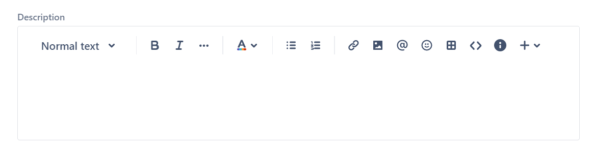
So if you saw this text box, where do you think you would click on it to start typing? Would it be inside the outlined area of the text box? Maybe the white space below the toolbar. Both are sensible guesses, but before you give me your answer, step back and think about the question. Remember your past experience with text boxes. Your instinct is that you can click anywhere inside the boundaries and start typing. That’s a good example of Fitt’s Law: “The time to acquire a target is a function of the distance to and size of the target.” Or in other terms, a bigger target is easier to hit. I’m already ignoring several problems in this box, like how there’s no clear separators between the toolbar and the editable text area, or the fact that the buttons aren’t even buttons. For the sake of this post we’ll grant these now common-day “cleanliness” design touches, even though I loathe them. But that’s a rant for another day, so back to the subject at hand. Let’s get back to the original question: where do you click to start typing?
If you answered “anywhere in the text box,” congratulations: you’re wrong. It’s not your fault; you’ve been conditioned to click on the box and start typing since you started using a computer. After all, text boxes have been around since the dawn of the GUI, and they’ve generally worked the same way for decades. It’s a fair and reasonable assumption to make. But that assumption is a trap when it comes to Jira, because you have to click in a very specific region of the text box to start typing. There’s no hint where that region is, other than when your cursor transforms into the I-bar. Take a look at this GIF.

Notice where the cursor transforms from the normal pointer to the I-bar. You can only enter text when the cursor enters this invisible zone that takes up a fraction of the text box! There’s no hint or clue for where this zone is—you have to carefully watch the cursor to know where to type. What looks like a big, appealing target is really just a tiny, hard to click strip.

Earlier I called that area outside the magic zone “dead space.” It’s dead because it does nothing inside the box. That doesn’t mean it lacks purpose—a little bit of white space to separate your text from the boundaries makes it easier to read. From a visual design standpoint, that’s a good thing. But most user experience designers would tell the programmers to make the white space a clickable area! Atlassian’s lack of care inadvertently tricked the user and made their life just a little harder.
Compare this to another product most of us have to endure: Slack. There’s a lot of criticisms I can lob at Slack, but at least they managed to make a functional message box. Compare Slack’s behavior when you click in the message box’s white space.

Clicking anywhere in the text box that isn’t a button makes it ready for text input. There’s a few things I could complain about here—namely, buttons should look like buttons, and I’m not really a fan of the toolbar sandwich. But what makes the toolbar sandwich tolerable is that clicking any place that isn’t a button puts the focus on text entry. The penalty for missing or being a little sloppy isn’t harsh. As soon as your cursor goes over the box, it changes to the I-bar, making it immediately obvious that you can type after clicking. It’s a nice, big target that’s hard to miss. It’s a good example of obeying Fitt’s Law. It’s rare that I tell some other app to be more like Slack, but in this case Jira could be a lot more like Slack.
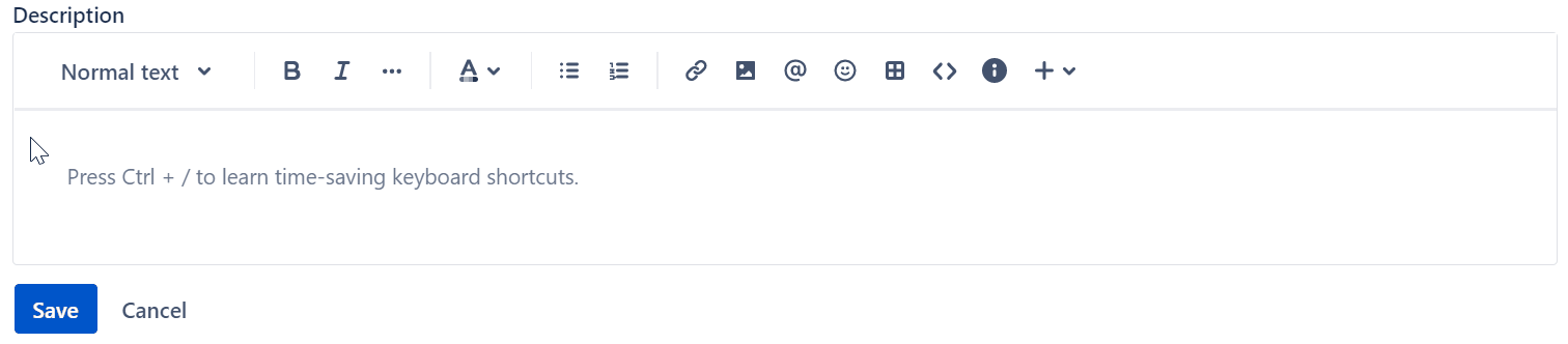
Here’s the real kicker, though: Atlassian manages to do this correctly in other parts of Jira! For example, hot zones for comment text fields behave properly. If you create a ticket that has no text in its Description, then edit the ticket, you can click anywhere in the description text box to activate the cursor. There’s even a nice little horizontal line separating the toolbar area from the text box itself!
It’s these kinds of inconsistencies that really grind users’ gears. A user expects that their applications will work consistently no matter what mode they’re in. Larry Tesler had a NOMODES license plate for a reason. Our job as user experience designers is to eliminate friction and make our users’ lives easier. They shouldn’t have to think about where to click in a text box to start typing. Atlassian, fix your freakin’ text boxes.