The Apple IIe - Computers Of Significant History, Part 2

Here in Userlandia, an Apple a day keeps the Number Muncher at bay.

Welcome back to Computers of Significant History, where I chronicle the computers crucial to my life, and maybe to yours too. If you’re like me and spent any time in a US public school during the eighties or nineties, you’ve likely used a variant of the Apple II. As a consequence, the rituals of grade school computer time are forever tied to Steve Wozniak’s engineering foibles. Just fling a floppy into a Disk II drive, lock the latch, punch the power switch... and then sit back and enjoy the soothing beautiful music of that drive loudly and repeatedly slamming the read head into its bump stops. Sounds like bagpipes being repeatedly run over, doesn't it? If you're the right age, that jaw-clenching, teeth-grinding racket will make you remember afternoons spent playing Oregon Trail. ImageWriter printers roared their little hearts out, with their snare drum printheads pounding essays compiled in Bank Street Writer onto tractor feed paper, alongside class schedules made in The Print Shop. Kids would play Where in the World is Carmen Sandiego at recess, and race home after school to watch Lynne Thigpen and Greg Lee guide kid gumshoes in the tie-in TV show. Well, maybe that one was just me. Point is, these grade school routines were made possible thanks to the Apple II, or more specifically, the Apple IIe

The Apple IIe.

Unlike the BBC Micro, which was engineered for schools from the start, the Apple II was just an ordinary computer thrust into the role of America’s electronic educator. Popular culture describes Apple’s early days as a meteoric rise to stardom, with the Apple II conquering  challengers left and right, but reality is never that clean. 1977 saw the debut of not one, not two, but three revolutionary personal computers: the Apple II, the Commodore PET, and the Tandy Radio Shack 80—better known as the TRS-80. Manufacturers were hawking computers to everyone they could find, with varying degrees of success. IBM entered the fray in 1981 with the IBM PC—a worthy competitor. By 1982, the home computer market was booming. Companies like Texas Instruments, Sinclair, and Atari were wrestling Commodore and Radio Shack for the affordable computer championship belt. Meanwhile, Apple was still flogging the Apple II Plus, a mildly upgraded model introduced three years prior in 1979.

Picture it. It's the fall of 1982, and you're a prospective computer buyer. As you flip through the pages of BYTE magazine, you happen upon an ad spread. On the left page is the brand new Commodore 64 at $595, and on the right page is a three year old Apple II Plus at $1530. Both include a BASIC interpreter in ROM and a CPU from the 6502 family. The Apple II Plus had NTSC artifact color graphics, simple beeps, and 48K of RAM. True, it had seven slots, which you could populate with all kinds of add-ons. But, of course, that cost extra. Meanwhile, the Commodore had better color graphics with sprites, a real music synthesizer chip, and 64K of RAM. Oh, and the Commodore was almost a third of the price. Granted, that price didn’t include a monitor, disk drive, or printer, but both companies had those peripherals on offer. Apple sold 279,000 II Pluses through all of 1982, while Commodore sold 360,000 C64s in half that time. In public, Apple downplayed the low-end market, but buyers and the press didn’t ignore these new options. What was Apple doing from 1979 until they finally released the IIe in 1983? Why did it take so long to make a newer, better Apple II?

Part of it is that for a long time a new Apple II was the last thing Apple wanted to make. There was a growing concern inside Apple that the II couldn’t stay competitive with up-and-coming challengers. I wouldn’t call their fears irrational—microcomputers of the seventies were constantly being obsoleted by newer, better, and (of course) incompatible machines. Apple was riding their own hype train, high on their reputation as innovators. They weren’t content with doing the same thing but better, so they set out to build a new clean-sheet machine to surpass the Apple II. To understand the heroic rise of the IIe, we must know the tragic fall of the Apple III.

The Apple III.

When Apple started development of the Apple III in late 1978, IBM had yet to enter the personal computer market. Big Blue was late to the party and wouldn't start on their PC until 1980. Apple had a head start and they wanted to strike at IBM’s core market by building a business machine of their own. After releasing the Apple II Plus in 1979, other Apple II improvement projects were cancelled and their resources got diverted to the Apple III. A fleet of engineers were hired to work on the new computer so Apple wouldn’t have to rely solely on Steve Wozniak. Other parts of Apple had grown as well. Now they had executives and a marketing department, whose requirements for the Apple III were mutually exclusive. 

It had to be fast and powerful—but cooling fans make noise, so leave those out! It had to be compatible with the Apple II, but not too compatible—no eighty columns or bank-switching memory in compatibility mode! It needed to comply with incoming FCC regulations on radio interference—but there was no time to wait for those rules to be finalized. Oh, and while you’re at it... ship it in one year.

Given these contradictory requirements and aggressive deadlines, it's no surprise that the Apple III failed. If this was a story, and I told you that they named the operating system “SOS," you'd think that was too on the nose. But despite the team of highly talented engineers, the dump truck full of money poured on the project, and what they called the Sophisticated Operating System, the Apple III hardware was rotten to the core. Announced in May 1980, it didn’t actually ship until November due to numerous production problems. Hardware flaws and software delays plagued the Apple III for years, costing Apple an incredible amount of money and goodwill. One such flaw was the unit's propensity to crash when its chips would work themselves out of their sockets. Apple’s official solution was, and I swear I'm not making this up, “pick up the 26-pound computer and drop it on your desk.” Between frequent crashes, defective clock chips, and plain old system failures, Apple eventually had to pause sales and recall every single Apple III for repairs. An updated version with fewer bugs and no real-time clock went on sale in fall 1981, but it was too late—the Apple III never recovered from its terrible first impression.

Apple III aside, 1980 wasn’t all worms and bruises for Apple. They sold a combined 78,000 Apple II and II Plus computers in 1980—more than double the previous year. Twenty five percent of these sales came from new customers who wanted to make spreadsheets in VisiCalc. Apple’s coffers were flush with cash, which financed both lavish executive lifestyles and massive R&D projects. But Apple could make even more money if the Apple II was cheaper and easier to build. After all, Apple had just had an IPO in 1980 with a valuation of 1.8 billion dollars, and shareholder dividends have to come from somewhere. With the Apple III theoretically serving the high end, It was time to revisit those shelved plans to integrate Apple II components, reduce the chip count, and increase those sweet, sweet margins.

What we know as the IIe started development under the code name Diana in 1980. Diana’s origins actually trace back to 1978, when Steve Wozniak worked with Walt Broedner of Synertek to consolidate some of the Apple II’s discrete chips into large scale integrated circuits. These projects, named Alice and Annie, were cancelled when Apple diverted funds and manpower to the Apple III. Given his experience with those canned projects, Apple hired Broedner to pick up where he left off with Woz. Diana soon gave way to a new project name: LCA, for "Low Cost Apple", which you might think meant "lower cost to buy an Apple.” In the words of Edna Krabapple, HAH! They were lower cost to produce. Savings were passed on to shareholders, not to customers. Because people were already getting the wrong idea, Apple tried a third code name: Super II. Whatever you called it, the project was going to be a major overhaul of the Apple II architecture. Broedner’s work on what would become the IIe was remarkable—the Super II team cut the component count down from 109 to 31 while simultaneously improving performance. All this was achieved with near-100% compatibility.

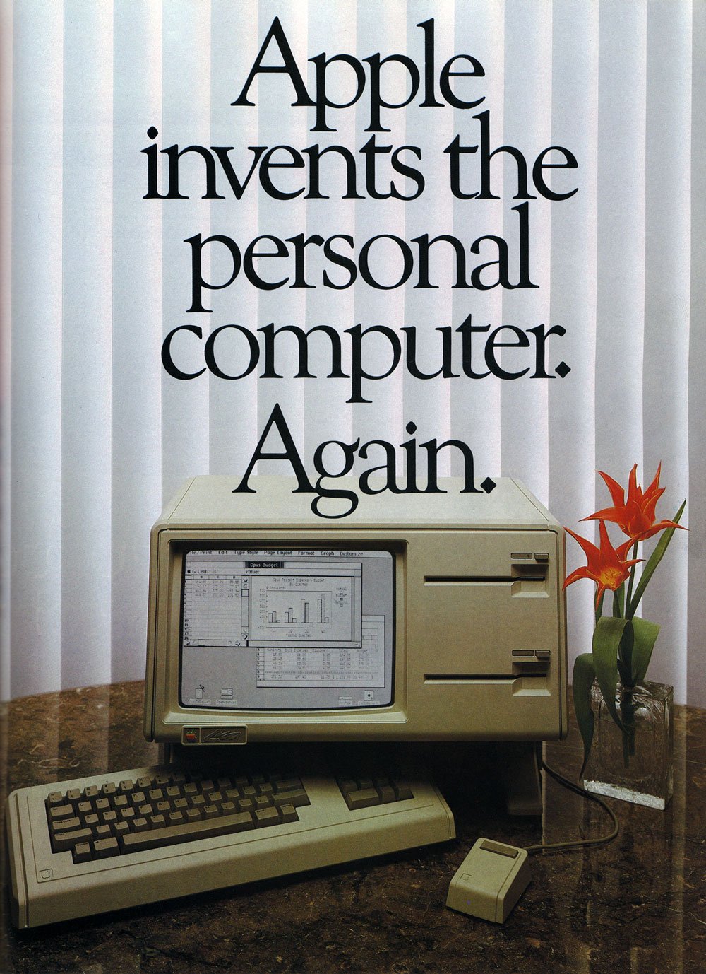
Ad Spread for the IIe

In addition to cutting costs and consolidating components, Super II would bring several upgrades to the Apple II platform. Remember, Apple had been selling the Apple II Plus for four years before introducing the IIe. What made an Apple II Plus a “Plus” was the inclusion of 48 kilobytes of RAM and an AppleSoft BASIC ROM, along with an autostart function for booting from a floppy. Otherwise it was largely the same computer—so much so that owners of an original Apple II could just buy those add-ons and their machine would be functionally identical for a fraction of the price. Not so with the IIe, which added more features and capabilities to contend with the current crop of computer competitors. 64K of RAM came standard, along with support for eighty column monochrome displays. If you wanted the special double hi-res color graphics mode and an extra 64K of memory, the optional Extended 80 Column Text card was for you. Or you could use third-party RAM expanders and video cards—Apple didn’t break compatibility with them. Users with heavy investments in peripherals could buy a IIe knowing their add-ons would still work.

Other longtime quirks and limitations were addressed by the IIe. The most visible was a redesigned keyboard with support for the complete ASCII character set—because, like a lot of terminals back then, the Apple II only supported capital letters. If you wanted lowercase, you had to install special ROMs and mess around with toggle switches. Apple also addressed another keyboard weakness: accidental restarts. On the original Apple II keyboard, there was a reset key, positioned right above the return key. So if your aim was a quarter inch off when you wanted a new line of text, you could lose everything you'd been working on. Today that might seem like a ridiculous design decision, but remember, this was decades ago. All these things were being done for the first time. Woz was an excellent typist and didn't make mistakes like that, and it might not have occurred to him that he was an outlier and that there'd be consequences for regular people. Kludges like stiffer springs or switch mods mitigated the issue somewhat, but most users were still one keystroke away from disaster. 

The IIe’s keyboard separated the reset key from the rest of the board and a restart now required a three finger salute of the control, reset, and open-Apple keys. Accidental restarts were now a thing of the past, unless your cat decided to nap on the keyboard. Next, a joystick port was added to the back panel, so that you didn't have to open the top of the case and plug joysticks directly into the logic board. A dedicated number pad port was added to the logic board as well. Speaking of the back panel, a new series of cut-outs with pop-off covers enabled clean and easy mounting of expansion ports. For new users looking to buy an Apple in 1983, it was a much better deal than the aging II Plus, and existing owners could trade in their old logic boards and get the new ones at a lower price.

A Platinum IIe showing off the slots and back panel ports.

Apple might have taken their time to truly revamp the II, but 1983 was a good year for it. Computers weren’t just playthings for nerds anymore—regular people could actually use them, thanks to a growing commercial software market. Bushels of Apple computers were sold just to run VisiCalc, but there were even more untapped markets than accountants and bookkeepers. By 1983, both the mainstream and the industry press had figured out how to explain the benefits of a microcomputer in your home and/or business. Word processors, databases, and—of course—games were all valid reasons to buy a computer, and sales exploded as a result.

Consider Apple’s sales numbers before and after the IIe’s introduction. Ars Technica writer Jeremy Reimer researched estimated sales figures for various microcomputers, and we’ll use them for the sake of argument. For all of Apple’s hype, they sold just 43,000 Apple II and II Plus computers from 1977 to 1979. Radio Shack, meanwhile, sold 450,000 TRS-80s during the same three years. Commodore sold 79,000 PETs. Atari waltzed into the market and sold 100,000 home computers in 1979. One difference is that the Apple II series had a higher average selling price than most of these computers—a TRS-80 kit with monitor and tape deck cost $599 in 1977, while an Apple II without monitor or drives cost $1239.

But this was a time of rapid advancement and innovation, and a hot start was no guarantee of long-term success. The TRS-80 family’s strong start gradually faded away despite newer models with better capabilities, and Tandy shifted to IBM compatibles in 1985. Likewise with Commodore and the PET, which Commodore largely abandoned after the C64 took off like a rocket. IBM sold 1.3 million PCs in 1983 and would only sell more from there. Apple sold 400,000 IIes in 1983, and a million more in 1984, all with excellent accessory attachment rates and monstrous margins. Shipping that many computers with Woz’s original board design would’ve been impossible because Apple’s quality control processes didn’t scale with manufacturing. Between the IIe’s reduced board complexity and new self-test routines, Apple could both build and test computers faster than ever before. With something like a 60% margin on the IIe’s wholesale dealer price, it was wildly profitable—and that was before upgrades and add-ons. With margins like these, Apple could afford to negotiate with schools, and sometimes even give away computers to seal deals.

Not mentioned: Help provided from Xerox.

The IIe wasn’t the only computer Apple introduced on January 19, 1983. Apple management—especially Steve Jobs—were all-consumed with dethroning IBM as the premier choice for business computing, and the Apple II just wasn’t part of those plans. A complex and powerful machine, the Lisa was the talk of the tech press thanks to its graphical interface and forward-thinking document oriented software suite. It was supposed to change the world of computers and singlehandedly make all text-based workstations obsolete. Yet even Apple had to know that, at ten thousand dollars each—in 1983 dollars, no less—the Lisa would be extraordinarily difficult to sell, even though its advanced graphical interface was unlike anything on the market. Another drawback was Apple’s new FileWare floppy disk drives. These drives, codenamed Twiggy—yes, after the British supermodel—were notoriously unreliable. Apple sold around ten thousand Lisas during its lifetime. Meanwhile, the IIe kept on keepin’ on, much to the chagrin of executives who wanted to change the world. Apple finally cracked its next generation computer conundrum with the Macintosh, and they were also hard at work building the Apple IIc and designing the IIGS. Soon the IIe would retire with the original Apple II and the II Plus. Or would it?

An Apple for the Teacher

My memories of the Apple IIe are bound together with its role as an educator. A computer was in every classroom at Highland Elementary School, and as far as my classmates and I were concerned a computer was as fundamental to learning as a textbook or a chalkboard. Like millions of other kids who were tutored by Apples, we had no clue about who designed these machines, or the cutthroat markets that forged them. A school computer was an Apple, just like a school bus was yellow, because that was the way things were. It never crossed our minds to ask why we had Apples at school instead of Commodores or IBM PCs.

By the time Apple launched the IIe, their computers had already found a foothold in American schools. This was largely thanks to the efforts of the Minnesota Educational Computer Consortium, or MECC. Minnesota might not be the first place you think of when it comes to computer leadership, but by the late seventies MECC had brought mainframe and minicomputer access to schools across the Gopher state. Like Silicon Valley and Route 128, Minnesota had a bustling technology and computer center. Control Data Corporation was headquartered in the suburbs of Minneapolis. 3M was a major supplier of materials and media for computers, and the University of Minnesota was full of programmers. When the 1977 trio of microcomputers that all ran BASIC came to their attention, MECC saw an opportunity. MECC’s library of software—called courseware—was written in BASIC for mainframe and minicomputers. Some Minnesota schools already had terminals to access said mainframes, but mainframes were expensive—very expensive. Mainframes also required a staff for maintenance, and they took up a lot of space. Microcomputers solved all these problems—individual teachers could manage them, and they were small and cheap enough to place in every classroom, or even a lab. Since all the new microcomputers used BASIC, it would be straightforward to port MECC’s courseware to a micro—the question, of course, was which one. 

Outfitting the entire state school system with microcomputers wasn’t as easy as picking a company and giving them a million dollar order. Rules of acquisition aren’t just for Ferengi—laws dictate how you can spend public money. The first step was acquiring a few computers to experiment with porting their software. MECC was already excited about the new Apple II, specifically for its color video capabilities. They asked if Apple would be willing to cut them a special price for five computers, and Apple obliged. When it came time for the formal bidding process, MECC opened up bids to all comers, but some bidders were better than others. Dale LaFrenz, former president of MECC, recalled as much in a 1995 oral history with the Charles Babbage Institute.

Yes, we got bids from Apple. We also got bids from other companies. Some of the companies, particularly Radio Shack, were not enamored with this process and thought it was kind of hokey—the process being the bid process and the state requirements—and so they weren’t real particular about how they responded. We told Radio Shack, “You know, if you don’t respond in the right way, we can’t accept your bid,” and they weren’t willing to change. The Atari people and Commodore people were late and there were very stringent rules—if you aren’t in by noon on the appointed day, you are [out]. Well, the fact is that the sentiment of the evaluation committee representing Minnesota education was toward the TRS-80.

How different would educational computing have been in America if Radio Shack hadn’t blown off MECC? The bid was theirs for the taking, but for whatever reason, they let it slide. Apple jumped through the hoops, won the bid, and sold 500 computers to MECC. Those 500 computers were crucial to expanding access to Minnesota students, but they were also the base upon which MECC built a software empire. Instead of spending years figuring out what to do with their new computers, MECC ported that existing library of mainframe software to the new Apple II. Word quickly spread and other states and districts knocked on MECC’s door. This ready library of software made the Apple II an easy choice for schools, and launched a virtuous cycle of educational Apple sales. People bought Apples because they could buy MECC courseware, and other developers wrote educational software because the market was Apple. MECC was so successful that by 1983 they transitioned to a private corporation owned by the state of Minnesota, and the Gopher State profited handsomely.

MECC’s early software would be updated and revised and ported to other platforms over the course of the early eighties, but the Apple II would always be its bread and butter. The IIe especially was a crucial ingredient to MECC’s ongoing success as a software powerhouse. MECC’s most popular and memorable titles were either introduced on the IIe or had their definitive versions released for it. Updated classics like the graphical versions of Oregon Trail and Odell Lake required 64K of RAM, which meant a IIe in almost all circumstances. Newly designed games like Number Munchers, Word Munchers, and Spellevator were designed from the ground up for 64K machines. These are the games most people in my age group would have played on their classroom IIe machines in the late eighties on to the early nineties. Though MECC diversified into other platforms, they were still publishing Apple IIe compatible titles well into the nineties.

Apple also updated the IIe during its lifetime, first with the Enhanced IIe in 1985 and then the Platinum IIe in 1987. Internally an Enhanced IIe featured an updated 65C02 processor and new ROMs that brought bug fixes and character updates from the IIc back to the IIe. One such “update” was the MouseText character set, which was used to construct a Mac-ish display using characters instead of bitmaps. Add the mildly updated internals with a mildly refreshed keyboard and you’ve got some mild enhancements. The Platinum IIe was so named due to its new exterior case color, which was a shade of gray that Apple's designers had named "platinum" the year before. The optional Extended 80 Column card was now standard equipment, which brought the total memory up to 128K. The keyboard layout was updated to match the IIGS, which included a standard numeric keypad. Improvements in density meant that eight 8K RAM chips on the logic board were replaced with two 32K RAM chips—Moore’s law in action!—and both ROMs were consolidated to a single chip.

In 1990, the Apple II seemed like a computer Apple just couldn’t kill. They sold over 300,000 across three model lines because schools kept buying the IIe and, to a lesser extent, the IIGS. Schools didn’t want to lose their investment in software, and when a IIe broke, it was easier and cheaper to just replace it with another one instead of a Macintosh or a IIGS. A Platinum IIe retailed for $800, and schools got even better pricing than that. Though the more powerful and advanced IIGS was still a thing, Apple much preferred it when you bought a Macintosh, thank you very much. The new for 1990 Macintosh LC was thought to be the Apple II killer. But even when Apple offered the Macintosh LC to schools at a 50% discount, $1700 was still too expensive for most districts. So they kept on buying the Apple II even if they procured a Mac or two with a CD-ROM drive that might get carted around or parked in the school library.

Still, 1991 and 1992 saw declining sales, and Apple officially discontinued the IIe in November 1993. It outlived its more powerful sibling, the IIGS, by a whole year. Though you could buy a machine labeled IIe for nearly eleven years, it’s hard for me to say that Apple sold the “same” machine for that time. It's the Microchip of Theseus question—does a ROM update, a memory increase, and a new case color really make for a “new” model? Still, the heart of the computer—the 6502 processor, the slots, the logic chips designed by Broedner and his team—was still the same.

Mr. Jobs Goes to Washington

Content warning: this next segment discusses federal tax law. Sensitive readers might want to put on some music for a few minutes.

In today’s world of budget Chromebooks, the idea of the premium-focused Apple dominating the educational market seems quaint. Computers aren’t just one per classroom anymore. Schools are networked now, with devices relying more and more on web services provided by companies like Google and Microsoft. That’s the difference between personal computing and information technology—most teachers could manage a single computer, but you can’t expect them to manage a fleet of cloud-connected services. MECC might have gotten Apple’s foot in the door, but Apple secured their dominant position in schools the same way Microsoft and Google did: good old-fashioned American politicking.

Not every state had an organization like MECC that could advocate for computers in the classroom, so Apple altruistically advocated for them—because we all know how altruistic corporations are. Steve and Steve—Jobs and Wozniak—were true believers. They'd both been using computers since they were young, and wanted to give kids across America the chance to share in the experience. But Steve Jobs also had dollar signs on his eyeballs. And that's why Apple was so eager to work with MECC to supply those 500 computers to Minnesota in 1978, even though that was almost 7% of their sales that year.

Because Kids Can’t Wait to help make Steve Jobs more money.

But getting a computer in every classroom was easier said than done. Even though the microcomputers of the late seventies cost a lot less than their minicomputer brothers, that still didn't mean they were cheap. And obviously, Apple couldn't afford to just give free computers to every single American school. Compounding the cost of computer components were the complexities of complying with the conglomeration of codes that comprise America’s state-based education system. The solution was obvious: federal legislation. If Apple could get a law passed in time for the launch of the IIe, they could capture the educational market with the help of good old Uncle Sam.

As part of the Smithsonian's History of Computing project, Steve Jobs told the story of how he and then-California congressman Pete Stark worked together to draft a bill granting a corporate tax deduction to companies that donated computers to public schools. According to Jobs, there were already tax breaks for companies donating scientific equipment to colleges and universities. But those breaks didn’t apply to primary and secondary schools, which limited the financial benefits for donating computers. Under the proposed law, Apple would donate 100,000 computers, which would cost Apple about $10,000,000 after the tax break. Without the tax break, Jobs figured the plan would have cost Apple around $100,000,000. The bill’s details and failures were more complex than Jobs’ characterization, and I actually dug through Senate Finance Committee and House Ways and Means Committee records to figure out how it worked.

California Congressman Pete Stark.

Stark designed House Resolution 5573 to allow a company donating computer equipment to deduct its cost to manufacture plus 50% of the difference between the cost and the retail price. The total deduction value per computer would be capped at twice the cost. Let’s say you have a computer that retails for $1300, and it costs $500 to make. Under these rules, Apple would receive a $900 deduction—a pretty significant valuation. Multiply that by 100,000 computers, and you’re talking real money. The bill also increased the total amount of money the company could deduct from their taxable income using this method from 10 to 30 percent. Remember, these are deductions, not credits, so it’s not a straight gift. But based on the average corporate tax rate of 42 percent in 1982, the net effect would have been about $90,000,000 over the course of five years.

Jobs personally met with senators and congresspeople to convince them of the need to get more computers in classrooms, forgoing professional lobbyists. Stark’s bill, known as the Computer Equipment Contribution Act of 1982, passed the House with an overwhelming majority of 323 yea to 62 nay, but it died in the senate. Jobs’ recollection of some of the facts was a bit off—he claimed Bob Dole as “Speaker of the House” killed the bill during “Jimmy Carter’s lame duck session.” Bob Dole was a lot of things—professional endorser of Viagra and Pepsi, guest-star on the NBC sitcom Suddenly Susan, space mutant—but he was never speaker of the House. And the 97th Congress’ lame duck session was called by Ronald Reagan in 1982, two years after Carter left office. Dole was chairman of the Senate Finance Committee in 1982, and their report requested a few changes. First, it broadened the definition of educational institutions to include libraries and museums, and it also increased the time period to claim the deduction from one year to three years. But the biggest change of all was reducing the maximum amount of the deduction from 200% of the cost to 150%, and kept the 10% taxable income cap. This change could have reduced Apple’s tax break by 75%. To make matters worse, the other changes could potentially have benefited Apple's competitors.

The US Senate in 1982 was under Republican control for the first time in nearly thirty years, and it was embroiled in all sorts of filibusters and procedural delays. This was especially true in the lame duck months after midterm congressional elections. While Bob Dole’s finance committee was responsible for the changes to the bill, it did recommend that the Senate put the bill to the vote. It’s more likely that majority leader Howard Baker and majority whip Ted Stevens declined to put it on the floor or honor the request to waive certain debate rules. Without some experienced lobbyists on hand to push for their bill, Jobs’ and Wozniak’s dreams of donating thousands of computers went up in smoke. Another angle to this story is the Minor Tax Bills article from the April 1983 edition of Congressional Quarterly Almanac, which is a contemporary take on the events. It turns out Apple itself stopped supporting the bill after the Senate changes, because that would have made the donation plan too costly. But this paragraph got a sensible chuckle thanks to forty years of hindsight.

While the bill was promoted as a boost for technological education, some members objected that it was little more than a tax subsidy for Apple. They pointed out that once the donated computer was in place, a school would be constrained to buy more equipment from Apple, rather than another computer company, if it wanted to expand the use of the machine.

Oh, if only they knew. Even though Apple failed to secure a federal subsidy, they did get a consolation prize at the state level. Around the same time the federal bill fell apart, California Governor Jerry Brown signed a law introduced by California assemblyman Charles Imbrecht that gave a company donating a computer to schools a 25% tax credit against its retail value. In January 1983, Apple announced its Kids Can’t Wait program along with the Apple IIe. Every public school in California with more than 100 students was eligible for a bundle of an Apple IIe computer, a disk drive, a monitor, and a copy of the Apple Logo programming package valued at $2364. Given that the tax credit is based on the retail price, if every one of California’s 9,250 public schools took Apple up on the offer, the total retail value of all those packages would be around $21,867,000. That results in a maximum possible credit of $5,466,750! Apple estimated their cost of the program at around $5,200,000, which included the cost of the hardware, software, dealer training, and dealer incentives. I haven’t been able to find a record of exactly how many schools took delivery, but Steve Jobs claimed every school took him up on the offer. Even if only eighty percent of California schools took Apple’s deal, that would have been over $4.3 million dollars worth of credits on a program estimated to cost $5.2 million. It had to be the cheapest marketshare Apple ever bought.

Apple and congressman Stark did try their national bill again in 1983, but this time it didn’t even make it past the House committee. Sometimes governments don’t move as fast as Silicon Valley would like, but in time other states and the federal government would end up with their own tax breaks and incentives to bring more computers into the classroom. And thanks to the lessons learned from these attempts, Apple’s later teams that sold the Macintosh to colleges were more adept at dealing with governments. By the mid-eighties, Apple was synonymous with education due to the efforts of local educators, governments, developers, and enthusiastic users. They even advertised on TV with music videos set to Teach Your Children by Crosby, Stills, Nash, and Young. It seemed like there was no stopping Apple as they sold millions of computers to schools across the globe.

The Head of the Class

The Apple IIe’s long and prolific career as an educator is remarkable for technology with a reputation for a short shelf life. It’s theoretically possible that a first grader who used an Apple IIe in 1983 could use a IIe in 1993 as a high school sophomore. It’d be unlikely, because the Apple II platform was phased out of high schools before middle or elementary schools, but if you told me you were that kid, I’d believe you. The IIe weathered stronger, tougher competition because the hardware was stout and the software library vast. Still, even a high quality textbook goes out of date eventually.

My hometown of Pittsfield, Massachusetts and its public schools hung on to the Apple II well into the nineties, with the venerable system finally being replaced in the 1995-96 school year. Three of the four walls of my middle school’s computer lab were lined with all-in-one Macs from the LC 500 series, and one lonely row of Apple IIe computers remained. Kids who drew the short straws for that week’s computer lab session were stuck in the 8-bit penalty box, forced to endure the same titles they had in grade school while luckier classmates got the latest in CD-ROMs. After winter break, the computer lab rang in 1996 by supplanting the last remaining 8-bit machines with shiny new Macintosh LC580s. Some places held on even longer—I’ve read reports of grade school classrooms still using the Apple II at the turn of the millennium.

Reid Middle School may have retired their remaining Apple II systems by the fall of 1996, but some vestiges of the old computers lingered on. One day when fixing my seventh grade math teacher’s Macintosh LC II, I noticed something unusual: an Apple II 5 1/4 inch disk drive was attached to it! I knew that Macs didn’t use those old floppies, so I opened up the case to see what, exactly, the drive was connected to. I pulled out the card attached to the machine’s processor direct slot and saw the words “Apple IIe Card” silkscreened on the board. This little piece of hardware was Apple’s way of convincing conservative education customers that yes, a Mac could fit right in. Using tech derived from the IIGS, Apple managed to shrink an entire Apple IIe to the size of a postcard. Moore's Law strikes again. A host Macintosh could run Apple II programs from floppies or a hard disk, and a special Y-cable allowed you to attach external drives and joysticks. It wasn't quite emulation, or virtualization either—if you’re familiar with Amiga bridge boards or Apple’s DOS compatibility cards, it was kind of like that. For the low price of $199, you could make that shiny new Macintosh LC compatible with your vast array of Apple II programs and ease the pain of putting an old friend out to pasture.

The Apple IIe PDS card.

The IIe card was introduced in March 1991, and sales of actual Apple IIe computers plunged. According to Apple, half of the LCs sold in schools came equipped with a IIe card, but actual sales numbers for these cards aren’t really known. The IIe card combined with the ongoing cost reductions in Macs meant the Apple II’s days were numbered. In 1991 Apple sold just 166,000 Apple IIe and IIGS computers—almost half of the previous year—and 1992 declined further to 122,000. Only 30,000 IIes were sold in its final year of 1993. Apple sold the IIe Card until May 1995, and you might think that was the last anyone would hear about the Apple II. Well, it turns out that yes, people still wanted to run Apple II software, and two engineers within Apple wrote a software IIGS emulator. This unofficial project, named Gus, was one of Apple’s few standalone emulators, and it could run both IIGS and regular Apple II software with no extra hardware required. Targeted towards schools, just like the IIe card, Gus kept the old Apple II platform shuffling on for those who made enough noise at Apple HQ.

Most product managers would kill to have something like the IIe—it was a smashing success no matter which metric you cite. Yet Apple always seemed to treat the machine with a quiet condescension, like a parent who favors one child over another. “Oh, yes, well, IIe certainly has done well for himself, but have you seen what Mac has done lately? He’s the talk of all of the computer shows!” The IIe sold a million units in 1984, but it wasn’t good enough for Mother Apple, who kept putting the Mac front and center. Even when the Mac suffered its sophomore slump in 1985 Apple seemed to resent that the boring old IIe sold almost another million units. Macintosh sales didn’t surpass the Apple II until 1988, and Apple didn’t sell a million Macs until 1989. Yes, yes, I know about transaction prices, but that’s not the point—without the Apple II to pay the rent, the Mac wouldn’t have been able to find itself.

I don’t want to judge the Apple II or its fans too harshly, because it’s a crucial piece of personal computing. But I also don’t think Apple was fundamentally wrong about the prospects of the Apple II—they just whiffed on the timeline. The core problem was the 6502 and later 65C816 architecture. Even though faster variants of the 65C816 used in the IIGS were available, the 6502-based architecture was a dead end. Maybe that would have been different if Apple had committed to the architecture with something like the Macintosh. But Western Design Center was a tiny design house operation which wasn’t on the same scale as Motorola, who not only designed their own chips, they fabricated them. Apple’s needs for things like protected memory, supervisors, floating point units, and so on would have meant a move away from 6502-based architectures eventually. A new CPU platform was coming whether Apple II users liked it or not.

The divide between the Apple II and Macintosh is endlessly fascinating to me. Could Apple have made the Apple II into something like the Macintosh? Maybe. The IIGS, after all, runs an operating system that mimics the Mac’s GUI. But what separates the two platforms is more of a philosophical divide than a technical one. The Apple II always felt like a computer for the present, while the Macintosh was a machine for the future. Wozniak designed the Apple II as a more reliable, practical version of his TV terminal dream. The Macintosh was a statement about how we would interact with computers for the next thirty years. Unlike the Xerox Star and the Lisa, an average person could buy a Macintosh without taking out a second mortgage. Other consumer-grade machines with graphical interfaces wouldn’t be out until 1985, and the Mac had the benefit of Steve Jobs’ Reality Distortion Field that let him get away with pretty much everything.

I don’t think Apple expected the IIe to live as long as it did. The IIGS was supposed to replace it—Apple even offered kits to upgrade the innards of a IIe to a IIGS! But the venerable computer just kept chugging along. Unlike the Commodore 64, which was just wearing out its welcome, the Apple IIe aged gracefully, like a kindly teacher who’s been around forever but never quite managed to make the jump to administration. By the 90s, Apple didn’t need the Apple II to survive, so they just quietly kept selling it until they could figure out a way to move everybody to Macintoshes without a boatload of bad press. Maybe it didn’t go as quickly as they would have liked, but they eventually got it done.

What accelerated the IIe's retirement, aside from just being old, was the proliferation of multimedia CD-ROMs and the World Wide Web. The Web was an educational tool even more powerful than a single personal computer, and unfortunately there weren't any web browsers for the IIGS, let alone the IIe. Computers were changing, and computer education was finally changing along with them. Now computer literacy wasn’t just about learning to program; it was learning about networking, linking, and collaboration. A school’s computer curriculum couldn’t afford to sit still, but even after all these years some things stay the same. Oregon Trail is still teaching kids about dysentery, just with newer graphics, nicer sound, and better historical accuracy. Carmen Sandiego is still trotting the globe, both on Netflix and in games.

The IIe was too personal for this new interconnected world, but that’s OK. It did its job and the people behind the first educational computing initiatives could retire knowing that they made a difference. Those classroom Apples taught a generation of children that computers weren’t mean and scary, but friendly and approachable instead. True, any other computer of the day could have risen to the challenge—look at our British friends across the pond with their beloved Beeb. But the IIe managed to be just enough machine at just the right time to bring high technology into America’s classrooms, and its true legacy is all the people it helped inspire to go on to bigger and better things.

Dropbox Drops the Ball


You never know when you’ll fall in love with a piece of software. One day you’re implementing your carefully crafted workflow when a friend or colleague DMs you a link. It’s for a hot new utility that all the tech tastemakers are talking about. Before you know it that utility’s solved a problem you never knew you had, and worked its way into your heart and your login items. The developer is responsive, the app is snappy, and you’re happy to toss in a few bucks to support a good product. But as time goes on, something changes. The developer grows distant, the app eats up all your RAM, and you wonder if it’s still worth the money—or your love.

That’s my story with Dropbox, the app that keeps all your stuff in sync. I still remember the day—well, my inbox remembers the day. It was June 2nd, 2010, when my coworker Stephen strolled into my cubicle and said “Hey, I started using this Dropbox thing, you should check it out.” Stephen has a habit of understatement, so from him that's high praise. Minutes later I registered an account, installed the app, and tossed some files into my newly minted Dropbox folder. It was love at first sync, because Dropbox did exactly what it said on the tin: seamlessly synchronize files and folders across computers with speed and security. A public folder and right-click sharing shortcuts made it easy to share images, files, and folders with anyone at any time. I could shuttle documents back and forth from work without relying on a crusty old FTP server. This utility was a direct hit to my heart.

How Dropbox Beat Apple at File Sync

Of course, remote file sync wasn’t a new concept to me—I’d used Apple’s iDisk for years, which was one of many precursors to Dropbox. Mac users could mount an iDisk on their desktop and copy files to Apple servers with just the classic drag and drop. Applications could open or save files to an iDisk like any other disk drive. Yet despite this easy-breezy user interface, the actual user experience of iDisk left a lot to be desired. Let’s say you have a one megabyte text file. Your Mac would re-upload the entire one meg file every time you saved it to an iDisk, even if you only changed a single character. Today, "ooh we had to upload a full meg of text every time" doesn't sound like any sort of problem, but remember: iDisk came out in 2000. A cable modem back then could upload at maybe 512 kilobits per second—and yes, that's kilobits, not kilobytes. So a one-character change meant at least a sixteen-second upload, during which your app would sit there, unresponsive. And this was considered super fast, at the time—not compared to the immediate access of your local hard disk, of course, but trust me, dial-up was much, much worse. The sensible thing was to just download the file from your iDisk to your hard drive, work on it, and then copy it back when you were done, and that was no different than FTP.

Needless to say, Apple felt they could do better. Steve Jobs himself announced major changes to iDisk in Mac OS 10.3 Panther at the 2003 WWDC Keynote.

“We’ve enhanced iDisk significantly for Panther. iDisk, as you know, is for our .Mac customers. The hundreds of thousands of people that signed up for .Mac. And iDisk has been a place where you can manually upload files to the .Mac server and manually download them. Well, that’s all changing in Panther, because in Panther we’re automatically syncing the files. And what that means is that stuff that’s in your iDisk will automatically sync with our servers on .Mac—in both directions—and it does it in the background. So what it really means is your iDisk becomes basically a local folder that syncs. You don’t put stuff in your iDisk to send it up to .Mac, you leave it in your iDisk. You can leave a document in your iDisk, open it up, modify it, close it, and the minute you close it, it will sync back up to .Mac in the background automatically.

So you can just leave stuff in your iDisk, and this is pretty cool. It’s a great way to back stuff up, but in addition to that it really shines when you have more than one computer. If I have three computers here, each with their own iDisk, I can leave a copy of the same document in the iDisk of each one, open up the document in one of those iDisks, change it and close it, and it’ll automatically sync back through .Mac to the other two. It’s really nice. In addition to this, it really works when you have untethered portables. You can be out in the field not connected to a network, change a document in your iDisk, the minute you’re connected whether you walk to an AirPort base station or hook back up to a terrestrial net, boom—that document and its change will automatically sync with .Mac.”

It’s hard not to hear the similarities between Steve’s pitch for the new iDisk and what Drew Houston and Arash Ferdowsi pitched for Dropbox. But even with offline sync, iDisk still had speed and reliability issues. And even after Apple finally ironed out iDisk’s wrinkles, it and iCloud Drive still trailed Dropbox in terms of features. Apple had a five-year head start. How could they lose to Dropbox at the "it just works" game?

Houston and Ferdowsi’s secret sauce was Dropbox’s differential sync engine. Remember that one meg text file from earlier? Every time you overwrite a file, Dropbox compares it against the previous version. If the difference is just one byte, then Dropbox uploads only that byte. It was the feather in the cap of Dropbox’s excellent file transfer performance. Its reliability and speed left iDisk in the iDust. Yet all that technowizardry would be worthless without an easy user experience. Dropbox’s deep integration into Windows Explorer and the Macintosh Finder meant it could integrate into almost any file management workflow. I knew at a glance when file transfers started and finished thanks to dynamic status icons overlaid on files and folders. Clumsy network mounts were unnecessary, because Dropbox was just a plain old folder. Best of all, it was a cross platform application that obeyed the rules and conventions of its hosts. I was so smitten with its ease of use and reliability that I moved a full gig of files from iDisk to Dropbox in less than a week.

Dropbox fulfilled iDisk’s original promise of synchronized web storage, and its public launch in September 2008 was a huge success. A free tier was available with two gigs of storage, but if you needed more space you could sign up for a fifty-gig Dropbox Plus plan at $9.99 per month. Today that same price gets you two terabytes of space. And Plus plans weren't just about storage space—paying users got more collaboration features, longer deleted file recovery times, and better version tracking. And yes, I realize that I'm starting to sound like an influencer who wants to tell you about this fantastic new product entirely out of pure unsullied altruism. Trust me, though—that’s not where this is going. Remember: first you fall in love, then they break your heart. Dropbox's core functionality was file syncing, and this was available to freeloader and subscriber alike.

Dropbox Giveth, and Dropbox Taketh Away

This isn’t an uncommon arrangement—business and professional users will pay for the space and version tracking features they need to do their jobs. But in March 2019, Dropbox dropped the number of devices linked to a basic free account from unlimited… to three. The only way to raise the device limit was upgrading to a Plus plan. Three devices is an incredibly restrictive limit, and basic tier users were caught off guard. My account alone had seven linked devices: iPhone, iPad, MacBook Pro, desktop PC, two work computers, and work phone. Dropbox’s intent with this change was clear—they wanted to shed unprofitable users. If a free user abandons Dropbox, that’s almost as helpful to their bottom line as that same user paying to upgrade.

Speaking of their bottom line, Dropbox Plus plan pricing actually went up to $11.99 per month soon after the device limit change. To keep a $9.99 per month price, you have to commit to a one year subscription. There’s also no options for a lower priced tier with less storage—it’s two terabytes, take it or leave it. In comparison, Apple and Google offer $9.99 per month with no yearly commitments for the same two terabytes. Both offer 200 gigs for $2.99 per month, and if that’s still too rich they offer even cheaper plans. Microsoft includes one terabyte of OneDrive storage when you subscribe to Office 365 for $6.99 a month, and if you’re already an Office user that sounds like a sensible deal. If you’re a basic user looking for a more permanent home, the competition’s carrots look a lot better than Dropbox’s stick.

Even paying users might reconsider their Dropbox subscriptions in the wake of behavior that had left user-friendly far behind, and was verging on user-hostile. Free and paying users alike grumbled when Dropbox discontinued the Public folder in 2017, even though I understand why they cut it. People were treating the Public folder as a webhost and filesharer, and that was more trouble than it was worth. But compared to the device limit, killing the public folder was a minor loss. Photo galleries suffered the same fate. Technically savvy users were annoyed and alarmed when they noticed Dropbox aggressively modifying Mac OS security permissions to grant itself levels of access beyond what was reasonably expected. And even if paying users didn't notice the device limits or the public folder or the photo album or the security misbehaviors... they definitely noticed the new Dropbox client introduced in June 2019.

Dropbox Desktop

This is what Dropbox thought people wanted. From their own blog.

A zippy utility was now a bloated Chromium Embedded Framework app. After all, what's a file sync utility without its very own Chromium instance? While the new client introduced many new features, these came at the cost of resources and performance. Dropbox wasn’t just annoying free users, it was annoying paying customers by guzzling hundreds of megabytes of RAM and gobbling up CPU cycles. With an obnoxious new user interface and, for several months, irritants like an icon that wouldn't let itself be removed from your Dock, the new client made a terrible first impression.

The Apple Silicon Compatibility Kerfluffle

The latest example of Dropbox irritating customers is their lateness in delivering a native client for Apple’s new processors. Apple launched the first ARM-based Macs in November 2020, and developers had dev kits for months before that. Rosetta emulation allows the Intel version of Dropbox to run on Apple Silicon Macs, but emulation inflicts a penalty on performance and battery life. With no public timelines or announcements, users grew restless as the months dragged on. When Dropbox did say something, their response rang hollow. After hundreds of posts in their forums requesting an ARM-native client, Dropbox support replied with “[Apple Silicon support] needs more votes”—definitely not a good look. Supporting an architecture isn't a feature, it's part of being a citizen of the platform! Customers shouldn't have to vote for that like it's "add support for trimming videos," it's part of keeping your product viable.

Niche market software usually takes forever to support new architectures on Mac OS or Windows, but Dropbox hasn't been niche since 2009. I expect better from them. I’ve worked for companies whose management let technical debt like architecture support accumulate until Apple or Microsoft forced our hands by breaking compatibility. But our userbase was barely a few thousand people, and our dev teams were tiny. Dropbox has over fifteen million paying users (not counting the freeloaders), a massive R&D budget, and an army of engineers to spend it. The expectations are a bit higher. After multiple Apple-focused news sites highlighted Dropbox’s blasé attitude towards updating their app, CEO Drew Houston said that they hoped to be able to support Apple Silicon in, quote, "H1 2022.” More on that later.

Compare Dropbox’s response to other major tech companies like Microsoft and Adobe. Microsoft released a universal version of Office in December 2020—just one month after Apple shipped the first M1 Macs. The holy trinity of Adobe Creative Suite—Photoshop, Illustrator, and InDesign—were all native by June 2021. Considering these apps aren’t one-button recompiles, that’s a remarkably fast turnaround. On the other hand, this isn’t the first rodeo for Microsoft and Adobe. Both companies lived through the PowerPC, Mac OS X, and Intel transitions. They know firsthand that botching a platform migration costs goodwill. And goodwill is hard to win back.

Dropbox is young enough that they haven’t lived through Apple’s previous architecture changes. Apple announced the start of the Intel transition in June 2005, and shipped Intel Macs to the public in January 2006. Dropbox's public launch wasn't until September 2008, and their app supported both Intel and PowerPC from the start.  Before the Apple Silicon announcement, the closest thing to a “transition” that Dropbox faced was Apple dropping support for 32-bit apps in Mac OS Catalina. Fortunately, Dropbox was prepared for such a move: they'd added 64-bit support to the client in 2015, two years before Apple hinted at the future demise of 32-bit apps at WWDC 2017. When Catalina arrived in 2019 and axed 32-bit apps for good, Dropbox had nothing to worry about. So why is it taking so long to get Dropbox fully ARMed and operational—pun intended?

One culprit is Dropbox’s GUI. Dropbox uses Chromium Embedded Framework to render its JavaScript UI code, and CEF wasn’t Apple Silicon native until July of 2021. My issues with desktop JavaScript frameworks are enough to fill an entire episode, but suffice it to say Dropbox isn’t alone on that front. Some Electron-based apps like Microsoft Teams have yet to ship ARM-native versions on the Mac despite the OpenJS Foundation releasing ARM-native Mac OS artifacts in Electron 11.0 in November 2020. I get it: dependencies are a bear—or, sometimes, a whole family of bears. But this is a case where some honest roadmapping with your customers earns a lot of goodwill. Microsoft announced Teams’ refactoring to Edge WebView2 back in June, so we know something is coming. Discord released an ARM-native version in their Canary nightly build branch back in November. Compare that to Spotify, which also uses CEF. They too fell into the trap of asking for votes for support on issues raised in their forum. Even so, Spotify managed to get a native beta client out in July and a release version in September. CEF isn’t Dropbox’s only dependency problem, but it’s certainly the most visible. I’m sure there’s plenty of Dropbox tech support people, QA engineers, and software devs who aren’t happy about the current state of affairs, and I’ve got plenty of sympathy for them. Because I’ve been in that situation, and it stinks. Paying customers shouldn’t have to complain to the press before they get an answer from the CEO about platform support.

The Cautionary Tale of Quark

Dropbox should heed the tale of Quark and its flagship app, QuarkXPress. Back in the nineties, most Mac users were printing and graphic arts professionals, and QuarkXPress was a crucial ingredient in their creative soup. Apple announced Mac OS X in January 2000, and the new OS would feature badly needed modernizations like preemptive multitasking and protected memory. But—and this might sound familiar—existing apps needed updates to run natively under the new OS. To expedite this, Apple created the Carbon framework for their long-time developers like Adobe, Microsoft, Macromedia... and Quark. Carbonizing was a faster, easier way to update apps for Mac OS X without a ground-up rewrite. Apple needed these apps for a successful OS transition, so it was in everyone’s interest for developers to release Carbon versions as fast as possible.

The Carbon version of XPress 5.0 previewed in Macworld.

How long did it take developers to release these updates? Remember, Mac OS 10.0 came out in March 2001, and it was very raw. Critical features like disc burning and DVD playback were missing in action. Even if some users could live without those features, it was just too slow to be usable day-to-day. It wasn't until the 10.1 update in September 2001 that you could try to use it on a daily basis, instead of poking at a few apps, saying "cool" and and then going back to OS 9 to get some work done. So Microsoft’s release of Office v.X for Mac in November 2001 was timed perfectly to catch the wave of new 10.1 users. Adobe wasn’t doing the whole Creative Suite thing at the time, so apps were released on their own schedules. Adobe’s Carbon conversions started with Illustrator 10 in October 2001, InDesign 2.0 in January 2002, and Photoshop 7.0 in March 2002. Macromedia was one of the first aboard the OS X train, releasing a Carbon version of Freehand in May 2001. Dreamweaver, Fireworks, and Flash all got Carbon versions with the MX Studio suite in the spring of 2002. Even smaller companies managed it—Extensis released a Carbon version of their font manager Suitcase in November 2001!

One year after the launch of Mac OS X, a working graphic designer could have an all OS X workflow, except for, you guessed it... QuarkXPress. How long would Quark make users wait? Well, in January 2002, they released QuarkXPress 5.0… except it wasn't a Carbon app, and it only ran in classic Mac OS. Journalists at the launch event asked about OS X, of course, and Quark PR flack Glen Turpin promised the Carbon version of QuarkXPress would be here Real Soon Now:

“The Carbon version of QuarkXPress 5 will be the next upgrade. There’s one thing we need to do before the Carbon version of QuarkXPress 5 is released: We need to launch QuarkXPress 5.0 in Europe.”

Would you believe that Quark, a company notorious for slow and unpredictable development, never shipped that promised Carbon update for version 5.0? Quark customers had to wait until QuarkXPress 6.0 in June 2003 for an OS X native version. Users who'd bought 5.0 had to upgrade again. And users who'd stayed with 4.x got charged double the price of a 5.0 upgrade—and yes, that's for upgrading to 6. Ask me how I know. Quark’s unfashionable lateness to the OS X party was another log in the chimney fire of failing customer relations. Despite Quark's many virtues, they charged out the ear for upgrades and tech support, and their leadership was openly hostile to customers. Quark CEO Fred Ebrahimi actually said that if you didn't like Quark's support for the Mac, you could, and I quote, “Switch to something else.” He thought that meant QuarkXPress for Windows. What it actually turned out to mean was Adobe InDesign.

The moral of the story is that customer dissatisfaction can reach a tipping point faster than CEOs expect. You can only take users for granted for so long before they decide to bail. Quark squandered fifteen years of market leadership and never recovered. Dropbox isn’t the only cloud storage solution out there, and they’d be wise to remember that. Google Drive and Microsoft OneDrive have native ARM clients in their beta channels. Box—not Dropbox, just plain old Box—released a native client in November 2021. Backblaze also has a native client, and NextCloud’s next release candidate is ARM native too.

When I was writing this episode, I had no idea when Dropbox would finally deliver an ARM-native client. The only clue I had was Houston’s tweet about the first half of 2022. At the time, I thought that “first half” could mean January. It could mean June. It could mean not even by June. Your guess would have been as good as mine. In my final draft I challenged Dropbox to release something in the first quarter of 2022. Imagine my surprise when just before I started my first time recording of this episode, Dropbox announced an upcoming beta version supporting Apple Silicon. This beta was already in the hands of a small group of testers, and was released to the public beta channel on January 13. I had to make a few… minor revisions to this after that. There’s still no exact date for a full final version—I’ll guess, oh, springtime. Even though that challenge wasn’t published yet, I still wrote it, and pretending I didn’t would be dishonest. I am a man of my word—you got me, Dropbox. Still, that doesn’t make up for poor communication and taking your users for granted. You still got work to do.

My Future with Dropbox and Comparing the Competition

Before my fellow nerds start heckling me, I know Mac users aren’t the majority of Dropbox’s customers. Windows users significantly outnumber Mac users, and their business won’t collapse if Mac users leave en masse. But like dropping client support for Linux, it’s another sign that Dropbox is starting to slip. You have to wonder what woes might befall Windows customers in due time. After all, Dropbox has yet to ship ARM binaries for Windows, which is a problem if you're using an ARM Windows device like a Microsoft Surface or virtualizing Windows on ARM. If you really want to access Dropbox on an ARM Windows device, you’re forced to use Dropbox’s tablet app, and that’s not quite right for a cursor and keyboard environment.

Amidst all this anguish about clients, I do want to emphasize that Dropbox’s core competency—hosting, storage, and syncing—is still very good. After all, the client might be the most visible part of a cloud-based storage system, but there's still… you know… the cloud-based part. People are willing to put up with a certain amount of foibles from a client as long as their content syncs and doesn't disappear, and Dropbox's sync and web services are still top of the line. Considering how long it took Apple to get iCloud Drive to a reasonable level of service, that competency has a lot of value. External APIs bring Dropbox integration to other applications,  and if you've still got a standalone 1Password vault, Dropbox will still be useful. All these factors make it hard to disentangle Dropbox from a workflow, and I get why people are waiting and won’t switch unless absolutely necessary.

So what’s the plan? For now, I’ve switched to Maestral, a third party Dropbox client. Maestral runs natively on Apple Silicon and consumes far less resources than the official client. While Maestral syncs files just fine, it does sacrifice some features like icon overlays in the Finder. I also signed up for Apple’s 50 gigabyte iCloud plan, and in my mixed Mac and Windows environment it works pretty well. And it’s only a fraction of the price of Dropbox. iCloud’s syncing performance is satisfactory, but it still lags when it comes to workflow. Take a simple action like copying a share link. Apple’s share sheet is fine as far as interfaces go, but I don’t need to set permissions all the time. Just give me a simple right click option to copy a public link to the file or folder, please. As for Google Drive, their client software has been an absolute disaster every time I’ve used it, regardless if it’s on Mac or Windows. Microsoft OneDrive seems reasonable so far, but I haven’t subjected it to any kind of strenuous tests. If push comes to shove, I’ll probably go all-in on iCloud.

This is complete overkill when most of the time you just need to copy a public link.

I miss what Dropbox was a decade ago, and I’m sad that it might end this way. It’s not over between us yet, but the passion’s dying. Without a serious turn-around, like a leaner native client and cheaper plans, I’ll have a hard time recommending them. It’s not my first software heartache, and I doubt it'll be my last, but I’d hoped Dropbox would be different. Naive of me, maybe, but Dropbox won’t shed any tears over me. Maybe the number of people I've signed up for their paid service balances out my basic account use over the years. Enthusiasm for Dropbox has all but dried up as they’ve prioritized IPOs and venture capital over their actual users. It’s that old Silicon Valley story—you either die the hero, or live long enough to become the venture capital villain. In the meantime, I’m sure there’ll be another cute utility that’ll catch my eye—and yes, that sounds flirtatious and silly. I began this episode with a “boy meets program” metaphor, but everybody knows that fairy tales are just that—fairy tales. Relationships take work, and that includes customer relationships. If one half isn't upholding their side, maybe it's time to move on.

It's not impossible that Dropbox could win me back... but it's more likely that I'll drop them.

Happy Twentieth Birthday, iMac G4


What is a computer? A miserable little pile of… yeah, yeah, I’ve done that bit before. These days it’s hard for a new personal computer to truly surprise you. When you scroll through a site like Newegg or Best Buy, you’ll see the same old story. Laptops are the most popular form factor, flanked by towers on one side and all-in-one slabs on the other. Old-style horizontal desktops are D-E-D dead, replaced by even tinier towers or micro-PCs. The Raspberry Pi 400 brought the wedge-shaped keyboard computer combo back from the dead, which I appreciate. But seeing a brand new design, something no one else has done before? That’s a rare opportunity indeed.

Hop in the time machine and let’s visit twenty years ago today: January 7th, 2002. The place: a foggy San Francisco, California, where the Moscone Center opened its doors to the journalists and attendees of Macworld San Francisco. This day—keynote day—was a very special day, and Apple CEO Steve Jobs would present all kinds of new and shiny things. Steve warmed up the audience with the announcements of iPhoto and the 14 inch iBook, which was all well and good. As well paced and exciting as these keynotes were, everybody in the audience was waiting impatiently for Steve’s magic words: they wanted One More Thing. I can only imagine how it felt in person, but mortal geeks like me could stream it via QuickTime in all of its MPEG glory. I was virtually there, watching as Steve launched an all-new computer. That was my first exposure to the brand new iMac G4: a pixelated, compressed internet live stream. But even a video crushed by a low bitrate couldn’t obscure this reveal.

A black podium slowly rose from the center of the stage. My brain, poisoned from years of pop culture, imagined an orchestra swelling with beats from Also Sprach Zarathustra. From within the monolith came a snow white computer that could have been plucked right off the set of 2001. A 15 inch liquid crystal display stood above a spherical base; its panel framed by a white bezel with a clear acrylic ring that reflected the stage lighting like a halo. As the podium turned I caught a glimpse of the silver cylinder that connected the two together. Oohs and aahs flowed from the crowd as Steve gently moved the display with only his fingertips. He pulled it up and down, then tilted it forwards and backwards, and even swiveled from side to side. I didn’t think a screen could perform such gymnastics—it was like the display weighed nothing at all, yet when Steve let go it stayed firmly in place with no wobbles or wiggles.  CRTs could swivel and pivot, but adjusting the height usually required plopping it on a stack of old encyclopedias. Other LCDs could only tilt forwards or backwards, including Apple’s pricey Cinema Displays.

Official Apple photo of the iMac G4.

I didn’t have to suffer with low-quality video for long. Apple posted some high-resolution beauty shots of the iMac on their website after the show. Photos couldn’t convey the monitor’s range of motion, but they could show off its unique design. When you look at the gumdrop-shaped iMac G3, you can see its evolutionary connection to the all-in-one Macs that came before it. Those computers were defined by a CRT stacked on top of disk drives and circuit boards, and the cases around these elements were shaped accordingly. iMac G3s were smoother and rounder, but you can see their evolutionary resemblance to a Power Mac 5500 or a Macintosh SE. An iMac G4 looks like a completely different species in comparison. It shares more visual design DNA with a desk lamp than the Macintosh 128K.

While iMacs are all-in-one computers, the iMac G4 feels the least all-in-one of them all. A literal all-in-one LCD computer puts everything into one chassis, but the iMac G4 is more of a spiritual all-in-one. Distinct  components, like the display and the base, are tied into a cohesive whole thanks to the articulating arm. Jony Ive and his design team wanted to emphasize the natural thinness of an LCD display. So they let the thin display stand on its own, and all the computery bits were housed in a separate hemispherical base. Unusual for sure, but this form did have a function—it allowed for that lovely 180 degree swivel with no risk of bumps. Reviewers and users alike praised the original iMac for its friendliness and approachability, but the new model seemed even more personable.

Steve Jobs really thought Apple was on to something with the iMac’s new design. The new iMac was, quote, “The opportunity of the decade to reshape desktop computers.” Jobs, John Rubinstein, Jony Ive, and the rest of Apple’s hardware and industrial design teams knew that flat panel displays would radically change desktop computers. For a long time LCDs were found only on laptops or other portable devices because they were very expensive. Their advantages—less eyestrain, less power draw, thinness—came with disadvantages like slow refresh rates, poor color quality, and small sizes. Panel makers kept iterating and improving their product during the 1990s, slowly but surely chipping away at their limitations while bringing down costs. By the turn of the millennium, flat panels were finally good enough to make a play at the desktop.

Gateway Profile Official Photograph

IBM NetVista X40. Official IBM Photo.

The new iMac wasn’t the first all-in-one desktop LCD computer, much like the Macintosh 128K wasn’t the first all-in-one CRT computer. Both the Gateway Profile in 1999 and IBM NetVista X series in 2000 beat Apple to the flat-panel punch. Gateway chose to layer laptop components behind the LCD, turning a nominally thin display into a thick computer. It was still thinner than a CRT all-in-one, but it was slower and more expensive. IBM took a different route with their NetVista X40. Sculpted by ThinkPad designer Richard Sapper, the NetVista X40 evokes Lockheed’s F-117 stealth fighter with its angular black fuselage. Eschewing Gateway’s method of mounting everything behind the LCD, Sapper instead put the big, bulky items in a base and smoothly blended it into the display, forming an L-shaped pedestal. Place it next to the iMac G4 and you can see how Ive and Sapper came to the same conclusion: let each element be true to itself. Where their executions diverge is in the display’s range of adjustability—you can only tilt the NetVista X40’s display forwards or backwards. If you wanted height or swivel adjustments, you needed to shell out two hundred bucks for a Sapper-designed radial arm. Think of the desk-mounted monitor arms you can buy today, except this one suspends the whole computer above your desk.

Steve Jobs called out these competitors indirectly during the keynote by reciting the flaws of slab-style all-in-ones. Glomming the drives and electronics behind the display makes for a thick chassis, negating the thinness of a flat panel display. All those components in a tight space generated a lot of heat, which affected performance of both the computer and display. Side-mounted optical drives had to run slower, and thinner drives couldn’t burn DVDs either. Previous LCD all-in-ones also placed their ports on the side of their displays, forcing unsightly cables into your field of vision. The new iMac’s design solved all these problems while having a more functional neck than the NetVista X40.

But there was another all-in-one LCD computer that influenced the new iMac, and it came out years before Gateway and IBM’s attempts: The Twentieth Anniversary Macintosh. Coincidentally, this is also the 25th anniversary of the Twentieth Anniversary Macintosh, which was also announced on a January 7, but that was in 1997. Nicknamed the TAM, it was the swan song for Robert Brunner, Apple’s chief designer during the 1990s. Brunner’s Industrial Design Group—including Jony Ive—had been experimenting with flat-panel all-in-one designs since 1992 in a project called Pomona. Designers from inside and outside Apple contributed ideas that all shared the same core concept: Apple’s future was an all-in-one flat panel Macintosh. One of these ideas was a Mac sketched by Eric Chan and modeled by Robert Brunner. This design was inspired by and named after Richard Sapper’s Tizio desk lamp, which goes to show how referential all these designers are. You might have seen it before—it was on the cover of the May 1995 issue of Macworld. Tizio was a jet-black Mac with an LCD display attached to its base via an articulating arm—sounds familiar, doesn’t it? After reviewing many wildly different design concepts like Tizio and a Mac shaped like a vintage television, the team settled on a Brunner-designed Mac that resembled a Bang and Olufsen stereo. Jonathan Ive then transformed Brunner’s models into an actual case design, code named Spartacus.

The Twentieth Anniversary Macintosh. Official Apple photo.

When members of the industrial design team finished the first Spartacus prototype in November of 1995, they envisioned it as a $3500 computer. Sure, that’s a premium price, but it was in line with Apple’s other premium products. But when Apple marketing executives saw the twentieth anniversary of the company looming on the horizon, they saw Spartacus as an opportunity. These executives decided to make Spartacus a limited edition collector’s computer, with a maximum production run of 20,000 units. The price ballooned to an outrageous $7499, and for an extra $2500 it would be delivered to your door in a limousine and set up by a tuxedoed technician. All the pomp and circumstance was the wrong way to market this otherwise interestingly designed computer, and the TAM flopped hard.

But the TAM’s outrageous price and marketing stunts are separate from its actual worth as a computer or as a design. From a technical point of view, it was a Power Mac 5500 that borrowed parts from a PowerBook 3400 and crammed them all into a case that looked more like hi-fi equipment than a computer. But the legacy of the Twentieth Anniversary Mac was more than just the computer itself—the process that gave us the TAM also gave Jony Ive and his team valuable experience with materials like aluminum and curved plastic surfaces, as well as new computer aided design techniques. Now that Apple was in a better place at the turn of the millennium, Industrial Design surely wanted another shot at a definitive LCD all-in-one Macintosh. I can imagine a meeting between Jony and Steve where Steve asks “if you could do it again, what would you do differently?” Fortunately, Jony Ive knew the TAM and its history inside and out—remember, he designed the production model. With a second chance to create a definitive LCD all-in-one, Ive and his team took the lessons they learned since designing the TAM and vowed to do it right this time.

iMac G5. Official Apple Photo

During the iMac’s reveal, Jobs predicted that the iMac G4’s beauty and grace would redefine desktop computers for the next decade. Like wishing on a monkey’s paw, Steve’s prediction came true—just not in the way he thought it would. After only two years on the market, the beautiful and graceful iMac G4 was replaced by the iMac G5. The complicated gooseneck was out and a simple aluminum stand was in. All the computer components and the display were crammed into a two inch thick white plastic case. Apple pitched this new design as bringing the iPod’s style to the desktop, but anyone who paid attention two years ago saw this white computer as a white flag. Apple had given up on their radical design and retreated to the safety of a slab. I don’t hate the iMac G5—it’s not an unattractive machine, but I can’t help but feel a little sad about what we lost in the iMac G4.

The M1 iMac with a VESA mount. Official Apple Photo.

Twenty years later, today’s iMacs carry the torch of the iMac G5, not the G4. Even the iMac G3’s radical rainbow color choices are lovingly homaged in the new Apple Silicon design. Where’s the love for the G4’s height adjustable screen? For years the slab-style iMacs have been stuck with tilt only adjustment, though admittedly they are light enough that you can simply turn the whole computer left and right. Astute listeners and readers won’t hesitate to point out the availability of VESA-mount iMacs. Since the slab iMac’s introduction, Apple has offered the ability to attach the iMac to any standard 100 by 100 VESA mount, like a wall mount or a desk arm. Some models could be converted with an add-on kit, but most require a trip to a fruit stand or an Apple authorized service provider to perform the conversion. Some are just plain stuck with their factory stand configurations. That said, adding a desk-mounted arm does bring back a lot of positional freedom. Alas, a VESA-mounted Mac won’t have the same effortless, soft-touch action as the iMac G4. Without something explicitly designed for the iMac’s weight and balance, it’ll always be a little tight or a little sloppy no matter how much you adjust the tension.

Steve might have cited “fatal flaws” as reasons to avoid an all-in-one slab, but as time went on the iMac G4 revealed its own set of flaws. That wonderful articulating arm was complex and expensive, and it could develop a droop over time. The base wasn’t exactly well ventilated, and the G4 processor ran quite hot. Apple never managed to put the even hotter G5 chips under its dome. But the most fatal of them all was, ironically, the cohesive visual design that made it so special. That free-floating display with its freedom of movement was still bound to the laws of physics. Without sufficient weight in the base to act as an anchor, the iMac could tip over when you push or pull on the screen. Apple only needed a few pounds of ballast to make this design work when paired with its original 15 inch display. But what happens when you attach a larger display?

Compare the two screen sizes. Official Apple Photos used for comparison

iMac G4s came in three sizes: 15, 17, and 20 inches, and the latter two were wide-screen ratios. An original 15 inch iMac G4 weighs 21 pounds. Upgrading to a 17 inch widescreen brought the weight up to 22.8 pounds, which isn’t much of a difference. But the 20 inch iMac G4, the biggest of them all, tipped the scales at a staggering 40 pounds—that made it heavier than an old CRT iMac G3! All the extra weight was ballast required to counterbalance the extra large screen size. Imagine how heavy 24 or 27 inch models would be! Another flaw with the 20 inch model was the visual proportions of the display when paired with the base. The same 10.8 inch diameter base supported all three display sizes, and what looked just right with the 15 and 17 inch screens didn’t pair well with the 20 inch. A larger base would consume more space on a desk and cost more to manufacture since it would reduce economies of scale. It’s a danger of making a design centered around solving a singular problem: sometimes it just doesn’t scale.

The iMac G4 might not look like the Mac 128K, but peel back their visual differences and you’ll find a similar philosophical core. All of its pieces work together in harmony to appeal to a more elegant idea of computing. Steve pitched it as the ultimate digital hub, where you would edit your home movies, touch up your vacation photos, and act as your digital jukebox. Part of this was thanks to the G4’s Velocity Engine, but it was also because iMacs are meant to look like a part of your home. Even though it evokes the same kind of glossy-white minimalism you’d find in an art museum, I have yet to see an iMac G4 look out of place whether it’s in a garage, a workshop, or a living room. You were inviting this computer into your home, and the iMac was designed to be the friendliest of guests.

The IBM ThinkPad 701’s trick keyboard let you have a ful-sized keyboard with a teeny tiny notebook. Official Richard Sapper photo.

Separating emotions from the iMac G4 is very difficult because it is an emotional machine. It looks like a person and tries to move like one. Even if it died due to practical realities, the world is still a better place for its existence. The iMac G4 joins such illustrious examples as the ThinkPad 701’s butterfly keyboard—the good butterfly keyboard. History is littered with designs like these—great solutions that get left behind because other designs were deemed “good enough.” Or in the case of the ThinkPad 701, the problem it was engineered to solve doesn’t exist anymore. It’s harder to justify a trick keyboard when you can make a laptop with a bigger screen that weighs less than the 701.

I didn’t own one back in the day, but I did procure a well-loved example a few years ago. My iMac G4 lives on more as an ornament than a computer, operating as a digital photo frame and jukebox. Every time I look at it, I get a little wistful and think of what might have been. Somehow the iMac G4 managed to pull off what the G4 Cube couldn’t: it was a computer that was both a work of art and a sales success. Let's raise a toast to the anniversary of this confluence of design and engineering. Twenty years later, the iMac G4 is still the computer that’s the most human of them all.

Let Macs Control Apple TVs

If you have an Apple TV and an iPhone, you might be familiar with the Apple TV Remote app. It used to be a standalone application until Apple moved its functionality to Control Center in iOS 12. After pairing with the Apple TV, all the functions of your remote control are now available on your iPhone. If you like swiping around to navigate an interface, I suppose you’d like the bigger trackpad surface. It’s also great to have another way to control an Apple TV without shelling out for another remote, just in case that slippery thing goes missing. Or if you just don’t like the “which way is up” Siri remote, that’s fair too.

Remote control is also available on the iPad, and there’s a cut-down version on the Apple Watch too. Even HomePods can control Apple TVs via Siri. But for some reason, Macs can’t remotely control an Apple TV. Macs can’t fast forward, adjust the volume, or queue up the next episode of JoJo’s Bizarre Adventure. Apple has yet to publish a standalone app, menu extra, or control center doohickey that’ll put your Mac in control of your TV. I imagine a Mac wouldn’t be somebody’s primary remote control, but having the ability to send commands from a Mac could be useful in other ways. Imagine Shortcuts remotely controlling your Apple TV.

But that’s not why I want the Remote functionality on my Mac. There’s one feature that puts the iOS remote above a Siri or infrared remote: text entry. If you’ve had the displeasure of entering any kind of text on a TV with a remote control, you’ll know why this feature is helpful. Whether they come in a grid or a line, on-screen keyboards are the most infuriating part of streaming devices and smart TVs. Apple TV’s system-level keyboard used to use the grid-based keyboard until the launch of the Siri remote, which introduced the line-based keyboard. You can still use the grid-based one if you use an infrared remote, but some apps will force line-based input regardless—Netflix, I’m looking at you.

This horizontal nightmare is inflicted not just on Apple TV users, but also Chromecast and Roku owners too.

There’s an escape hatch to this line-and-grid prison if you’ve paired your iPhone or iPad to your Apple TV as a remote. When a text field pops up on screen, you’ll get a notification on your iOS device to enter some text. This text field behaves like any other, and you can type anything into it. Thumboarding on a phone is far quicker than pressing multiple buttons or swiping around using normal remote controls. It took fifteen seconds for me to type five letters using the awful horizontal arrangement. Unlocking my iPhone and using its keyboard cuts that time to two seconds. If you’re already in the Remote app, it’s even faster than that.

This is incredibly useful, and not just for finding the right film for your Friday night Netflix fix—this text field can summon password managers! If you’re like me and have uniquely generated random passwords for every single login—complete with numbers, special characters, and capital letters—entering them with an on-screen keyboard is torture. So it’s super handy to autofill or paste a password from Bitwarden instead of hunting and pecking with an on-screen keyboard! This feature’s been around for three years now on iOS devices, but it’s nowhere in sight for a Mac. People watch TV with their laptops, they AirPlay from laptops to TVs, and there could be TVs in rooms with desktop Macs. Given that Macs can now AirPlay to other Macs in Monterey, the absence of an Apple TV remote on the Mac is glaring.

The Mac OS Now Playing menu extra.

So how would you add this functionality to a Mac?Sure, a standalone application could do the job, but the Mac has many ways to add the controls. Let’s start with the Now Playing menu extra. Introduced in Big Sur, Now Playing is a quick shortcut to control media apps. Why not Apple TVs? Pull down the menu and you could play, pause, or fast forward whatever’s currently playing on any of the Apple TVs on your network. Easy peasy.

But Now Playing is fairly limited in terms of space, and shoving a full remote in there would be overkill. Along with Now Playing, a standalone Remote app can mimic all the functions of the iOS Remote app. Just bring it all over. Want to move through menus with your Mac’s trackpad like the Siri remote? Swipe away! Hate swiping? Use arrow keys or click on the buttons with a mouse! As for keyboard access, the app could show text prompts just like on iOS, but don’t forget about Notification Center. When a text prompt comes up on the Mac, it should be an interactive one that you can type into, just like Messages’ alerts. The next time a password or text prompt shows up, I won’t have to reach for my iPhone again! The lives of multi-screeners who use a TV and laptop at the same time will never be the same again!

Okay, okay—I admit, that’s a bit much. I know this feature won’t change the world, but the whole ethos that Apple is pushing these days is “ecosystem.” Macs should be part of the Apple TV remote ecosystem, just like they’re part of the AirPlay ecosystem. AirPlaying from my laptop to my Apple TV is one of the best ways to work through my daily YouTube queue, and I can pause, rewind, and fast forward using controls on my Mac. That’s been there since day one of AirPlay. Let’s get remote control and text entry on the same level.

Now, I know there’s some workarounds I could use right now. I do have a Bluetooth keyboard paired up with my Apple TV. I think it’s mixed in the drawer of game controllers and miscellaneous games in the entertainment center. But that keyboard can’t autofill passwords, and the goal is to avoid having to use a separate input device. Still, if you want to use one, it’s a valid option. Game controllers can control an Apple TV too, but they’re not that great at text input. Just ask Microsoft, who made an add-on keyboard for Xbox controllers.

“Just pick up your phone!” you say. Well, my phone might be another room. My Mac might be more convenient. Plus, my Mac has a real keyboard, and it’s easier to copy-n-paste passwords with a real pointer and keyboard.

“Use CiderTV or Ezzi Keyboard!” Yes, that’s true. They do exist. But this should be an operating system level feature. These apps also don’t have all the functionality of the Remote app, since they’re just emulating a bluetooth keyboard. Still, they are useful and their developer is filling a nice that Apple seems to be overlooking.

I’ve also been told that Roomie Remote has full support for controlling Apple TVs including text input, but $60/year is pretty steep for just that functionality alone. It looks like a very powerful utility with a lot of functionality, and in that context the $60 is likely justified. But for just reproducing the Apple TV remote app on a Mac, it’s overkill.

So, to Apple, I issue this challenge: let my Mac control an Apple TV. You’ll make a minor inconvenience disappear, and for that I would commend you.

The Toshiba Satellite Pro 460CDT - Nifty Thrifties

Here in Userlandia: a new home for wayward laptops.

Do you like searching for old tech? Sure, you can try Craigslist, Letgo, or even—ugh—Facebook Marketplace. But if you're really feeling adventurous, there's nothing like a trip to a thrift store. If you're someone who'd rescue a lonely old computer abandoned by the side of the road, then Nifty Thrifties is the series for you. After all, one person’s obsolete is another’s retro treasure. Like most retro enthusiasts, I’m always on the hunt for old junk. My usual thrifting circuit consists of Savers, Goodwill, and Salvation Army stores in the Merrimack River valley of Massachusetts and southern New Hampshire. I leave empty handed more times than I care to admit, but every once in a while fortune smiles upon me and I find something special.

Here’s a recent example. Back in August, I was combing through the usual pile of DVD players and iPod docks in the electronics section at the Savers in Nashua, New Hampshire. It was about to be another regulation day ending in regulation disappointment when two platinum slabs caught my eye. I dug them out and was quite surprised to find two identical Toshiba Satellite Pro 460CDT laptops, tagged at $7 apiece. Dock connectors, PCMCIA ethernet cards, and Pentium MMX stickers pegged their vintage around 1997. Toshiba always made good laptops, and Satellite Pros were business machines aimed at a demanding clientele. Both laptops were in decent physical condition, but they lacked power supplies—hence the low price. Missing power adapters don’t faze me since I have a universal laptop power adapter. Whatever their problems, I figured I could probably make one working laptop out of two broken ones. I happily paid the fourteen dollars total and headed home with my prize.

Not bad, for a machine old enough to drink.

The first order of business when picking up old tech is a thorough cleaning. “You don’t know where they’ve been,” as my mom would say. Although these didn't look too dirty, a basic rubdown with a damp cloth still removed a fair bit of grime. After cleanup comes the smoke test. We begin with laptop A, distinguished by a label on the bottom referencing its previous owner—hello, JG! After a bit of trial and error, I found the correct tip for the universal charger, plugged it in, and held my breath. After a tense moment, the laptop’s power and charge LEDs glowed green and orange. Success—the patient has a pulse!

Confident that the laptop wouldn’t burst into flames, I pressed the power button and waited for signs of life. An old hard drive spun up with a whine, but no grinding or clicking noises—a good sign. Next came the display, whose backlight flickered with that familiar active matrix glow. A few seconds later the BIOS copyright text announced a Chips and Technologies BIOS, a common one for the time. Things were looking good until my new friend finished its memory test. A cursor blinked at me, cheerfully asking: “Password?” My new friend had a BIOS supervisor password! I tried a few basic guesses—Toshiba? Password? 12345?—but JG hadn't been that sloppy. New Friend called me out with a loud beep and shut itself down.

Well, there was always laptop B. I plugged in the charger, the LEDs came on, I powered it up… and got the same result. Both of the laptops had supervisor passwords. Great. Adding injury to insult, laptop B’s display panel had multiple stripes of dead pixels. At least everything else on both computers seemed to be working. I bet they’d boot just fine if I could get around the password. This would be a delicate operation, one that required a light touch—like a safecracker.

Breaking Through The Back Door

Security for personal computing was an afterthought in the early days. Operating systems for single-user home computers were, well, single-user, and didn’t need any permissions or login security. But when laptops were invented, people asked inconvenient questions like "what happens when somebody steals one?” The laptop makers didn't have a good answer for that, so they hastily threw together some almost-solutions, like password-lock programs that ran during OS startup. In MS-DOS land, startup programs or drivers were specified in the autoexec.bat and config.sys files, and there were plenty of ways to bypass them. Even a password program embedded in a hard drive’s bootloader can’t stop someone from booting the computer with a floppy disk. It's like tying your bike to a parking meter with a rope. Inconvenient to defeat, but easy if you know how and have the right tools. There’s got to be a better way!

Well, that better way was a supervisor password. When a PC starts up, the system’s BIOS gets things moving by performing a power-on self test and configuring hardware devices. After finishing its work, the BIOS hands control over to a bootloader which then starts the operating system. A supervisor password sits in-between the self-test and hardware configuration stages. If you don’t know the magic word, the BIOS will never finish its startup routine and thus will never start the bootloader. This closes the external storage loophole and ensures only an authorized user could start the operating system.

Early supervisor passwords were stored in the battery-backed CMOS settings memory—the very same memory used for disk configuration data and the real-time clock. To clear these passwords, all you had to do was unplug the computer’s clock battery. To close that hole, laptop makers pivoted to non-volatile memory. A password stored in an EEPROM or flash memory chip would never be forgotten even if batteries were removed, went flat, leaked acid, or—as can happen if you're really unlucky—literally exploded. So what kind of lock did my new friends have?

Some light Googling revealed that Toshiba laptops made from 1994 until sometime around 2006 stored the password in a reprogrammable ROM chip on the motherboard. Because Toshiba anticipated users forgetting their supervisor passwords, they included a backdoor in their password system. An authorized Toshiba service tech could convince the machine to forget its password by plugging a special dongle into the parallel port and powering on the locked laptop. Apparently this service cost $75, which is a bargain when you're locked out of a $3000 laptop.

Now, backdoors are generally a bad thing for security. But users and administrators are always making tradeoffs between security and usability. Businesses wanted the security of the password, but they also wanted the ability to reset it. In principle, only Toshiba and its techs knew about the backdoor. But once customers knew that resetting the passwords was possible, it was only a matter of time before some enterprising hacker—and/or unscrupulous former Toshiba employee—figured out how to replicate this. And the backdoor was just one of the Satellite’s security flaws. The hard disk carrier was held in place by a single screw. Anyone with physical access could yoink out the disk and read all its data, since there was no support for full disk encryption. Odds are, Toshiba thought being able to save customers from themselves was more important than pure security.

So how does this backdoor work? It’s actually quite simple— for a given value of “simple.” Toshiba used a parallel port loopback. By connecting the port’s transmit pins back to its own receive pins, the computer is able to send and receive data to itself. It’s a common way to test a port and make sure all its data lines are working. When the laptop is powered on, it sends a signal to the parallel port’s transmit pins. If that signal makes it back to the receive pins, the BIOS clears the password stored on the EEPROM and the computer is ready to boot.

So how would you reset the password without paying Toshiba to do it, just in case they stopped supporting those laptops fifteen years ago? Just wire up a homemade loopback dongle! It's easy enough—again, for a given value of “easy.” Multiple websites have instructions for building a DIY password reset dongle. You can cut up a parallel cable, solder some wires together to connect the right pins to each other, and you'll have those laptops unlocked before you know it.

Of course, I didn't actually have any parallel cables I could cut up, no. That would have been too convenient. Since I only needed this to work once for each machine, I took a page from Angus MacGyver's playbook and connected the pins using paperclips. If you want to try this yourself, just make sure none of the paperclips touch each other, except the ones for pins one, five, and ten. Make sure to unplug the power supply first and wear a grounded wrist strap while connecting the pins. And... well, basically, read all the instructions first.

As with the best MacGyver stories, the paperclips worked perfectly. Once the paperclips were in place, I powered the machines back on, and the password prompts disappeared. Both laptops carried on with their boot sequence and the familiar Windows 95 splash screen graced both displays. I opened the locks, but that was just step one in bringing these computers back to life.

Laptop B—the one with the half-working screen—made it to a working desktop. Unfortunately those black stripes running through the screen meant I needed an external display to do anything useful. Laptop A, which had a functioning screen, was problematic in other ways. It crashed halfway through startup with the following error:

"Cannot find a device file that may be needed to run Windows or a Windows application. The Windows registry or SYSTEM.INI file refers to this device file, but the device file no longer exists. If you deleted this file on purpose, try uninstalling the associated application using its uninstall program or setup program.”

I haven’t used a Windows 9x-based system in nearly two decades, but I still remember a lot from that era. I didn’t need Google to know this error meant there was a problem loading a device driver. Usually the error names which driver or service is misbehaving, but this time that line was blank. I rebooted while pressing the F8 key to start in safe mode—and it worked! I got to the desktop and saw a bunch of detritus from the previous owner. This machine hadn’t been cleanly formatted before it was abandoned, likely because nobody could remember the supervisor password. Safe Mode meant the problem was fixable—but Windows wasn’t going to make it easy.

Microsoft’s impressive ability to maintain backwards compatibility has a downside, and that downside is complexity. Troubleshooting startup problems in the Windows 9x era was part science, part art, and a huge helping of luck. Bypassing autoexec.bat and config.sys was the first step, but that didn’t make a difference. Next was swapping in backup copies of critical system configuration files like win.ini and system.ini, which didn’t help either. With the easy steps out of the way, I had to dig deeper. I rebooted and told Windows to generate a startup log, which would list every part of the boot sequence. According to the log, the sequence got partway through the list of VxDs—virtual device drivers—and then tripped over its own feet. Troubleshooting VxD problems requires a trip to that most annoying of places: the Windows Registry.

I can understand the logic behind creating the registry. It was supposed to order the chaos created from the sea of .INI files that programs littered across your hard drive. But in solving a thousand scattered small problems, Microsoft created one big centralized one. Even though I know the registry's logic and tricks, I avoid going in there unless I have to. And it looked like I had to. Since the problem was a VxD, I had to inspect every single key in the following location:

HKEY_LOCAL_MACHINE\System\CurrentControlset\Services\VxD

After inspecting dozens of keys, I found the culprit: a Symantec Norton Antivirus VxD key was missing its StaticVXD path. Without that path the OS tries to load an undefined driver, and the boot process stumbles to a halt. An antivirus program causing more problems than it solves? Whoever heard of such a thing! I deleted the entire key, rebooted, and New Friend started just fine. Hooray! I landed at a desktop full of productivity applications and Lotus Notes email archives. According to their labels, these laptops belonged to salespeople at a national life insurance company. Don’t worry—I cleaned things up, so all that personally identifiable information is gone. Still, it bears repeating: when disposing of old computers, format the disks. Shred your hard drives if you have to.

Where Do You Want To Go Today?

1997 was an amazing year for technology, or maybe for being a technologist. No one knew then that the merger of Apple and NeXT would change the world. Microsoft and Netscape’s browser war was drawing the attention of the US Justice Department. Palm Pilots were finally making handhelds useful. Sony’s PlayStation had finally wrested the title of most popular game console away from Nintendo. Demand for PCs was at a fever pitch because nobody wanted to miss out on the World Wide Web, and laptops were more affordable and user-friendly than ever before.

If you were looking for a laptop in 1997, what would you buy? Apple was selling the fastest notebook in the world with the PowerBook 3400C, but if you couldn’t—or wouldn’t—run Mac OS, that speed wasn’t helpful to you. DOS and Windows users were reaping the benefits of competition, with big names like IBM, Compaq, Dell, HP, and of course Toshiba, dueling for their dollars. Most buyers were shopping for midrange models, and Toshiba aimed the 1997 Satellite range directly at these Mister Sensible types. The lineup started with the Satellite 220CDS at $1899 and topped out with the 460CDT at $3659 according to an October 1997 CDW catalog. That works out to $3,272 to $6,305 in 2021 dollars. The Satellite family featured similar cases, ports, and expansion options across the lineup. What differentiated the models were case colors, types of screens, CPU type and speed, the amount of memory, and available hard drive space.

If you had the scratch for a 460CDT, you scored a well equipped laptop. The bottom-line specs are all competitive for the time: a 166MHz Pentium MMX processor, 32 megabytes of RAM, and a staggeringly huge two gigabyte hard drive. CD-ROMs were standard equipment across all of Toshiba’s Satellite laptops, though there wasn’t enough room for both a floppy and CD-ROM drive at the same time. Don’t worry, because the SelectBay system allowed the user to quickly swap the CD-ROM for a floppy drive, hard drive, or a second battery. Multimedia games and PowerPoint presentations were no problem thanks to integrated stereo sound and 24-bit true color Super VGA video output.

Despite all these standard features, laptops of 1997 were still significant compromises compared to their desktop counterparts. Active matrix color TFT screens looked beautiful—but only if your eyes stayed within a narrow viewing angle. Trackpoints and trackpads may have kicked trackballs to the curb, but most users still preferred a mouse when at a desk. Memory often came on proprietary boards, hard drives were smaller and more fragile, and PCMCIA cards were expensive. Power management features in Windows laptops were rudimentary at best—standby never worked very well and it drained the battery faster than a Mac’s sleep function. But this was the tradeoff for portability. To us, today, it's obvious that these are significant disadvantages. But back then, they were top of the line. Think about the average laptop buyer in 1997: mobile IT professionals, road warrior businesspeople, and well-off college students. They were not just willing, but eager to accept these compromises in the name of true portability.

In their prime, these laptops were beloved by demanding business users. Today they’re worth only a fraction of their original price tags, fated to rot in an attic or get melted down by a recycler. So if you stumbled across one in the wild, why would you grab it? Well, it turns out these laptops are decent retro gaming machines. It’s a bit ironic, because serious gamers in 1997 wouldn’t touch a laptop. But hear me out—for playing MS-DOS and Windows 95-era games, these machines are a great choice.

Most laptops of this era fall into a Goldilocks zone of compatibility. A Pentium MMX-era PC can still natively run MS-DOS along with Windows 95, 98, or even NT 4.0. Windows is still snappy and responsive, and demanding DOS games like Star Wars: Dark Forces are buttery smooth. Unlike most older laptops, these Toshiba models have built-in SoundBlaster-compatible digital sound with a genuine Yamaha OPL-3 synthesizer for authentic retro music. Though it lacks a 3D accelerator, the Chips & Technologies graphics processor supports your favorite DOS video modes and has good Windows performance. There’s even a joystick port, although granted, it requires an adapter. External video is available (and recommended), but the LCD panel can run both in scaled and unscaled modes, giving some flexibility compared to laptops that are forced to run 320x240 in a tiny portion of the panel.

Running some games across all these eras was painless—again, for a given value of “painless.” I tried my favorite DOS games first: Doom 2 and Warcraft 2. Blasting demons and bossing peons around was effortless on this Pentium machine. Windows and DOS versions of SimCity 2000 ran A-OK, though the FM synth version of the soundtrack isn’t my favorite. But this CD-ROM machine was made for multimedia masterpieces like You Don’t Know Jack, and announcer Cookie Masterson came through crystal clear on the built-in speakers. The most demanding game I tried, Quake, still ran acceptably in software rendering mode. For seven bucks, this is one of the best retro values I’ve ever picked up—and I have two of them! It’s a testament to Toshiba’s history as an innovator in the portable space that these machines still work this well twenty five years on.

The Toshiba Satellite Legacy

Toshiba’s been a leading Japanese heavy manufacturing concern for over a century. Like Sony, their name is on so many products that it’s probably easier to list what they don’t make. With a history in computing stretching back to the mainframe era, and their expertise in consumer electronics, Toshiba personal computers were inevitable. After designing a few microcomputers of their own, Toshiba joined Microsoft and other Japanese electronics companies to form the MSX consortium. Toshiba’s MSX machines were perfectly fine, but they were mostly known only in Asian markets. If they wanted to compete on the global stage, they’d need to bring something unique to the table.

Everything changed for Toshiba in 1985 when they introduced the T1100, one of the first laptop computers. Toshiba liked to hype up the T1100 as “the first mass market laptop,” which is true from a certain point of view. It’s not the first clamshell laptop—that honor belongs to the GRiD Compass. Other clamshell-style machines followed suit, like the Sharp PC-5000 and the Gavilan SC. Don’t forget the Tandy TRS-80 Model 100 either, which was just as much of a laptop despite a flat slab chassis. So what did Toshiba bring to the table?

Each of those predecessors had some kind of compromise. The GRiD Compass was the first clamshell, but since it didn’t have a battery its portability was limited to wherever you could plug in to a power socket. Gavilan and Sharp’s offerings had batteries, but both machines had compromised displays that could only show eight lines of text at a time. What about operating systems? GRiD wrote a custom operating system for its PCs, while Sharp and Gavilan used MS-DOS. But they weren't fully MS-DOS compatible, because MS-DOS expected a 25-line display instead of that measly 8. The T1100 managed to beat them all by having a 25 line display, battery power, integrated 3.5 inch floppy drive, and full MS-DOS compatibility.

Weighing in at 8.8 pounds, the T1100 was also the lightest of the first battery-powered clamshells. Toshiba’s PC engineers pitched it as a go-anywhere machine for a demanding user, but according to project leader Atsuoshi Nishida, Some Toshiba Executives Who Would Rather Not Be Named had their doubts about whether there was a market for something so expensive. The T1100 met Nishida’s first year sales target of ten thousand units in Europe, proving that MS-DOS portable computers didn’t have to be back-breaking suitcase-sized luggables.

In 1989, Toshiba introduced the first super-slim, super-light notebook computer. They dubbed it Dynabook—the name computer pioneer Alan Kay had suggested for an always-connected, take-anywhere computer. The chief of Toshiba’s computer division, Tetsuya Mizoguchi, easily secured that name in European markets. Japan and the US were more difficult, because some other companies had trademarked that name already. In Japan, that was the ASCII Corporation. Mizoguchi called the president of ASCII, Kazuhiko Nishi, and secured a license for the Dynabook name. Unfortunately, Mizoguchi didn’t have those special connections in America. Because Toshiba wouldn’t—or couldn’t—cough up the licensing fees, models for the US market omitted the Dynabook name.

Steve Jobs running OpenStep on a Toshiba Tecra laptop.

Toshiba maintained a leadership position in the laptop market despite competition from the likes of Compaq, Dell, and IBM because they pushed the envelope on power and features. Toshiba laptops were some of the first to feature hard drives, lithium ion batteries, CD-ROM drives, PCMCIA card slots, and more. When NeXT was in its post-hardware days, Steve Jobs ran OpenStep on a Toshiba laptop, and it’s hard to find a better endorsement than that.

By the mid-nineties, competition in the laptop sector was stiff. Toshiba adapted to changing times by creating multiple product lines to attack all levels of the market. The Satellite and Satellite Pro series were the mainstream models, preferred by perpetrators of PowerPoint for their rugged construction and balanced feature list. If you desired something less weighty, the compact Portégé subnotebook gave you the essentials for portable computing in a smaller, lighter package. If the Portégé was still too big, you could try the Libretto: a petite palmtop with paperback proportions packing a Pentium-powered punch. Lastly, there’s the Tecra series. As Toshiba’s desktop replacements, Tecras had the biggest screens, the fastest processors, and a veritable Christmas list of features. All it cost you was most of your bank account and a tired shoulder from lugging all the weight around.

This strategy served Toshiba well for nearly two decades, but you know what they say about all good things. You might’ve seen the news in 2020 that Toshiba left the laptop market. Like IBM selling its PC business to Lenovo in 2005, Toshiba decided to call it quits after years of cutthroat, low-margin business. The first sell-off was in 2018, when Sharp purchased an 80% share in Toshiba’s Dynabook division. Two years later, Sharp bought the remaining 20%, completing Toshiba’s exit from the market. What used to be Toshiba laptops now bear the Dynabook name everywhere, not just Japan.

It’s not like Toshiba hadn’t faced competition before. There were just as many companies making laptops in 1997 as there were in 2018. We still have the old stalwarts like Dell, Sony, and HP, and though the labels say Lenovo the ThinkPad is always a popular choice. Don’t forget Apple’s still sniping at all of them too. Old names like Winbook, AST, Micron, and NEC may have fallen to the wayside, but Asus, Acer, MSI, and Razer have taken their place. The field’s just as crowded today as it was back then. Why did Toshiba bail out of the market they helped create?

Like IBM before them, Toshiba simply decided that they had enough of chasing razor-thin margins in a cutthroat market. Their money could be better spent elsewhere. Business gotta business, I suppose. Seeing Toshiba exit the laptop market is like seeing Minolta leave the camera business. These companies were innovators that changed the very core of their markets, and seeing them fall to the wayside breaks my heart. In the case of Minolta, they wisely sold their camera division to another company with a history of innovation: Sony. Every Sony Alpha and RX series camera sold today has some Minolta expertise inside. I can only hope that Sharp carries the legacy of Toshiba to new heights.

The future may be uncertain, but when it comes to the past Sharp might be all right. Dynabook’s website has a wealth of drivers, spec sheets, and knowledge base articles for decades-old computers. Go ahead and try to find drivers for a Compaq Armada of similar vintage on HP’s website—yeah, try. Most manufacturers are terrible about keeping any kind of support for vintage machines online, so major props to Toshiba and now Dynabook for providing some kind of long-term support.

I didn’t own a Toshiba laptop back in the day, but I’ve always had a lot of respect for what they could do. Or at least, respect for what they could do, according to the tech journalists in PC/Computing magazine. Part of the fun of reviving these retro relics is experiencing first-hand the things you lusted after and seeing if the reality lives up to the legend. Thanks to a little effort and a little luck, I was able to appreciate these machines for a fraction of their eBay prices. These Satellites are welcome in my orbit anytime.

The Mystery of Mac OS’ Mangled Image Interpolation Implementation

Here in Userlandia, I’m talking rainbows, I’m talking pixels.

Bugs. Glitches. Unintended consequences. Computer software, like everything made by us imperfect humans, is full of imperfections of its own. When weird things happen, most people just mutter and/or swear. But I'm one of the few who feels compelled to learn why. When there’s something strange in the Network Neighborhood, I’m the one you called. But there’s nothing supernatural about software. Computers do exactly what they’re told, like a vexatiously literal genie. It’s not always obvious why bad things happen to good programs. And, as with any whodunit, they may only be obvious in retrospect.

One such mystery crossed my path back in June. I ran into an interesting thread on one of my usual Mac haunts: Ars Technica’s Macintoshian Achaia forum. Forum user almops was having a weird problem with Keynote. When a specific PDF was placed into Keynote, its contents—a series of colored squares—became a smooth rainbow gradient! Don't get me wrong, rainbows look cool, but they're not helpful when you need distinct solid blocks of color. The PDFs in question had been created by a  suite of command line apps called generic-mapping-tools, or GMT, which generates maps and map accessories… like color bars. Almops said Adobe Acrobat displayed the PDF correctly, as did Chrome, and PDF viewers on other operating systems. Anything Apple, on the other hand—be it iWork, Preview, or Safari—displayed those color blocks as a gradient, ruining his presentation.

When I saw that thread, I knew I had to tackle the mystery. It’s the kind of obscure problem that calls for my very particular set of skills, skills I acquired over a long career. For fifteen years I worked for OEMs in the graphic arts industry—more specifically, in workflow software. These applications do the hard work of managing color, rasterizing vectors, and compositing transparencies so designs can be put on paper, film, or plates. I was part of the QA teams for these companies, where I designed features, sniffed out bugs, and figured out why things go sideways. This wasn't the first time I've seen an interpreter mangle something beyond recognition, but there's almost always a way to work around it. I requested a copy of the problem file, and almops sent along both the PDF they imported into Keynote and the PostScript file used to generate said PDF. Concealed in those files was code that could clarify this this calamitous conundrum of colorful confusion. Time to put on the deerstalker cap and do some old-fashioned detective work.

Layers of Quartz

This mystery revolves around Quartz, the display engine at the heart of Apple’s operating systems. Every copy of Mac OS (and iOS) uses Quartz to draw and composite on-screen graphics. The special thing about Quartz is that its programming model is based on PDF. That's why Mac OS applications can import PDFs into their documents without needing to roll their own PDF import routines. This is a legacy inherited from Mac OS X’s predecessor, NeXTSTEP. Though Mac OS’s Quartz is very different from NeXT’s Display PostScript, both systems are designed to bring the flexibility and fidelity of a print-oriented graphics model to a computer display.

Display PostScript had a lot of intricacies and gotchas—and I’m not even talking about the licensing fees. NeXTSTEP’s window server was a Display PostScript interpreter which executed PostScript code to update the display. When NeXTSTEP was remodeled into Mac OS X, Apple replaced Display PostScript with the Quartz display model. Quartz isn’t just a renderer—it’s a complete technology stack. One facet is Quartz 2D, better known today as Core Graphics. Quartz 2D is the graphics framework that does the hard work of drawing and rasterizing the contents of your windows. Those graphics are then passed on to the Quartz Compositor—also known as Mac OS’ Window Server—which composites all the windows together into a complete computer display.

Separating rendering from compositing was the trick that let Mac OS X build compatibility for legacy graphics and lead us into the future. Now the OS could easily combine the results of very different graphics APIs. Quartz 2D and the Cocoa framework was the way of the future but apps built using the Carbon framework could carry over QuickDraw routines from classic Mac OS. QuickTime and OpenGL could render video and 3D graphics. Quartz Compositor combined the results from all these graphics libraries into one coherent display. Another advantage of this model was its extensibility—new libraries and APIs could be added without reinventing the entire display model, something that was very difficult to do in classic Mac OS.

An average user on the web might say “I’m not a developer. Why should I care what Quartz 2D can do for me?”  Well, being able to print anything to a PDF file in Mac OS without shelling out big bucks for a copy of Adobe Acrobat Pro is pretty big. So is being able to import a PDF into almost any application. Since PDF is a superset of PostScript, it’s still code that needs to be interpreted by something to display a result. That something could be a viewer application, like Adobe Acrobat, PDFPen, or PDF Expert. It could be an editor, like Callas PDFToolbox, Markzware FlightCheck, or Enfocus Pitstop Pro. Or it could be a renderer, like Adobe PDF Print Engine, Global Graphics Harlequin, or Quartz 2D.  Because PDF is a codified standard, all of these applications adhere to the rules and principles of that standard when interpreting PDFs. Or, at least, that's what's supposed to happen.

An example of banding.

An example of banding.

Almops’ PDF problem was perplexing, that’s for sure. My first theory was a blend detection bug. Making gradients in older versions of PostScript and PDF wasn’t easy. In PostScript Level 1 and 2, gradients were built from an array of paths of varying color values. Think of it like arranging a series of color slices that, from a distance, look like a smooth gradation. There were a lot of problems with this, of course—too many slices, and the interpreter would run out of memory or crash. Not enough slices, and it would show hard color edges instead of a smooth blend. This is called banding, and it looks really awkward. Most interpreters detected these arrays as blends and post-processed them to improve their smoothness. Since the introduction of PostScript Level 3, making a gradient in an application is super easy. Set the start and end points along with the number of colors in-between, and ta-da—your PDF or PS file has an actual gradient object called an shfill. But there’s still plenty of old-school level 1 and 2 blends out there, and maybe that's what Quartz thought almop’s color bar was.

This theory was quickly disproven when I used Pitstop Pro’s inspector to examine individual objects. I discovered that they weren’t a series of fills, but an image! This couldn’t be—what would cause an image to transform into a gradient? An image should just be an image! Unlike a vector object, which needs to be rasterized, an image is just a series of pixels! All it needs is scaling to render at the appropriate size. What could possibly have happened to transform these chunky blocks of color into a smooth gradient?

I needed to look closer at the image’s details. I’m not talking about zooming in—I wanted to see the metadata attributes of the image. Once again, it's Pitstop’s inspector to the rescue. It was an RGB image, eight bits per pixel, and four inches tall by four tenths of an inch wide. In pixels, it was ten pixels tall by one pixel wide, giving an effective DPI of about two and a half... wait, what? ONE pixel wide?! I opened the image in Photoshop, and confirmed the ghastly truth: Almops' image was a single pixel wide. At one pixel wide by ten pixels tall, each pixel was a single block in the color bar. The rainbow, I realized, was the result of Keynote upscaling the lowest-resolution image possible.

Resolving Power

Why does resolution matter? If you’ve ever taken a photo from a random website, sent it your printer, and been horrified by its lack of sharpness, congratulations—you’ve fallen prey to a low-res image. Computer displays historically have low resolution compared to printers, much to the consternation of graphic designers, typographers, tattoo artists, cake decorators, or anyone who just wants a high-fidelity image. An image designed for screens doesn't need as much pixel resolution as one that's going to be printed, because screens can't resolve that much detail. Files used for printing often require three to four times the resolution that your monitor is capable of displaying! So how can we put a high resolution image in a page layout or drawing application, and be sure it’ll be printed at full resolution?

That's where device-independent page description languages like PostScript and PDF come in. These languages bridge the gap between the chunky pixel layouts of a display and the fine, densely packed dots of a printer. By describing the logical elements of a page—like shapes, text, and images—as a program, PostScript and PDF abstract away messy device dependencies like pixel grids. It’s up to an interpreter to rasterize PostScript or PDF objects into a format the device can understand.

Some PostScript code describing an image. An interpreter must parse this code to render it for an output device.

Remember, pixels don’t tell you anything about the physical size of an image. How big is a six-hundred-by-six-hundred-pixel image, for instance? On a six-hundred-DPI printer... it's one square inch. One very crisp and sharp square inch, because your eye can't see the individual pixels. But if you opened that same image on a one-hundred DPI computer monitor, it would display at six inches by six inches... with very obvious individual pixels. So if you wanted it to show as one square inch on both the monitor and the printer, there has to be some way to tell both the computer and the printer how large the image should be.

Well, that way is the DPI value. Take that same six hundred by six hundred pixel image mentioned earlier, set its DPI to three hundred, and a page layout application will size it at two inches by two inches. A printer will also know that image should be two inches by two inches, and it'll paint the source pixels into the device pixels, after which ink pixels will embed themselves into paper pixels, so that you can look at it with your eyeball pixels. We could scale the image up or down, but that will make the DPI go down or up. The more pixels you can pack into the same area, the sharper the image will look when printed. This isn't the same as making it bigger. If you make the image bigger but don't have more pixels to back that up, you won't get more detail no matter how many times you yell ENHANCE at the computer. 

Given the barely-there resolution of almops' image, I wondered what would happen if it got a bit of help. I opened the image in Photoshop and resampled it to 100x1000, using the nearest neighbor algorithm to preserve its hard pixel edges.  I saved my edits, updated the PDF, and reopened it in Preview. The gradient was gone! I was greeted with a nice column of colors that looked just like the original file did in Acrobat. Case closed, mystery solved! I posted a theory for the rainbowfying in the thread:

My guess is that when Quartz sees images like this, it has a special handling exception. Quartz creates a replacement true gradient blend with those pixels as the control points of the blend. My hunch is that this is used somewhere in Quartz for UI drawing performance reasons when using small raster elements, and because Preview is a Quartz renderer, well...

Trust me—if you eat, sleep, and breathe Mac graphics software, it almost makes perfect sense. No other viewer was doing something like this, so Quartz had to be doing something special and unusual. I even helped almops tweak their software to output a file that would never rainbow again—but we’ll come back to that later.

Objection!

As the weeks went by, I gradually lost confidence in this theory. I just couldn’t shake the feeling that there was a simpler explanation. The gradient shortcut theory sounded right, yes, but what evidence did I actually have? After all, the first version of Quartz was PDF version 1.4 compatible, and PDF had added support for gradient shfill objects back in PDF version 1.3. Why, then, would Apple use one-pixel strips as a shortcut for gradient generation? That didn’t make any sense. What was I missing? I had to reopen the case, reexamine the evidence, and figure out the truth.

What’s the piece of evidence that will blow this case wide open?

I compared myself to Holmes earlier, and maybe that was wrong too. No, maybe I’m more like Phoenix Wright, from the Ace Attorney games. Ace Attorney is about finding contradictions. You comb through crime scenes, present your evidence, and examine witness testimony. Even when you think you’ve found the culprit, your reasoning and deductions are constantly challenged. I had to accept that my initial conclusion could be wrong and look at the case from another angle—just like Phoenix Wright.

I recalled some complaints that Mac OS’ Preview application made certain images look blurry. Could that be related to the rainbow gradient problem? I opened a PDF file containing some classic Mac OS icons—first in in Preview, then in Acrobat Pro. These icons were only 32 pixels by 32, but they were scaled up to fill a page. Acrobat displayed clean, sharp pixels while Preview was a blurry mess—a tell-tale sign of bilinear interpolation. I opened that one-pixel-wide color-bar image and resampled it to 100 pixels by 1000, but this time I used the bilinear algorithm. The result was a familiar rainbow. That’s when it hit me—Preview wasn’t using a nearest neighbor or matrix transformation, it was using a bilinear algorithm to smooth out the color values! How could I have missed this? It was right there the whole time! I sure hope somebody got fired for that blunder.

The last piece of the puzzle was to check if Quartz 2D was in fact modifying the image contents,  or just displaying them with a filter. I dumped Quartz 2D’s output to a PDF file, using Mac OS’ built-in print to PDF function. I cracked the new file open with BBEdit, and scrolled to the image dictionary to examine the code. The image was still defined as one pixel wide by ten pixels tall, and it was still the same physical size. But there was a new wrinkle: when Preview interpreted the PDF, it added the interpolate flag to the PDF’s code and set it to true. I opened this new file in Acrobat Pro, and sure enough, there was a rainbow gradient instead of solid blocks of color. I’ve cracked the case, just like Phoenix Wright when—spoiler for the tutorial—he realized the clock wasn’t three hours slow, but nine hours fast! Cue the dramatic courtroom music.

Interpolation Interpretation

I hadn’t thought about the interpolate flag in years! But Quartz 2D is a PDF interpreter, and I should’ve known it was a possibility. Because PostScript and PDF are device independent, it’s up to the interpreter to scale the source pixels of the original image to the appropriate device pixels. Almops’ color bar consists of ten color swatches, each made of one image pixel and physically sized at four tenths of an inch. When viewed on a 100 DPI computer monitor, it would take forty device pixels to render one of those image pixels at the requested size. So where do all these new pixels come from?

Why, the computer makes them up, using the PIDOOMA method: Pulled It Directly Out Of My... uh, Algorithm. To scale one image pixel to forty device pixels, the PostScript or PDF interpreter uses a matrix transformation. Think of it like the paint bucket tool in an image editor—the interpreter samples the nearest source pixel’s color values and paints those values into the required device pixels. The interpreter calculates all the necessary values with a simple function that consumes a minimal amount of CPU cycles. Sounds great, doesn't it—but that efficiency has a cost, and the cost is image quality. If you've ever resized an actual photo using Photoshop's nearest neighbor algorithm, you know what I mean. When upscaling, continuous tone images like photographs look blocky or show jagged edges. When downscaling, fine details are smudged out, and you can get artifacts like moiréthat weird screen-door effect in repeating patterns.

To solve these problems some very smart mathematicians invented resampling algorithms to smoothly resize raster images. If you've ever looked at what Photoshop's menus actually say, you might recognize terms like nearest neighbor, bilinear, and bicubic—they’re all different ways of filling in those missing pixels. Nearest neighbor is great for images that need hard edges, like retro video game sprites, but as mentioned earlier, it’s not great for images that need smooth color transitions. Bilinear is better for continuous tone images because it interpolates two nearby pixels to create smooth color transitions. Bicubic is even better for photos because it uses four adjacent pixels, creating a sharper image at the cost of more processor power. Wouldn’t it be cool if the printer’s interpreter could apply these fancier algorithms when scaling images to print them, so you wouldn't have to open Photoshop every single time? Then all our photos would be as smooth as the music of Steely Dan!

Downsampling comparison

The original image has been downsampled using nearest neighbor and bicubic methods. Notice the lack of jaggies on the bicubic example.

Adobe heard the demands for smoothness. They released the new and improved PostScript Level 2 in 1990, which added support for color graphics. Level 2 also added countless improvements for image objects, like the interpolate flag. Setting an image dictionary’s interpolate flag to true tells the interpreter to resample the image using a fancier algorithm like bilinear or bicubic. Even if your file had the flag set to false, you could override it at any time if the interpreter had options like “enable image smoothing.” Or the renderer could just ignore the flag entirely. The PDF and PostScript specs grant a lot of leeway to the interpreter in how it, well… interprets the interpolate flag. To wit, the PostScript Level 3 reference guide has this note at the end of interpolate’s definition:

Note: the interpolation algorithm is implementation-dependent and not under PostScript program control. Image interpolation may not always be performed for some classes of image or on some output devices.

A similar note can be found in the PDF reference guide.

NOTE: A conforming Reader may choose to not implement this feature of PDF, or may use any specific implementation of interpolation that it wishes.

This explains the difference between Adobe Acrobat and Apple’s apps. Acrobat obeys Adobe’s default spec. if the image object lacked the interpolate flag, Acrobat wouldn’t apply any fancy algorithms when upscaling the image. When set to true, Acrobat applies a bilinear interpolation, which averages the values of adjacent pixels together when scaling the image. This blurs the single pixel values together and creates—you guessed it—a smooth rainbow gradient.

Acrobat respecting the PDF interpolate flag.

The original PDF file didn’t have any interpolate flags set, but Preview interpolated all images anyway—which, as per the reference guide, it's completely allowed to do. But what if I set the flag to false? I opened almops’ original PDF in BBEdit, added an interpolate flag with a value of false, saved it, and reopened the file in Preview. No dice—it was the same old rainbow gradient. Preview doesn’t care if it was missing or false—it will always interpolate.

I should’ve expected as much because Apple frequently uses interpolation in its own apps. Keynote, Numbers, and Pages apply interpolation to any images placed in your documents. Same goes for using Preview to view PDFs with embedded images. Images in Safari are interpolated when they’re scaled, usually because they lack high-res alternates. Parts of the operating system are constantly scaling, like growing icons in the Dock or dynamically scaled windows in Mission Control. Without interpolation, all those actions would be a rough, jagged mess. But does it make sense to always interpolate images in apps like the iWork suite? After all, look what happened to almops. Luckily, there is a way for almops to create PDFs that won’t go all rainbow in Keynote.

The Fix is In

If this was a one-off problem that wasn’t likely to happen again, I would just edit the image in the PDF, resize it with nearest neighbor to 100x1000 pixels, save the file, and call it a day. But that would just be a band-aid—I wanted a cure. After some research, I found a promising solution. Remember back at the beginning I mentioned that these color bars were created by a program called GMT, or generic-mapping-tools. GMT is an open source library of command line tools for generating maps and map related graphics, and a major feature is its scriptability. Unlike iWork or Preview, GMT has a lot of knobs to turn.

I knew nothing about GMT, so I Googled “GMT psscale options” and the first hit was the command’s official documentation. Turns out that there’s a flag for psscale that determines how it writes out the color bar! Everything hinges on the -N flag and its arguments. The first helpful argument is P. When the P argument is called, psscale draws the color bar components as a series of vector squares instead of as an image. This is the perfect solution for this scenario because vector objects are paths made out of points connected by curves or lines. Because they’re math and not pixels, vectors are infinitely scaleable, and drawn at the device’s output resolution.

So if this option is available, why would you want to generate a color bar as an image? GMT recommends using an image for gradients—my guess is that they don’t write smooth shades as shfill objects. Luckily, the other flag is DPI, which does exactly what you think it does. When set, psscale will generate the image at the requested effective DPI. So if you need an image, you can set -N[600] and it’ll generate the color bar at 600 DPI. Some interpreters also handle color management on raster versus vector objects differently, but that's a problem for its own episode. Lastly, if you’re using GMT’s Modern mode and you stumble upon this same problem, the same -N flag and arguments exist for the colorbar command.

The Final Cut

Well, there it is. Mystery solved—at least, for almops. I’d still like to talk to whoever it was at Apple who decided to force all images to interpolate in most of their own apps without small image exceptions. I know, I know—exceptions are a rabbit hole that’ll leave somebody unhappy. If I were to file a bug radar or feedback about this behavior, it’ll likely be closed with a “works as designed, won’t fix.” An anticlimactic end to an otherwise enjoyable investigation.

No matter how strange or inexplicable, there’s always a rational explanation—or, at least, an explanation—for why a piece of software behaves the way it does.  Even the gnarliest of bugs—the ones that crash your computer and ruin your day—can be explained. It only takes the will to decipher the clues, and maybe a little stack tracing. What separates a bug from a glitch or unintended consequence? To someone unfamiliar with the fiendishly clever intricacies of software development, almops’ rainbow problem seems like a bug. Show the rainbow problem to a developer or product manager, and you'd get a different answer.

That’s why some of your software annoyances can hang on for so long. In the case of Preview and other Apple apps, they decided that always-on interpolation provides the best image quality for photos, which is what most images are. And you know what? I agree with them! Photos are the most common type of image, by a longshot. The only flaw in Apple's plan is that you can't turn it off when it doesn’t work. A few users complaining about the occasional blurry image, versus a lot of users complaining about jaggies and moiré, isn’t a hard choice. That's not to say that the occasional blurry image isn't something to be disappointed by—but that's the thing about compromises: they don't make everyone happy.

But this time I don’t have to worry about convincing some PM that their decision is a problem. There’s something nice about figuring out a computer mystery without job-related stakes. Yes, Preview’s still going to interpolate images even when it’s a bad idea, and I can’t change that. But I managed to solve the mystery and supply a solution to prevent it from happening again. As far as I’m concerned, my job is done. Now only if Preview could interpolate an end to this episode…