Commodore 64 Computers of Significant History Video is Live
The video version of the first Computers of Significant History is live! Featuring genuine Commodore 64s and more. Why not give it a watch?

The video version of the first Computers of Significant History is live! Featuring genuine Commodore 64s and more. Why not give it a watch?
Over the holiday break I appeared on an episode of Crossed Wires to talk about vintage Macs with Sean (Action Retro), Steve (Mac84), and James (the host). If you like vintage Macs and strong opinions about them, give it a listen!
I’ve just posted a video version of the Toshiba Satellite Pro 460CDT episode. The audio’s remastered, there’s some updates, and there’s lots of video footage of the computer in action. Check it out!
Here in Userlandia, we’re entering the NeXT dimension.
Ah, NeXT. Now there’s a corporation as lousy as it was brilliant. With their bold black hardware, their object-oriented software, their memorable marketing—and unfortunately, their problematic pricing—NeXT workstations were unlike anything the competition put out. Steve Jobs often bragged that the NeXT was five years ahead of its time—hence the name. But being ahead of your time is no guarantee of world domination—just ask the creators of the Amiga. After five long years selling very few of its very expensive computers, NeXT retreated from the hardware business and shuttered its highly automated Fremont factory. It survived as a software company long enough to be acqui-hired by Apple in a last-ditch effort to save the faltering Macintosh. RIP NeXT Computer Corporation. It died as it lived: spending Ross Perot’s money.
Death for corporations is as certain as it is for humans, but unlike with humans, it doesn't have to be the end. Like your favorite underappreciated artist, NeXT was far more successful after its demise. Every Apple device sold over the past twenty-ish years runs an operating system based on NeXT software. More people know about NeXT today than ever before because of Apple's miraculous turnaround after Steve Jobs rejoined the company. That awareness, combined with the trendiness of retro computing, means a hot market for old NeXT gear. Even a non-functioning NeXT looks good on a shelf. But actually getting a NeXT on that shelf is easier said than done. According to my sources—which, annoyingly, don't cite their sources—barely fifty thousand NeXT computers were actually sold. Most were used in corporate or university settings, which makes finding complete examples even more difficult because institutions have a tendency to sell off unused hardware. The spooks at the CIA loved NeXT machines, maybe theirs were melted down.
Victory at the Auction!
But owning hardware isn’t the be-all and end-all of the vintage computer hobby. Tons of peripherals, software, manuals, merch, and media are ready to move in with your old computers. The best way to find this memorabilia are places like swap meets and vintage computer shows, and that’s how I acquired the subject of this episode. Listed in the 2022 VCF Midwest Auction preview was a “Complete NeXT Cube Documentation Set.” “Big deal,” I thought, “it’s just some manuals.” But when it came up for bids, I realized I was wrong to judge an item by its listing. It was actually a complete accessory kit for a first-generation NeXT Computer. This NeXT box contained not only a complete set of documentation, but also software, warranty cards, setup sheets, and the famous NeXT computer brochure. Topping it off was a sheet of NeXT logo stickers, and I’m a sucker for shiny stickers. If no one else had been interested, I could have walked away with it for a mere $50, but apparently I'm not the only one with excellent taste in antiquated computer paraphernalia, and after an honest-to-god bidding war, I paid $270. A small price to pay to support the convention.
Discovering a complete-in-box NeXT Cube or NeXTstation might not even be possible these days. I thought the same thing for a complete accessory kit. This accessory box might be the closest I ever come to getting a new NeXT computer. But buying a new computer isn’t just about the computer—at least, not for me. It’s also about the experience of setting it up and settling in. That means perusing the packaging, browsing the booklets, and enjoying the extras. It’s the same vibe you get when opening up an old big-box computer game and combing through all the feelies. NeXT certainly obliged on this front, providing a hefty accessory kit that held everything you needed to get started.
Opening the box reveals the famous NeXT computer brochure. Granted, the NeXT brochure has long since been scanned and uploaded, but actually holding a real one is a different experience. This particular example shows some signs of use but it’s in otherwise excellent condition. Actual-sized photographs of the one-foot cubic computer adorn the front and back covers, giving you a taste of what’s to come. Each page is printed on heavy 100 to 120 pound satin text paper, which is almost as thick as the cover. This isn’t some throwaway piece—the designers wanted you to treat this brochure with respect.

The NeXT System Board
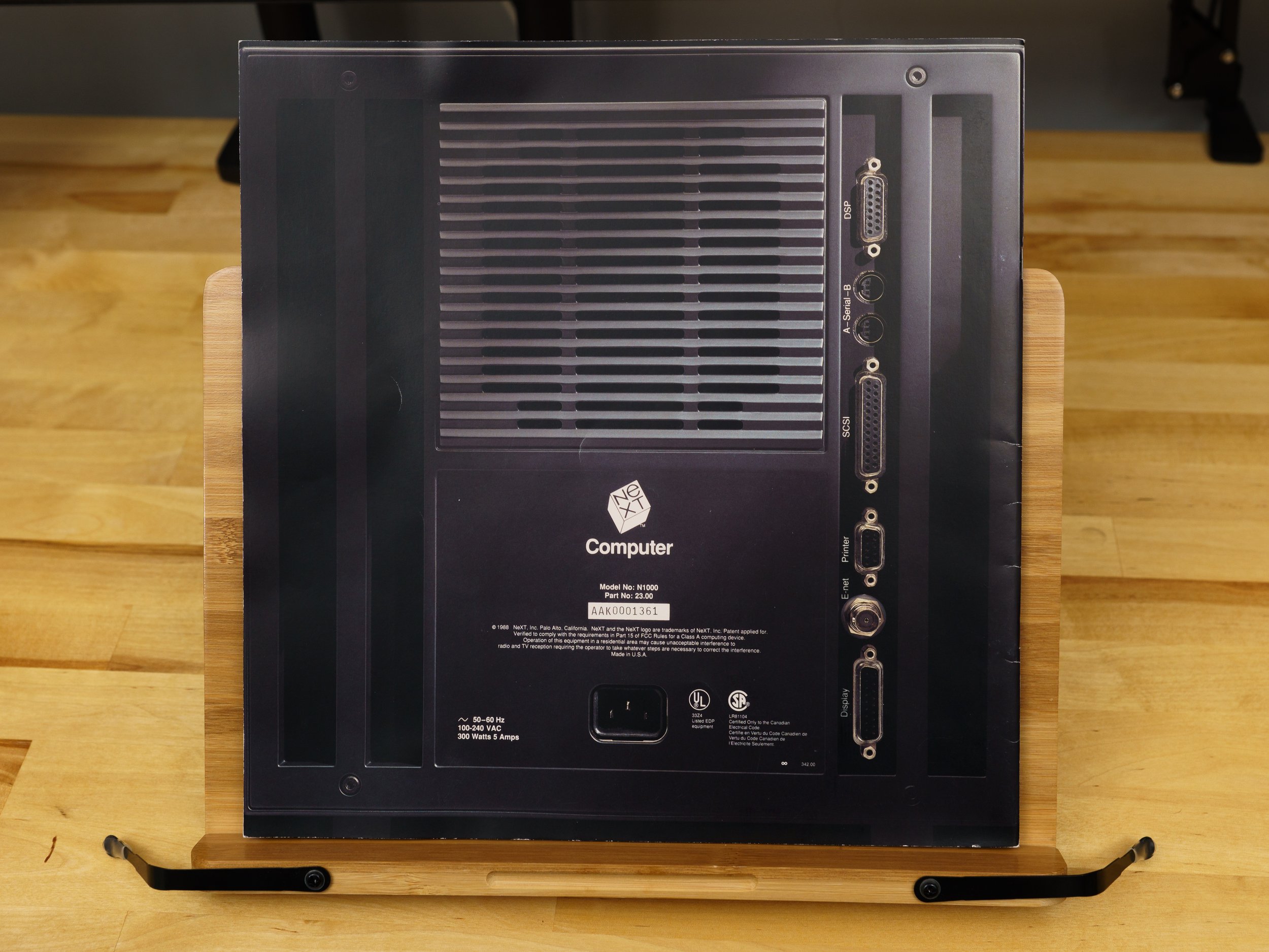
In keeping with NeXT's intended user base of academics, the brochure opens with a thesis statement. A NeXT Computer was, and I quote, “the yardstick for measuring computing in the nineties.” This remarkably persuasive argument plays out over twenty-six pages, describing seven unique features. The actual-size depictions continues with the system board and storage sections. These cutting-edge creations are impressively captured in a full-scale full-color reproduction. Each component on the NeXT board is purposefully arranged in a model of engineering elegance where no square inch is wasted. That’s due to an overwhelming usage of surface-mount components. NeXT invested millions of dollars developing an automated assembly robot that could pack both surface-mount and through-hole components closer than ever before. That’s old hat today, but cramming this many circuits and components on to a board was cutting edge in 1988. It was complete overkill, of course, and this very expensive automaton would become a symbol of NeXT’s delusions of grandeur. But it’s hard to argue with the actual finished product. If circuit boards could be art, this would be it.

Magneto-optical didn’t kill the hard drive star.
Turning the page brings us to a magneto-optical disk, which still looks kind of futuristic, even thirty years later. Both the board and cube are tough acts to follow, and the marketing copy makes a case for the disk by promising vast rewritable storage that wasn’t chained to one computer. You could transform any NeXT cube into your own computer by popping in an optical disk with your own OS, documents, and applications. Unfortunately, this first-generation Canon MO drive didn’t live up to the hype. It was slow and unreliable, which are bad qualities to have in a boot device. No other computers used the format—it was proprietary—so exchanging data without a network or an external disk drive was literally impossible. Even if you had the non-NeXT version of that Canon MO drive, it couldn’t read NeXT disks. NeXT quickly abandoned the MO drive and pivoted to floppies, CD-ROMs, and networked storage. The only legacy of that optical disk today is, of all things, Mac OS' "busy" cursor. Yes, that spinning rainbow beach ball was originally a spinning magneto-optical disk.

Motorola 56001 DSP
More impressive than magneto-optical disks was the Motorola 56001 Digital Signal Processor. A DSP endowed every NeXT computer with powerful 16-bit 44.1KHz sound playback and recording capabilities. Every app in NextStep had access to the DSP’s digital audio and MIDI music capability thanks to the included SoundKit and MusicKit frameworks. Sadly, the brochure is only paper, and can’t convey the difference between CD-quality digital sound and the 8-bit 22KHz that most PC sound cards were capable of at the time. The brochure also claims that the DSP can be used for all sorts of things, like emulating a fax modem entirely in software, or controlling a very impressive array of external devices. While there were DSP-specific add-ons like imaging boards and sound samplers, my reading of old NeXT newsgroups and modern NeXT forums indicates that most NeXT users never plugged anything into their DSP ports.
PostScript for both display and print.
Software also gets its due, with the Display PostScript engine billed as the next generation of “What You See Is What You Get.” By using PostScript for a device-independent display model, the same commands used to print were also used to create the computer’s display—a revolutionary idea at the time. NextStep’s window server could combine high-resolution raster images, vector graphics, and outline fonts to render a high-resolution display that far outclassed a Windows PC or Mac… as long as you were okay with grayscale. NeXT wasn’t the first to utilize a device-independent display—look up Sun’s NeWS for a contemporary competitor. But since Display PostScript was an official Adobe product, it gave NeXT serious graphical bonafides. DPS, like the MO drive, was an attempt to disrupt the status quo. But unlike the MO drive, DPS was more successful, even though it wasn’t exactly speedy and NeXT took a lot of heat for not initially supporting color. Speed improved over time and NeXT did announce color machines in late 1990. DPS was replaced by the PDF-based Quartz in Mac OS X, which carries on the legacy of a device-independent display layer.
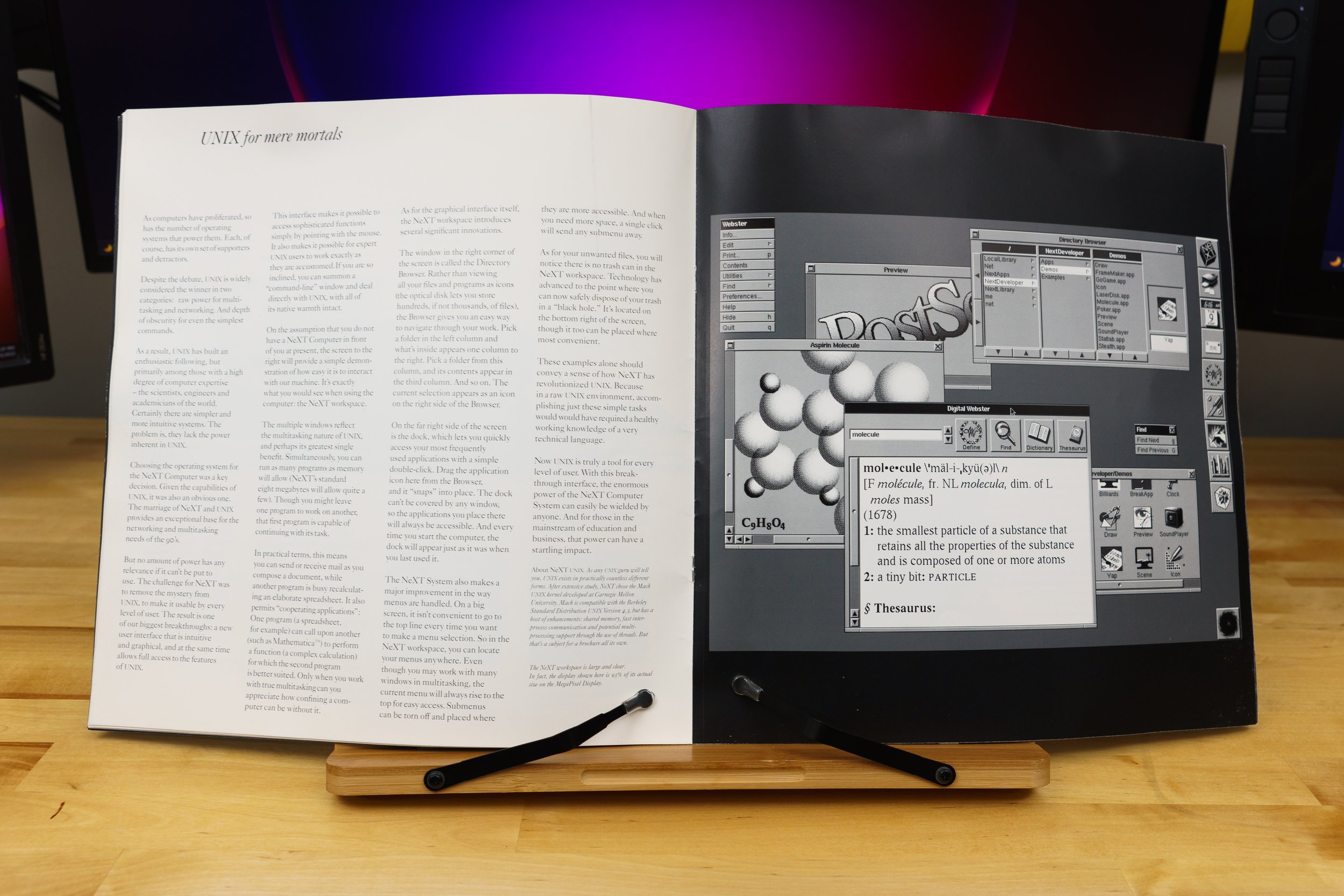
UNIX for Mere Mortals
Another familiar quote is “UNIX for mere mortals.” Other UNIX systems had GUIs, but NextStep was arguably the easiest one to live with on a daily basis. It had all the benefits of a multitasking, multithreaded, protected-memory environment with ease of use that rivaled a Macintosh. You didn’t have to use a command line to get your daily tasks done, but it was there just in case. Apple used the same exact sales pitch when OpenStep became Mac OS X, which appealed to a new wave of techies and developers who previously overlooked Macs.
The software story continues with several pages about NextStep's bundled applications. The parallels to Mac OS are noticeable, with today's Dictionary.app serving as the heir to NextStep’s Webster and Digital Library. Same goes for NextStep’s e-mail application, to which Mac OS’ Mail.app still bears a passing resemblance. It was the most advanced e-mail system you could buy in 1989, and Steve loved demoing NeXTmail and its advanced features. Combine that with WriteNow—a full-featured word processor—and you could be writing your dissertation minutes after setting up your NeXT.
Developers! Developers! Developers!
Last in the brochure are pages discussing software development and NeXT’s third-party partnerships. NeXTstep’s application framework kits allowed developers to spin up custom applications in no time by using common code objects. Then, after you built the app, you created the UI in Interface Builder by dragging and dropping controls on to a window template. This was the most revolutionary part of NextStep, but it only got one page of copy! Mac OS and iOS still use this framework methodology, and other visual toolkits have copied NextStep’s philosophy with varying degrees of success.
Third Parties Will Surely Come, Right?
The final page is NeXT’s closing argument, restating their thesis that they have created a new standard of computing. Endorsements from leading third-party developers project an air of legitimacy, as does retail sales support from BusinessLand—which was ultimately that company’s undoing. Lotus is making a spreadsheet! Adobe is porting Illustrator! FrameMaker will be there too! And it’s true that all these apps eventually shipped for the NeXT. But that's the problem: eventually. Jobs and NeXT were perpetually behind schedule. It was a classic example of Steve Jobs' hubris. He thought he could bring this into existence by sheer force of willpower, Green Lantern-style. He thought that once everyone saw it, they would agree and say "oh yes, this is brilliant!” The brochure concluded by saying the NeXT decade had already begun, which is just begging to disappoint
The Quick Setup Guide
But that's in NeXT's future. We're pretending to be in NeXT's present. We're done thumbing through the brochure, and now it's time to set up our new cube. We won’t have to do it alone, because the Quick Setup card is here to help. An overhead photograph shows a complete NeXT computer system with each cable numbered in the order you’re supposed to connect them. It’s a nice picture, but as a step-by-step guide it’s a bit weak. There’s no flow to the layout, and that triggers my comic book page layout sensibilities. Your eyes ping-pong around the page instead of naturally flowing from left to right. Or you’ll follow the steps at the top and ask “where’s number four again?” because the numbers don’t stand out on the page. Despite everything Steve Jobs ever said about functional design, this is a case of aesthetics over practicality.
Next comes a reminder that this box wasn't advertised as "unopened", just “complete.” Instead of the standard three-prong IEC power cord, there's some thin ethernet terminators and jumpers, and a laser safety data sheet. "Do not look directly into the laser with your remaining eye" indeed. The magneto-optical drive does have a laser in it, but this datasheet has the word "printer" on it, so it's probably from a NeXT laser printer's box. Maybe that's what I'll get at the next auction, no pun intended.
NeXT Documentation Library
With the miscellany out of the way, we’re left with a pile of documentation. These books are less fancy than the brochure, but they’re still quality examples of late eighties documentation. As far as I can tell, these NextStep 1.0 manuals aren't anywhere online, so this might be the first time you've seen them. Maybe I'll get myself an overhead scanner for Christmas, so I can put them on archive.org without damaging their binding. All the books follow NeXT’s minimalist packaging style, featuring plain white covers, Helvetica Italic type, and a giant NeXT logo. Hey, when you’ve got a logo that good, you place that cube front and center.
First in the stack is the Registration, Warranty, and License booklet. Your introduction to NeXT documentation cheerfully reminds you to fill out your warranty card and make sure all your doodads and thingamabobs arrived safely in their boxes. If you fill out the registration card as intended, and can find a mailbox that goes to 1989, you can get a free NeXT t-shirt, which is an offer I wouldn’t have refused. Inside the license booklet are illustrations of the contents of the NeXT computer box, the NeXT accessory kit, and the MegaPixel display box. And yes, I can confirm that everything except for the power cord is in this kit. NeXT tried to get away with a mere 90-day warranty on the original NeXT computer and accessories. If you weren’t satisfied, a NeXT dealer or service provider could sell you a one-year extended warranty for $600 plus the reseller’s markup. Not including hard drive coverage, of course—that’s another $300 plus markup! And remember, all these prices are in 1989 dollars. I’m sure Steve Jobs thought that was a bargain. NeXT eventually realized that expecting people to accept a 90-day warranty on a ten grand computer package was pushing their luck. Newer models had warranties for a full year.
Batting second is the Getting Started booklet. If you skipped—or, more likely, lost—the Quick Start sheet, this guide helps you connect your NeXT computer and peripherals. It also introduces the basic concepts of the NextStep GUI, Workspace Manager, and the Laser Printer. The guide’s user tutorials cover the basics of using a graphical interface, which was still novel in 1989. If you were new to computers, this guide would get you comfortable with using your NeXT in about an hour.
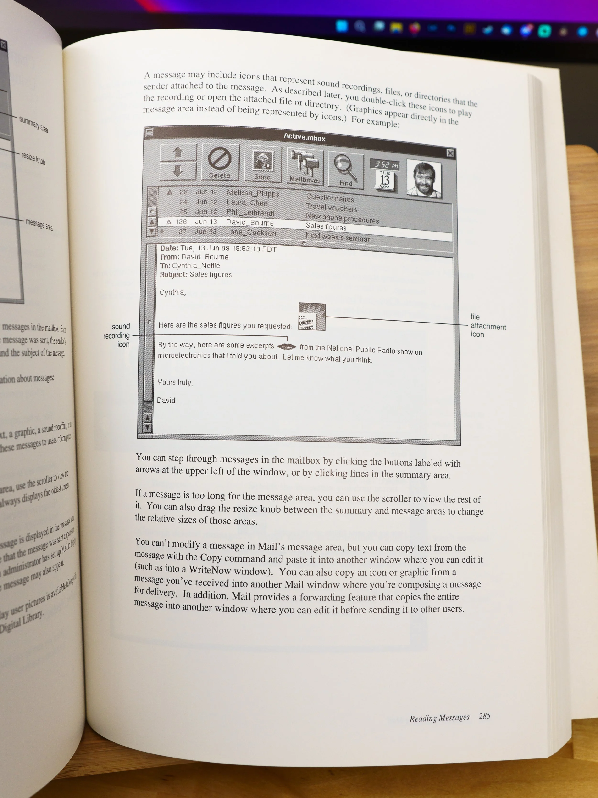
A more advanced user might dive right into the thickest tome: the NeXT User’s Reference Manual. This 460-page book is admittedly pretty dry, but it's well-written for a computer manual, and exhaustively details included applications like the Workspace Manager, NeXTmail, and the WriteNow word processor. This book’s got your back when you need the steps for building a bootable optical disk, pruning the print queue, or finding forgotten files. In addition to NextStep there’s several chapters about the care and feeding of the NeXT computer and peripherals. Need to peek inside that ominous black cube to add some memory or change the clock battery? There’s a complete walkthrough for disassembling the cube, and port pinouts for the technically curious—like you!
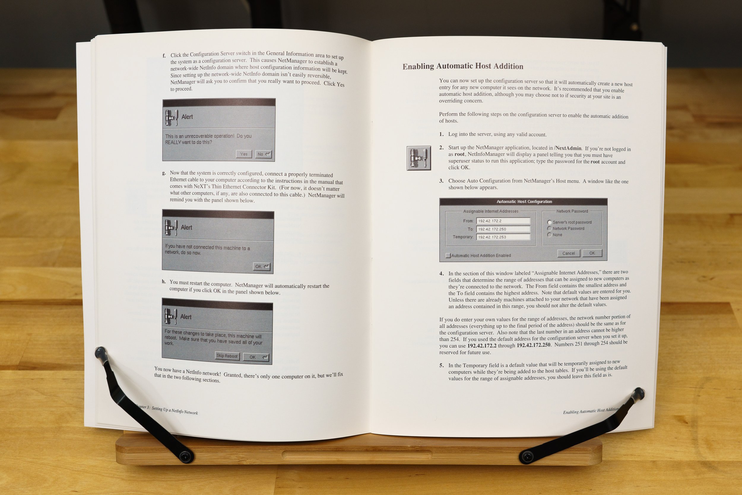
If you were in charge of a network of NeXT computers, the Network and System Administration guide was up your alley. This manual guides you through setting up Netinfo, the directory service that NextStep used to locate other servers, manage user accounts, and enable network booting. NeXT developed Netinfo instead of licensing Sun’s Network Information Service, because Sun was, at the time, their bitter rival. NetInfo hung on until Mac OS 10.4, and this material might look familiar to you if you were a Mac network admin around the turn of the century.
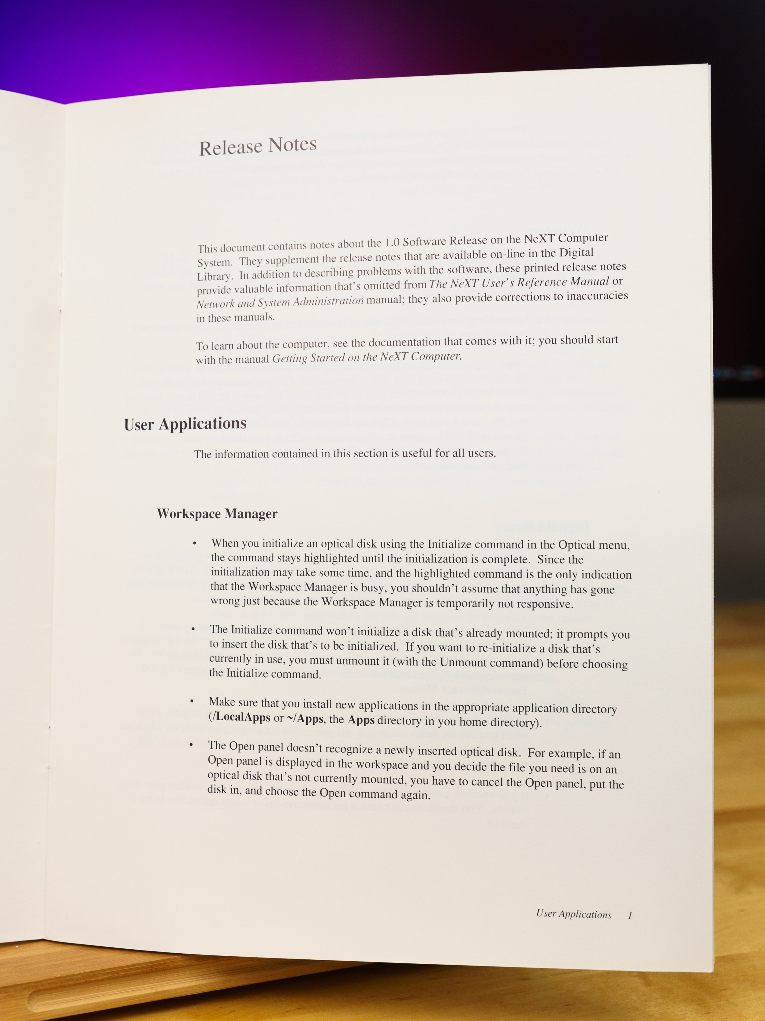
Last but not least is one of the more interesting booklets: the Release Notes. Printed in November 1989, this is the last-minute stuff that missed the deadline for the Getting Started or User’s Reference manuals. NeXTstep 1.0 was famously late and a little rough around the edges, and I’m not surprised that there’s a nine page booklet full of uncomfortable little admissions. Here’s a few of the more humorous ones.
Initializing an optical disk appears to freeze the Workspace Manager. Don’t panic! The highlighted menu item means it’s busy, you see, and for some reason there was no dialog box with a progress bar. I couldn’t find that reason on record anywhere, but I’m sure there was one. So be patient.
A period on its own line in an email message is interpreted as the “end” of the email by NeXTmail. Anything after that gets ignored. Period, end of story, I guess.
If you print to a network printer and the job fails with an error, you have to abort the print job on both the client and server before anyone can print again.
Don’t choose an invalid startup device. Apparently 1.0 didn’t hide unavailable boot options, and you could easily put your NeXT in an unbootable state if you picked the wrong one. So don’t accidentally choose NetBoot when your machine isn’t connected to a network. The only way out is using a magic key command to enter the ROM monitor, and then typing in the code to boot from another device. Good luck.
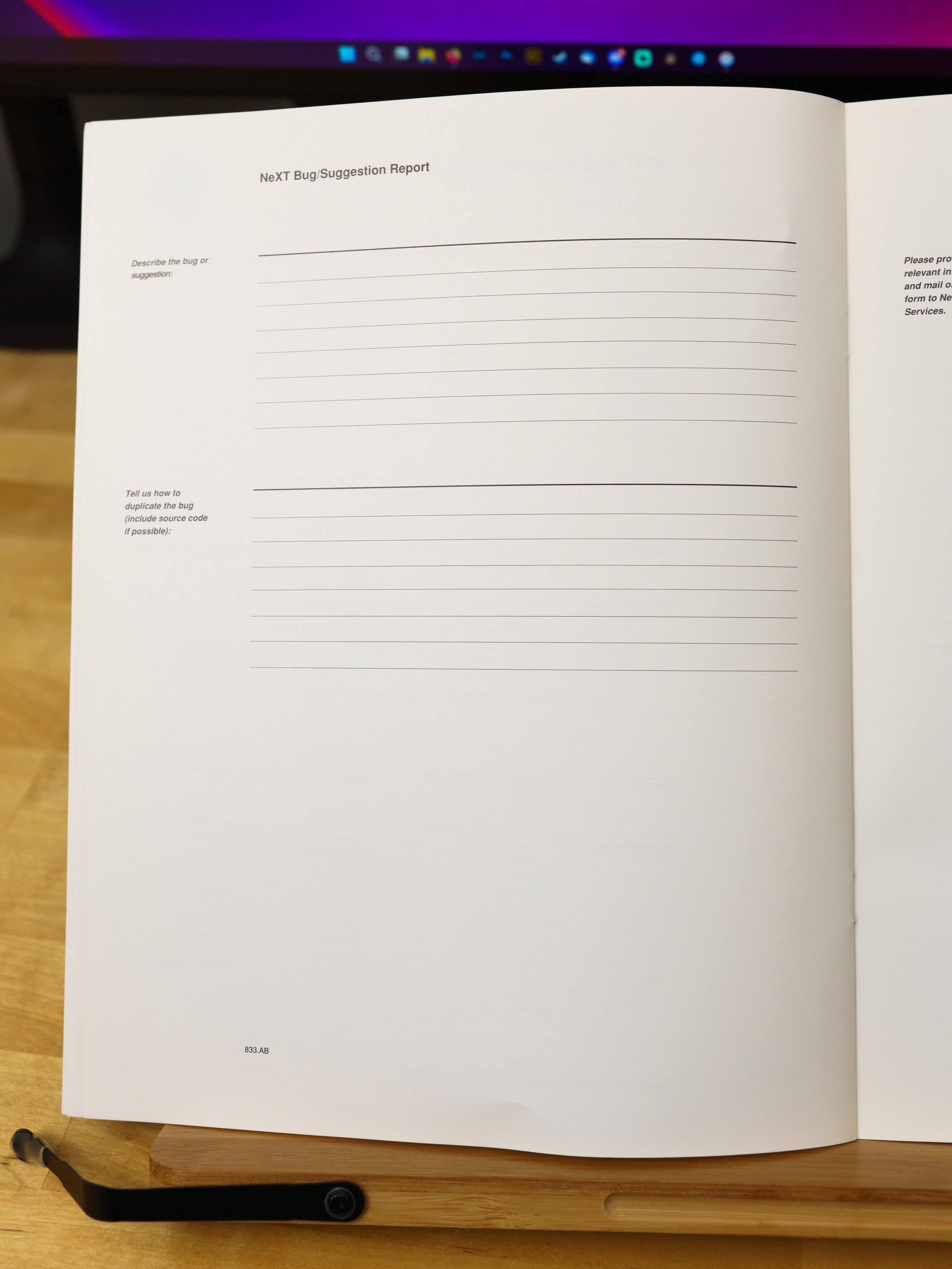
If you happen to run into a problem not mentioned in this long list of limitations, NeXT helpfully provided two feedback forms at the end of the booklet. Simply mail or fax your bug report to Redwood, California and they’ll get right on it.
And now, the part you've all been waiting for, the reason why I spent way too much money on this box of stuff. Behold: a letter-sized sheet of NeXT logo stickers! With fifteen stickers across three different sizes, NeXT really wanted you to slap their logo on everything. Compare this to Apple, whose contemporary sticker sheet gave only gave you four stickers. I’m very fortunate that only one sticker’s been used from this sheet, and that it was one of the smaller ones. The previous owner apologized for the missing sticker, but I told him it was okay. Stickers are made for sticking, and I’m lucky that he chose one of the little ones.
The NeXT Generation of Stickers
Now, I know what you’re thinking. “Why did you spend so much money on those stickers when you can buy stickers from some rando on Redbubble?” Well, there’s some advantages to the genuine article. If you look closely at most of the NeXT logos on the web or on knockoff products, you’ll notice that they just swiped a flawed logo from Wikipedia. It’s got the wrong colors and a non-uniform gap separating the sides of the cube. Symmetrical means all sides have to be the same! These stickers are actual, 100% accurate NeXT logos, and that satisfies the fussy little designer in me. Amusingly, despite my fussing about Wikipedia having a slightly wrong version of the NeXT logo, I didn't think to check that they still had the slightly wrong version. On November 14, a few days before I recorded this episode, Wikipedia user DigitalIceAge extracted a clean version from a copy of the press kit on archive.org. Thank you, DigitalIceAge. Nice to know I'm not the only one who cares about that sort of detail.
But let’s say you’re okay with a mildly inaccurate NeXT logo. After all, there’s very few genuine NeXT stickers out there, and I recognize that most people aren’t as picky as I am. I don’t begrudge them their knockoffs, because the market abhors a vacuum. If Apple won’t supply NeXT merch, someone else will. But even if you don’t care about the accuracy of the logo, you might be wondering about the construction of these stickers. How do they compare to a knockoff? First, these stickers are solid spot-color inks based on vector artwork. The linework is sharp and the colors match the Pantone swatches selected by Paul Rand. Second, they’re clear, not white, so there’s no distracting borders. Third, they’re vinyl and not paper, which makes them significantly more weather resistant.
I’ll grant that a lot has improved in sticker printing technology over these past thirty-odd years. We’ve got magical direct-print inks that don’t need fussy flexography or sensitive silkscreening to make a durable, water-resistant design. Redbubble will happily sell you stuff printed on clear or white gloss vinyl. But the wildcard is fade resistance. If you’ve used one of the old rainbow Apple stickers, you know that they eventually fade under the sun’s unforgiving ultraviolet rays. These NeXT stickers would likely do the same even if they used fade-resistant inks, but that process usually takes years of outdoor abuse. Redbubble vinyl stickers are printed with UV-resistant inks, but I’ve yet to get one that’s lasted more than a year outdoors without fading significantly. Still, $280 buys a lot of knock-off stickers. When they inevitably fade, you can slap on a new one. Not so much with these genuine NeXT stickers—once they’re gone, they’re gone.
There’s three items of interest left in the accessory kit, and two of them are these magneto-optical disks. One is blank, the other is a system software disk for installing NextStep on a hard drive. I didn’t have MO disks of any kind in my collection until I bought these, and now I’ve got some of the most infamous. While NeXT’s MO disks may have missed the mark, the technology was still used for many years as a high-capacity archival format. The lesson here is that even the most promising tech can fall flat if circumstances are wrong.
The Magneto-Optical Disks and the Hex Wrench
And last, but certainly not least, is a NeXT-branded hex driver. Odds are most users won’t have a hex driver to loosen the cube’s screws, and NeXT solved this problem by including one. Why they did that instead of using Phillips or Torx screws—well, I assume they had a reason, but like with the absence of a disk initialization progress bar, I haven't been able to find anyone willing to go on the record about it. Its handle is molded in the same angular fashion as the cube and MegaPixel display, with distinctive ribs and—ooh, fancy—a NeXT logo. It’s even got a ball-point at the end—not a pen, obviously, it's a little thingy that doesn't seem to have a technical name other than ‘ball-point.' These normally help hex drivers fit in tight spaces, but those clever engineers at NeXT figured out another use. Check the reference manual and you’ll see that you’re supposed to use the ball end to help pull the system board out of the case! Just snap the ball head’s groove into the conspicuous hole on the bracket and pull out the board. Sure, you can use your thumbs, but where’s the fun in that?
Now that we’re left with an empty box, one question remains: was this worth almost three hundred bucks? I could have bought an actual computer for that much money, but this is rarer and neater. Perhaps that’s flimsy post-hoc justification, but it’s nice to have something genuinely rare to call my own. None of this stuff is particularly useful on its own, except for the stickers and perhaps the hex driver. But something doesn’t have to be useful to be collectible—it can be appreciated in the context of its time. NeXT was on a mission to redefine computing, and in spite of its troubles and Steve Jobs’ flaws, the enduring legacy of NeXT in Mac OS and iOS proves that they got something right. These accessories and extras were expressions of that mission, and this box shines a seldom-seen light on that past. All that’s left is to find a NeXT cube and complete the set.
Because Twitter is currently self-immolating, I’ve set up backup social media accounts at various places. One of them is Mastodon! You can follow me at https://bitbang.social/@kefkafloyd. I haven’t decided whether or not to make a Userlandia-specific account, because admittedly I’m not good at dividing attention between multiple accounts. But I will be posting modern and vintage computing thoughts on Mastodon. This instance is run by (forgive me if I had the wrong spelling) Shaun from Action Retro. It’s quickly grown into a gathering place for retro/vintage enthusiasts. See you there!
Here in Userlandia, we’re brought to you in glorious ultra-color.
If you’ve been reading some parts of the internet lately, you might’ve seen a brouhaha over the quote-unquote “fact” that Pantone has “copyrighted colors.” They’re forcing Adobe to pay them oodles of money for color swatches, and Adobe said “no you.” Now users have to pay $15 a month just to use COLORS? Madame is outraged!
Well, it’s more complicated than that. The reality is that the world of color is difficult, even for those of us that see and feel it every day. Many working designers don’t know all the fiendish intricacies surrounding the tools of their trade. Your real questions are “how does this affect me” and “what can I do about it?” Or maybe you’re used to picking colors from all those swatch books in Photoshop and wondered why it’s such a big deal that they went away.
In the name of expedience I’m writing this in a question-and-answer format. Sit back, grab some popcorn, and be prepared for more than you wanted to know about the Pantone Matching System.
I got my start in the graphics industry back in the nineties. My high school had a graphic arts program, and that’s where I fell in love with computer graphics. I graduated from college in 2006 with a bachelor’s in art with a concentration in graphic design. During those years I also worked several jobs as a designer, prepress technician, and all-around computer toucher. In 2007 I was hired by a prepress workflow software company as an apps specialist, which is a fancy way of saying “you’re a quality assurance engineer, tech support person, and a hardware tech.” I then spent the next fifteen years developing software that solved printing problems for mom-and-pop shops, megacorporations, and the US Federal Government. I had to know about software, hardware, color, fonts, screening, process control… In short, my fingers have been in a lot of ink tins. I changed careers last year and I’m out of the graphics industry today, but I still help solve people’s PostScript problems. I’m still a graphic artist at heart.
If you’re not in the print or advertising business, this might be the first you’ve heard of Pantone. Pantone’s sales pitch is about solving a specific but very real problem: consistently reproducing a particular color amongst a variety of media and substrates. If you’re the brand manager for Coca-Cola, you want Coke Red to be Coke Red regardless if it’s on a bottle, can, or wax cup. If you’re the printer that prints the labels for Coke bottles, you want a consistent way to measure and confirm the color of ink when you print it. If you’re an ink manufacturer making the inks used by that printer, you want to guarantee that every tin of Coke Red ink is the same color ink every time. Pantone’s ink-spertise is the binding factor between these groups.
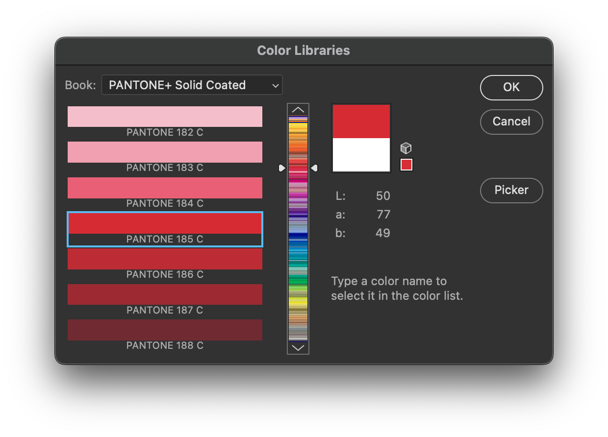
Most companies don’t have Coca-Cola’s copious cache of coins to commission Pantone to develop a specific ink formulation for their brand colors. Most designers choose colors from one of Pantone’s many color libraries. This is the company’s bread and butter and why they’re so entrenched in various creative industries. If you’re a designer hired by a company to select a signature color, you’d crack open your Pantone Solid Coated book and choose from one of the many hues available. Might I suggest Pantone 185 C? It’s a classic, saturated red that’s guaranteed to catch your eye. Now that you’ve picked a color, you can tell anyone that utilizes Pantone’s system to match that color when designing a logo, printing a brochure, or silkscreening a T-shirt. Congratulations, you’re now a brand expert.
For decades Pantone’s primary business was selling swatch books to printers and designers, formulating inks, and licensing said formulas to ink manufacturers. Because there’s only so much growth in that market, Pantone leveraged their dominance in print to other markets. They soon expanded their color production expertise into plastics, fashion, makeup, and more. With PR stunts like “Color of the Year” Pantone continually tries to cement their brand as the canonical source for color. While I’d say they’re more mainstream now than two decades ago, I don’t think they’re on the tip of the general public’s tongue.
The answer is no, you can’t. That’s a glib, reductive answer to the idea of colors as intellectual property, but it’s not wrong. What is color anyway? Think back to your middle-school science classes and you’ll recall that color comes from varying wavelengths of light. The mushy organic bits in our eyes are sensitive to those differing wavelengths across the visible spectrum. Since we can’t trust our lying eyes, humans invented color science to mathematically and scientifically measure what, exactly, is color. Since color science is math, the law in the United States is pretty clear: math can’t be copyrighted. You can’t like, own red, man.
However, you can copyright a book or database. Cookbooks are a perfect example. Recipes can’t be copyrighted, but if you wrote a fancy nerd cookbook with photos and recipes for “goblin cookies” and “magical roasted beast?” That’s a different story. Your new transformative work certainly qualifies for copyright protection. What’s eligible for copyright in a cookbook is the presentation, commentary, and organization applied to otherwise uncopyrightable recipes. Think of the Pantone Matching System as a cookbook for colors. Pantone has carefully organized their color recipes into specific groups, applied a distinct presentation, and designed an identifiable mechanical style with their fan-out guides. The same would go for an electronic database containing Pantone’s color formulas. I’m not a lawyer, but I’ve been involved with enough IP like this to know the general idea.
UPS does not “own” their brown, in the sense that they don’t own the physical properties of said brown. What UPS does own is their trade dress. Colors can be used in specific trade dress, which falls under trademark law and all of its fun foibles. Again, I’m not a lawyer, so don’t take this as legal advice, but there’s a lot of misconceptions around what trade dress means for colors.
Sticking with our example of UPS, you can make brown paint that looks exactly like UPS brown, and sell it too! The catch is that you can’t sell it as UPS brown, and you better not have violated any patents to make it. I would also avoid selling that brown paint to someone else in the shipping industry or using it in your own shipping business. And even then, UPS might sue you for diluting their brand anyway. Whether they’d win would be up to the whims of judges and lawyers. Are you trading on UPS’ reputation by using that color in your trade dress? Other factors would certainly apply, like your logo, typeface, and so on. The point is that UPS or Coke don’t go around suing people for using brown or red, they sue them for infringing on trade dress. But that’s enough of that, let’s get on to the real issue at hand.
Around February 2022 news circulated around the print industry that Adobe and Pantone’s licensing agreements were falling apart. This made color and graphics professionals understandably nervous. It’s a safe bet to say money was the cause: Pantone wanted more and/or Adobe wanted to pay less. Most Pantone libraries have already vanished from Creative Cloud, and soon they’ll all be gone. That doesn’t mean you can’t specify Pantone colors, but not having a built-in library certainly makes it more difficult. Of course, Adobe won’t be passing the savings along to you—they’re adding insult to injury by increasing Creative Cloud plan prices this year.
Convenience, mostly. Without a swatch library, referencing spot colors was a real pain. Remember that Pantone 185 C I talked about earlier? That’s a spot color—a special ink that exists outside your normal CMYK inks. The vast majority of Pantone’s colors are spot inks. Traditional printing presses use the four-color process of overlaying cyan, magenta, yellow, and black to produce many colors, just like your desktop printer—if you’ve still got one. But this process can’t produce many colors, especially weird ones like metallics, fluorescents, and opaque whites. Referencing spot colors without a library can be a real time sink. You’d have to dig out your Pantone Solid to Process book, type the color name, and then enter all the alternate color space values manually. Because if there’s one thing creative people like, it’s typing in numbers over and over again.
Eventually the early desktop publishing developers—Aldus, Quark, Adobe, and others—licensed libraries from Pantone and other companies to spare you that inconvenience. Now you just clicked on a color and you had a new swatch in a fraction of the time.
Absolutely! Nothing stopped you from selecting a swatch from the Pantone library and converting it to RGB or CMYK. Sometimes your material will run in media like a magazine where they’re not going to print unique spot colors on their interior pages. Even if your particular color doesn’t fit within a traditional CMYK or RGB color model, Pantone made a “close as possible” simulation and included that in the library. Which leads to…
The libraries aren’t just lists of color names. Each color has an alternate color space definition that must be included with the ink. In the olden days these were manually calculated CMYK or RGB values. Nowadays they’re LAB values, which I’ll address in a more technical way later. This alternate color space data is written into the PostScript, PDF, PSD, AI, TIFF, and other files written by these apps. When you send your files to a print shop or open them in another application, you’ll see a color preview instead of a mystery black separation. Part of licensing these libraries is to have Pantone-blessed color definitions instead of somebody’s guesses.
You sure can! Nothing’s stopping you from scanning a Pantone book with a spectrophotometer, writing down the LAB values, and composing your own swatch library. Perhaps you’ll, uh, acquire a library from somewhere, wink wink. You can also import old swatch libraries from older versions of Creative Cloud. Heck, you could just make a new ink, call it “Pantone 185 C” and set its alternate color value to 100% cyan. The app doesn’t care what you name it, because as far as it’s concerned that’s just another ink. When you use the library to add a swatch, the applications are copying the alternate color space values and pasting them into the ink you create.
If you were using Pantone color books to pick colors to use in CMYK or RGB colorspaces and not actually creating spot inks, you could definitely explore alternate swatch books. Of course, Pantone would prefer that you shell out $15 per month or $90 per year for their Pantone Connect plugin, a piece of software that I wouldn’t want to use even if it was free. This bloated piece of junk tries to “add value,” when all you really want is a swatch palette.
You’d be playing with fire, that’s for sure. Pantone’s a litigious company. One of my previous employers never distributed a Pantone spot color library with our workflow software because Pantone demanded an incredibly high licensing fee. Even if we wanted to build a database ourselves, using our own labor and none of Pantone’s provided resources, we would have been sued for distributing it. This led to some of our more enterprising users creating a Pantone database using our format and distributing it amongst themselves. Pantone wasn’t going to roll up to an individual shop and sue them, but I’d expect a cease and desist if you’re posting them on a website.
I can think of many ways to make a non-infringing version of the database, but at the end of the day applications and renderers do some tricks when they detect Pantone names (or variations like PMS 185 C). Another issue that you’ll run into is differing opinions on what constitutes a color. Should your database have the LAB values, or preselected RGB or CMYK values?
Something that goes unsaid in a lot of this discourse is that color is hard. There’s an entire industry built around the difficult task of correctly reproducing color, which doing consistently has been a problem for centuries. Computer monitors and printers have magnified the problem, yes, but it’s always been there. Pantone (and its parent, X-Rite, and its parent, Danaher) is one part of the color industrial complex. How do you organize colors, anyway? Names are hard, because you’ll run out of them very quickly and that’s not including language localization. Pantone’s solution to this conundrum was numbers. When you say “I want Pantone 185 C,” every person in the chain has a Pantone book with color chips and formula guides to get you the same hue, every time. At least, that’s the idea—it’s easier said than done.
Painters make different colors by mixing different paints together, and mixing Pantone inks for printing works much in the same way. If you mix a certain amount of Cerulean Blue and Cadmium Yellow paint, you’ll make green paint! But the quality of that green can change depending on the ratio of blue to yellow, let alone if you mix in any Titanium White to lighten things up a bit. The classic Pantone Matching System works in the exact same way, except instead of an artist eyeballing the color, Pantone’s guides contain formulas for recreating the same color every time from a base set of inks. Bob Ross can paint almost any landscape from a palette of fourteen colors, and you can make any one of Solid Coated’s 2,000+ shades from a set of fifteen base inks. It’s amazing how close that is, really. That’s why Pantone persists, because printers needed an agreed-upon way to make the same color every time.
You might’ve heard about RGB color, and maybe even CMYK color—these are the two most common color models. RGB adds colors together to create white, while CMYK subtracts them. I’m used to thinking in terms of bits, and hex values are one method of expressing those bits. 8-bit color means 256 different discrete values for a given primitive, with 0 for minimum and 255 for maximum. 255R 255G 255B is white, which is expressed in hex as FFFFFF. It can be none more white. Or can it?
Head back to your science class again and you’ll recall that the human brain perceives color by mixing the responses of various wavelengths of light. Visible light is only a tiny fraction of the entire electromagnetic spectrum, but in terms of frequencies it’s still a lot for us to measure. That chunk of the spectrum spans over 350 terahertz, which means trillions of spectral colors for our peepers to peep. When you see a red rose or a green lime, your eyes are measuring the frequencies of light reflected by those objects. But like a sound wave can have multiple frequencies, so can a light wave. Our brains perceive colors that don’t exist in the sun’s light! That’s because these colors are the result of multiple frequencies mixed together. Purple’s the go-to example, because it’s a combination of reflected red and blue frequencies. Compare that to violet, which exists as a spectral wavelength. This is all wibbly-wobbly colory-wolory stuff, and I won’t bore you with the finer details. But suffice to say that some colors can be reproduced in some media while others can’t, and translating between multiple media is often difficult.
Even if I simplify things and say that we stay within the RGB color model, it doesn’t get easier from there. A device producing RGB color is bound by the spectral properties of its red, green, and blue primitives. Those properties define its “color space,” or the gamut of colors it’s capable of producing. Take red, for example. If you have a computer, a phone, and a tablet, you could ask each to produce 255 red, 0 green, 0 blue. Depending on the manufacturers of the screens and their physical properties, you may see three different reds! One could be dimmer, the other could look more orange-ish. Without knowing the actual spectral properties of these screens, 255 just means “maximum output.” Controlling and accounting for these differences is color management.
Needless to say that you can’t specify the hex value that you entered in for your website’s color in the logo for your printed business cards. Even if you just printed them on your inkjet printer, it must be translated to a CMYK color model, and if your RGB color is too bright, it may be out of the printer’s gamut, rendering it duller than what you’d expect. Color management is out-of-scope here, but this should be enough to give you an idea of why people like an idea of a known, defined library of colors.
This is the last of the technical bits, I promise. RGB and CMYK values are device-dependent. That means their color rendering is a function of the device’s ability to create (or reflect) light. You can request 255 Red on Monitor A and get a very different result than the same number on monitor B. This has been a known problem for a long time, so the handsomest scientists at the International Commission on Illumination devised the CIELab color space to describe color in a device independent way. This is the foundation of modern production color management, with ICC profiles and rendering intents and all the rest. The LAB color space describes the human perception of color, and we can map the colors our devices produce inside this uniform color space. It’s not the only device-independent space, and it’s certainly not perfect, but it’s good enough for the vast majority of us to get our jobs done.
When you go into Photoshop and choose a Pantone Solid Coated color from the swatch library, it gets converted from a LAB value defined by Pantone into your destination RGB color space. Some color spaces are bigger than others, but Photoshop will try to render an RGB value as close as possible. For most users, that destination color space is sRGB, which is a fairly narrow gamut as far as RGB is concerned.
Pantone does have their Color Bridge guide with CMYK and RGB alternate values for their colors, but they have never documented what gamuts they use to determine those values, along with other relevant color management settings.
Sure will! In fact, both sides are counting on it. You know how cable companies and broadcast networks fight it out every few years over carriage rights? This is basically the same thing. Usually those are just brinkmanship efforts that get resolved with maybe a minor blackout. But this isn’t going that way. Pantone’s had their Connect software live for a while, and Adobe’s let licenses lapse before. If you depend on Pantone colors for your livelihood, you’re gonna be coughing up the cash.
Unfortunately, it depends on the file and the applications you use! Illustrator files, InDesign files, and PDF files have spot colors—Pantone or otherwise—defined as a unique ink with an alternate color space. You should be able to open them up and see whatever colors you had selected in the file’s swatch palette. You can copy and paste them into a custom library or from document to document. Sometime around… CS6, I think, Adobe introduced a feature called “Book Color” where in addition to the alternate color space they would write in proprietary info that referenced ACB files. Adobe apps prefer this “book color” stuff, which might also trigger a color replacement. The behavior differs depending on the application used.
Photoshop’s a trickier case. The PSD file format has alternate color space declarations for spots, but it’s mostly for the benefit of other applications. If your spot channel lacks alternate color space info, Photoshop used to be able to locate a suitable one in its library. If those libraries don’t exist, you’ll get a very passive-aggressive dialog box warning you that the Pantone libraries are no longer available, and then the dreaded black separation.
There are competitors to Pantone, but they mostly exist outside the North American sphere of influence. In Japan there’s DIC and Toyo, and in Europe there’s HKS. There’s also up-and-comers like Spot Matching System. Maybe they could use this as an opportunity to break into the market. But there’s a lot of inertia that will keep Pantone in place in North America. Said inertia has helped and harmed Pantone in the past. Pantone tried creating a new color matching and ink formulation system back in 2007 with the ill-fated Goe system. Goe used fewer base inks to make a wider variety of colors, but its ink was just as proprietary as PMS. Goe failed for a variety of reasons, but the main one was a lack of clarity on the future of PMS. Printers didn’t want to stock two sets of inks, and if PMS wasn’t going away, there wasn’t much of an incentive to change. Before that there was Hexachrome, which was Pantone’s idea to get everyone to move to a six-color printing process of CMYK plus orange and green. This also failed spectacularly because Pantone tried to keep most of the “magic” for itself. Pantone ultimately revamped the existing PMS system via the Pantone+ update, which reorganized the color guide and addressed the formulation of the existing base fifteen inks to give them some of the benefits of Goe’s base inks.
Going back to the traditional Matching System, Pantone controls many patents and formulas regarding the base set of inks used to create their colors. Nothing is stopping an enterprising ink manufacturer from creating knock-off or “compatible” inks, so long as they’re not infringing on patents. After all, Megabloks are compatible with Lego bricks. But as much as people dislike Pantone, there is a level of trust in that name and the ink manufacturers that license it. Print and manufacturing is expensive, and people don’t want to risk trashing their product because a slightly cheaper ink didn’t match.
Serif’s Affinity line of products still include Pantone libraries, but who’s to say that Pantone won’t turn the screws on them as well? QuarkXPress still supplies Pantone libraries, but you don’t want to use Quark.
Photoshop does write alternate color space info into PSD files, but ironically enough doesn’t read it in certain scenarios. In the past it would do a name-based lookup and pick the value from their library. Now that the library’s gone, instead of falling back to the file’s alternate color space it gives you the passive-aggressive dialog box instead. Adobe’s apps in general have gotten aggressive about overriding a file’s internal definition for an alternate color space, and this is the result. I haven’t fully explored all the ramifications yet, but suffice it to say that you can still replace the color in the alternate color space if you have to. Most print workflows and raster image processors will still use their own libraries if you give them one of your PSD files.
It’s hard to say. Pantone will absolutely lose mindshare amongst designers and artists who used those Pantone swatch libraries as quick shortcuts. Those same customers will also curse Adobe’s addiction to rent-seeking behavior. But for actual professionals whose livelihoods depend on these standards, they’ll continue to pay while gritting their teeth. For newbies entering the field, their first exposure to Pantone colors are usually in these digital products. I wonder if they really want to lose that.
Pantone should be careful, though, because Adobe knows all too well when a controlling licensor overreaches. Microsoft and Apple made the TrueType font standard in response to Adobe’s iron-grip control over Type 1 PostScript fonts. TrueType eventually morphed into OpenType, which is the standard for font binaries today. All the same conditions are there—font shapes aren’t copyrightable, but binaries are.
I would be surprised if Pantone gets much traction on their plugin outside people who must use it or lose work. It’s lousy software at a terrible price. Piracy of swatch books will rise, and Pantone will have no one to blame but themselves. Maybe this is the kick in the pants that the print industry needs to tell Pantone to pound sand. Or maybe it’ll just be accepted as another tax on the working designer. Either way, the only color Pantone and Adobe seem to care about is green.
Here in Userlandia, be very quiet. We’re hunting dogcows.
Brands. Can’t live with ‘em, and in today's hellscape they don't let us live without ‘em. No one in technological society knows a life without Conglom-O relentlessly bombarding them with WE OWN YOU at every opportunity. Our collective wills are assailed every day by these corporate giants, so it’s no surprise that instead of rejecting the marketing, we embrace it. We love that logo stamping on our human faces forever, and happily ask for more, because we love Big Branding. How else can we convince ourselves that a trip to Atlanta is incomplete without a visit to the World of Coca-Cola, or that the Ben & Jerry’s Flavor Graveyard is a must-see Vermont landmark? Maybe it’s the decades of pop-culture contamination talking, but I find something comforting about the self-serving fictions that companies tell you during a factory tour.
Our story begins back in April, when I was on vacation in San Francisco. It was my first time back in the bay area since the pandemic started, and when planning the trip I realized I had some spare time left over. What could I do to fill a morning before flying back to Boston? Why, I could finally visit Apple’s worldwide HQ in Cupertino, California! It wasn’t that far of a drive from where I was staying, and I could easily make it back to the airport in time for my 3 PM flight. Sounds like a perfect way to cap off a trip.
Apple’s called Cupertino their home since 1977, when they opened their first corporate offices on Stevens Creek Boulevard. As Apple’s profits grew, so did their need for real estate. By 1985 they’d occupied so many buildings along De Anza Boulevard that they could’ve asked it to be renamed Apple Boulevard if they thought they could get away with it. Some buildings like Mariani 1 were built from scratch, while others were leased for quick move-ins. Instead of a beautiful orchard, Apple found themselves working in a patchwork campus with little to unify the company, and Steve Jobs thought Apple could do better. In a Wired oral history, John Sculley told the story of SuperSite, Steve Jobs' plan to bring everyone in Apple together under one roof. Steve dreamed of a campus that was more like a theme park than a headquarters, complete with ridiculous gimmicks like a bona-fide electrified six-car monorail.
Unfortunately for Steve, SuperSite was one of his many grandiose ideas that wouldn’t come to pass thanks to his forced departure in 1985. But even after his exit, there was still a desire to unify Apple’s workspace. Sculley devised a new, less ostentatious plan for a central Apple campus and found the perfect site. Right across the street from their then-current HQ at Mariani 1 was De Anza Park, the former site of Four-Phase Systems. Apple bought the land from Motorola, bulldozed the property, and constructed six new buildings arranged in a ring. With a quad-like grassy field inside the ring, it felt more collegiate than corporate. Completed in 1993, Apple christened the new site Infinite Loop and gave everyone who moved in an office of their own.

One Infinite Loop.
Unfortunately for Sculley, the road to bankruptcy is paved with good intentions. Thanks to Apple’s ever-growing head count, they kept many of the buildings that the Loop was supposed to replace. These real estate assets quickly became liabilities, though, when Apple's bright future began to dim. Burdened by failing strategies, incompetent management, and bad product, Apple needed radical intervention just to stay alive. That’s when Gil Amelio made the fateful decision to buy NeXT on Christmas 1996 and use their technology to build the future of the company. And while buying NeXT gave Apple a superlative software stack, it also came with another important asset: NeXT’s executive staff. People like Jon Rubinstein and Avie Tevanian spent the rest of 1997 methodically slashing budgets, cutting anything and everything to stave off bankruptcy. Hundreds of employees were laid off, dozens of projects were cancelled, and the Mac lineup was streamlined.
Apple’s radical downsizing left them with a lot of empty buildings they could barely afford. With leases expiring one by one, employees of all ranks consolidated inside Infinite Loop. Gil Amelio gave up his fancy office at Cupertino City Center and moved back into Infinite Loop just in time for Steve Jobs to launch a boardroom coup and kick him out entirely. Jobs settled into an office on the fourth floor of One Infinite Loop after assuming the role of interim CEO in September 1997. His initial reaction to Infinite Loop was about what you’d expect—he didn’t build it, ergo he didn’t like it. But his opinion changed during Apple’s increasingly successful comeback tour. Although it’s now in the shadow of Apple’s new spaceshippy headquarters that landed to the east, Infinite Loop still has significance both to Apple itself and to people like me who survived the beleaguered era.
While Infinite Loop isn’t a public Apple theme park, there’s still two reasons for Apple enthusiasts to visit, even if one technically doesn’t exist anymore. The first is Apple Store Infinite Loop, which used to be Apple’s company store. Many large faceless corporations have a company store selling tchotchkes of middling utility—apparel, sports gear, office supplies, and such. My personal favorite is Boeing’s at their factory in Everett, Washington. Where else can you buy a 747 t-shirt and an easy chair made out of an engine cowling? Some day I’ll work up the courage to spend three grand on that chair—some day.
The Apple Company Store of the nineties bore little resemblance to a modern Apple retail store. It was very much like other company stores selling branded merch to employees and visitors. You could get an Apple logo on pretty much anything from telephones to teddy bears to tote bags. The Company Store served this role until 2015 when it was closed, gutted, and rebuilt as a modern Apple retail experience. Even though Apple Infinite Loop might not look different from the Apple Store at your local mall, it still owes some of its soul to the old Company Store thanks to specially branded merchandise that isn’t available anywhere else.

The Apple Store at Infinite Loop
If you ever wanted a pen that perfectly matched the color of your MacBook Air, or a coffee mug or steel water bottle with an Apple logo, you're in luck. I picked up one of the canvas sketchbooks—in classic beige, of course. Thirty bucks for a half inch of smooth 60-to-80 pound 8x10 paper is a wildly overpriced alternative to a ten-dollar spiral bound drawing pad, but… eh, Apple tax, what're you gonna do. Meanwhile, the other side of the wall had the real cool stuff: T-shirts! Infinite Loop’s Apple apparel appeals to maniacal Macintosh mavens, with designs evoking eras long past. There’s a couple modern designs, like the "Mind Blown" emoji, but by and large these shirts look like they came straight from the nineties. Apple and the T-shirt are inseparable—there’s even a whole book chronicling the history of Apple-related T-shirts. I don't normally talk about clothing, but hey—it’s from Apple, it's soft, and you wear it. Good enough, let’s go.
A quick note: My own photos of the shirts had some issues, rendering them unusable for this segment, apparently. Please forgive me, 9to5mac, for, uh, borrowing yours.

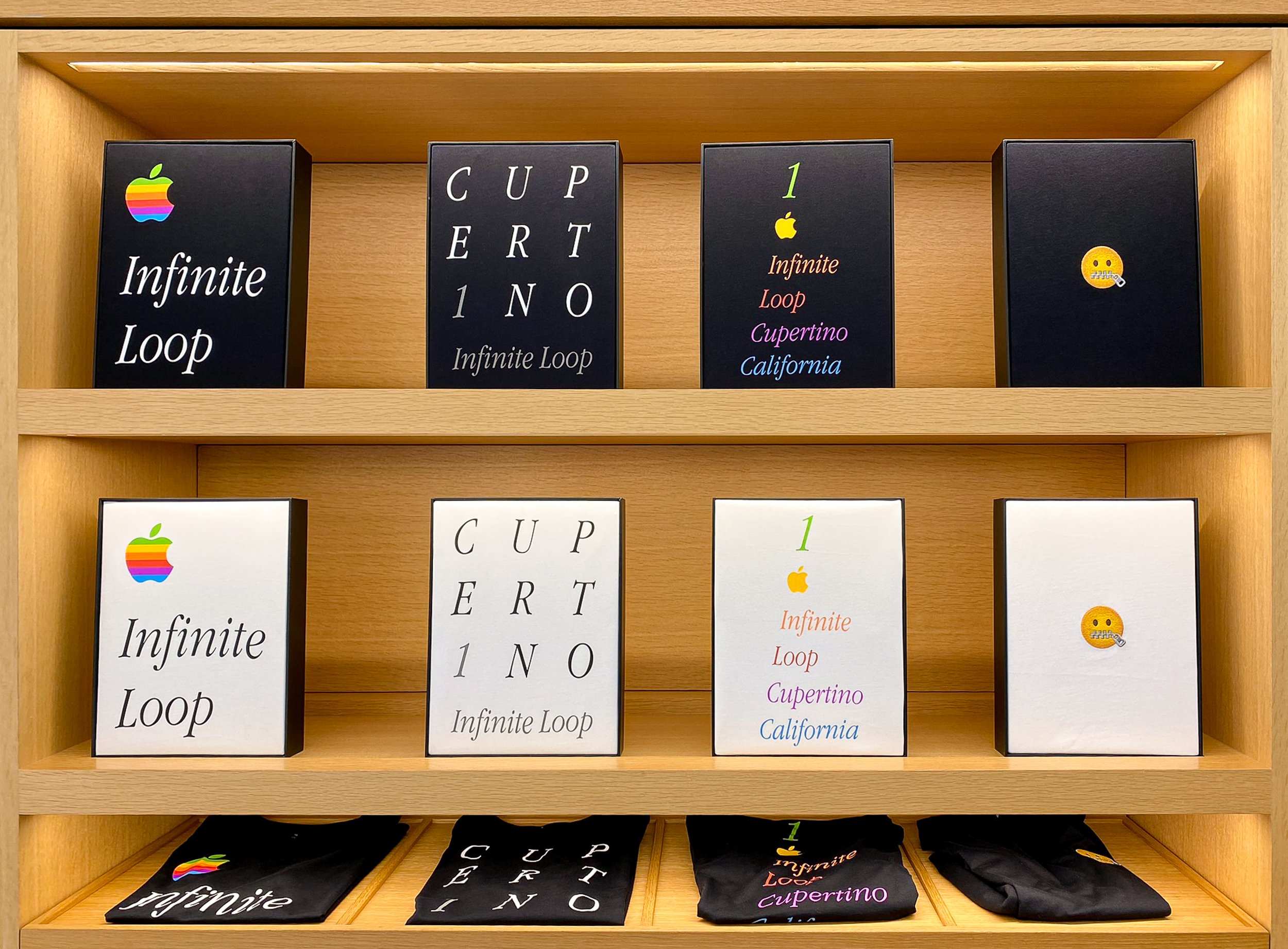
Logo Infinite Loop. A large Apple logo along with Infinite Loop in white Apple Garamond Italic. This is a classic Apple shirt design and a must have, especially in black.
1 Infinite Loop Cupertino Rainbow. More Apple Garamond Italic, but each line of text is a different color of Apple’s rainbow, along with a smaller Apple logo. If Logo Infinite Loop’s big Apple logo is too much, this is your alternative.
CUPERT1NO. The letters of the word Cupertino are arranged in a grid of white uppercase Apple Garamond. A gray numeral 1 replaces the letter I, which matches the gray “Infinite Loop” text below. Neat design, yes, but as someone who's actually designed shirts in his day, I think it'd look better on a poster.
Mind Blown Emoji. You can do better than an emoji. Skip it.
Hello. The latest version of the Macintosh’s Hello script as seen in the M1 iMac’s introduction. If you like subtle shirts, this is your pick. Mac fans will nod in approval, everyone else will just think you’re friendly.
Cupertino Script. The word “Cupertino” written in the same script as Hello. Same vibes as Hello, but even stealthier.
Pirates. An homage to the famous pirate flag that once flew above Apple HQ. The white variant has an emoji-style Jolly Roger flag, while the black version has a big skull and crossbones print on the chest. The eyepatch is a rainbow Apple logo, and printed on the inside neck is the famous Jobs quote “It’s better to be a pirate than join the navy.” The black version is a must have for any classic Apple fan.
Icons. A grid of Susan Kare’s legendary classic Mac OS icon designs are printed all over this shirt. There’s a spray can, stopwatch, command key, Apple logo, happy Mac, and even a bomb. A perfect match for the Classic Mac OS nerd, though the all over print is a very loud design. Whether or not Susan Kare is actually getting royalties for Icons, Pirates, or Hello, she deserves them.
While picking out these shirts, I was assisted by one of Apple’s retail employees. His name was Philippe, and we had a good time chatting about my visit to IL-1 and the various T-shirt designs. Folks like me who come by for a bit of the unique merch and seeing where it all happens aren’t uncommon, and Phil was a pro about it. He had stories about how he got into tech—his dad worked down the road at Sun Microsystems and he grew up surrounded by computers. We had a great talk about my time in the graphics industry and about this very blog, site, podcast—whatever. Hi, Phil! Thanks for listening! After paying for three T-shirts and a sketchbook, my time at the store was done. Now I was ready for the other reason I came to Infinite Loop.
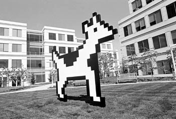
Clarus roams the garden.
Photo: George Sakkestad, Cupertino Courrier
A small park lives at the corner of Infinite Loop 1 and 6. It’s somewhat larger than the other green spaces around the Infinite Loop buildings, with a concrete walkway and some trees dotting the interior. There’s not much to see there, save for those trees. Probably most people who head to the Apple Infinite Loop store walk right by this little patch of greenery without knowing its significance. But for longtime Apple employees and diehard fans who suffered through the bad old days, this otherwise unassuming park means just a little bit more.
Yes, this field is the former home of the famous—or maybe infamous—Icon Garden. As the legend goes, the government of Cupertino asked Apple to contribute to the beautification of their fair city. When Infinite Loop opened in 1993, Apple honored the city’s request by installing twelve foot tall sculptures of pixelated icons from Mac OS and MacPaint. Whether or not larger-than-life versions of icons like a paint bucket, the stopwatch, and Clarus the Dogcow count as art is open for debate, but it was good enough for the city of Cupertino. Thus, the Icon Garden was born. During its five years of existence the Garden was a place of pilgrimage for Apple acolytes—their way of paying homage to the whimsy that made them fall in love with a computer in the first place. This was when I was a teenager, so I only knew of the Garden through the pages of Mac magazines and Apple fansites. Taking a trip to Silicon Valley was out of the question, so I had to make do with an online QuickTime VR tour.
A morning stroll along the Garden.
Photo: Steve Castillo, Associated Press
But change was in the air with Steve Jobs’ return to Apple, and no dogcow was sacred. Employees arrived at Infinite Loop one morning in May of 1998 to find all the Icons missing from the Garden. Various theories and explanations as to why Clarus and company went AWOL emerged over the years. One Apple spokesperson said they were removed for cleaning, which was just a deflection. Another answer is from former Apple employee David Schlesinger, who said he cornered Steve at a company party and demanded an answer. Schlesinger posted the following in a Quora answer back in 2015:
“[Steve] admitted he’d had it done, he found them too pixellated, and that they were at that point sitting in a warehouse in Santa Clara.”
That’s a cromulent answer, but I think we should look at it from Steve's perspective. When Steve Jobs and Bill Gates were at the 2007 All Things Digital conference, the subject of righting the good ship Apple came up. Steve’s response is one found on many SEO content farm famous quotation pages today.
“And, you know, one of the things I did when I got back to Apple 10 years ago was I gave the museum to Stanford and all the papers and all the old machines and kind of cleared out the cobwebs and said, let’s stop looking backwards here. It’s all about what happens tomorrow. Because you can’t look back and say, well, gosh, you know, I wish I hadn’t have gotten fired, I wish I was there, I wish this, I wish that. It doesn’t matter. And so let’s go invent tomorrow rather than worrying about what happened yesterday.”
While this referred to Steve shipping off Apple’s in-house library and museum to Stanford, which happened in November 1997, it’s the same mentality that deemed the Icon Garden an anchor rather than an inspiration. I can’t fault Steve here, because Apple in that beleaguered era had a lot of problems, and one of them was an unwillingness to make a break with the past. Killing the past was the right thing to do, because Apple’s habit of navel-gazing often turned into abyss-gazing. The company was dying, and it desperately needed to rid itself of bad habits and dead weight. Mistakes like Copland, QuickDraw GX, and OpenDoc were in the past, and if Apple was to succeed, it needed to focus on the future. If that also meant putting away nostalgic memories of happier times, then so be it. With the museum shipped off and the Icon Garden dismantled, Apple set about inventing the future by designing new products to attract more than just the diehards.
And though wild dogcows no longer roam the fields of Cupertino, there have been recent sightings of this endangered species. Yes, Clarus returns in Mac OS Ventura’s page setup dialog box, where she does backflips in sync with your sheet orientation just like in the good old days. New iMacs proudly say hello in Susan Kare script as rainbows shine over Apple once more. Maybe Apple has found the right balance to honor their past without repeating its mistakes. Or maybe it's just a cynical tug at the heartstrings of people like me, diagnosed with a terminal case of retro brain.

The Icon Garden today.
Having paid tribute to an empty field, I hopped in my rental car and took a quick drive around the loop before I left. That’s when I noticed a fun little easter egg. Even though Steve had the icons dragged into the metaphorical trash, some pixelated parts of the past still persist. Each building is identified by a large numeral set in the classic Chicago font used everywhere in the Mac’s interface all those years ago. So although they weren’t technically part of the Garden, these links to Apple's visual past still remain at Infinite Loop. After completing my drive around the Loop, I set a course for across town. I had one more Apple destination to visit before returning to the airport: Apple Park.
The spaceship awaited.
After a short drive down Stevens Creek Boulevard and a left onto North Tantau Drive, I arrived at the Apple Park Visitor Center. With its tall glass walls and a wooden slat roof, you’d be forgiven for thinking “wait a minute, that sounds like an Apple Store.” Congratulations—you’re right! If you’ve been to one of Apple’s flagship stores like Fifth Avenue, then you have an idea of the Visitor Center’s vibe. Unlike Infinite Loop the public isn’t allowed anywhere near the starship, so we have to settle for a shuttlecraft instead.
The majority of the Visitor Center’s floor space is dedicated to the usual tables lined with Macs, iPhones, and iPads. One wall of the store is dedicated to Apple merch, but the selection is different than Infinite Loop’s. Coffee cups and sketchbooks are out, and baby onesies, tote bags, and flash cards are in. The flash cards were amazing, and I regret not having taken a photo of them. They had a set of them permanently mounted to the wall, arranged like a flower so you could see all the individual cards. Unfortunately, they didn't have any sets for sale that day. On the other side of the wall was a selection of T-shirts, three of which—Mind Blown emoji, Hello, and Cupertino script—are carryovers from Infinite Loop. Apple Park’s location specific design is a color or monochrome ring resembling an aerial view of the spaceship with the words “Apple Park” written below.
The T-Shirt Collection at Apple Park.
Forget about that boring Ring design though, because Apple Park is lucky enough to get two absolutely classic Apple shirt designs with Rainbow Streak and Apple Garamond Rainbow. It’s tough to choose between an Apple logo blazing a rainbow across your chest or the classic rainbow Apple lettering—so I bought them both. Odds are you’ll be buying multiple shirts too. It’s hard to say which store has the better shirt selection. Ignoring the three overlapping designs, Apple Park has two absolute killers in Rainbow Streak and Apple Garamond Rainbow. Infinite Loop has two designs that are equally excellent but have more niche appeal: Pirates and Icons. Despite the awesomeness of Rainbow Streak and Apple Garamond Rainbow, I think the nod has to go to Infinite Loop because its location-branded shirts are better than Apple Park’s. Look at it this way—the Ring and emoji shirts are things I expect employees to wear. The One Infinite Loop shirts are far better souvenirs.
Mixed in with the various bits of merch on the wall is a small tribute to iconic Apple designs. Some photos of the Industrial Design Group’s greatest hits are arranged like plaques in a sports Hall of Fame. Superstars like the iPod and iMac G4 are there, of course, but I was pleasantly surprised to see that they've also got journeyman players like the original Pro Mouse and the clear subwoofer from the Harmon-Kardon Sound Sticks. Following these portraits leads you to Caffe Macs Apple Park, where you could take a break for a slice of pizza or a cup of coffee.
We’re waiting on the veteran’s committee to add a plaque for the cinema display.
After perusing the cafe, I climbed some nearby stairs to visit the center’s other big attraction: the observation deck. Some tables and chairs give the hungry Caffe Macs customers a place to sit back, enjoy their coffee or pizza, and take in a scenic overlook. Both the Steve Jobs Theater and the southeast quadrant of the spaceship are visible from this vantage point. It’s not exactly a sweeping vista that rivals the majesty of Yosemite, but it would be a nice place to watch the hustle and bustle around an Apple Event.
The Observation Deck at Apple Park.
As I took in the view of a meticulously manicured monument to Silicon Valley megalomania, an Apple employee came over to talk to me. I don’t quite remember her name—I’m pretty sure it was Stephanie—and she offered to snap a photo of me in front of the spaceship. I accepted and we got to chatting about my quick tour of both Apple campuses. Steph and I wound up having a great conversation about growing up with Commodore 64s. Having what amounts to an Apple Park Ranger on hand is a nice touch.
A Close Encounter of the Apple Kind.
Having seen and done everything I could at the Visitor’s Center, I hopped in the car and headed towards SFO to catch my flight back to Boston. Was it worth all the time and expense to visit the house that the Steves built? I certainly wouldn’t have planned a whole trip around it—flying from Boston to San Francisco just to buy a T-shirt and visit a patch of grass is well outside my budget. But I enjoy visiting San Francisco and the bay area. I’ve hiked amongst the redwoods, I’ve stood at the base of El Capitan, and I’ve listened to the waves in Monterey. Every time I go, I try to do something different, and this time Apple came up on the list.
Touring Infinite Loop also provided a bit of closure for one of my life’s many “what-ifs.” There’s a branching timeline where I could have been an Apple Genius. After I was laid off from a print shop job in January 2007, I spent a few months looking for new employment. In March I saw that Apple was hiring new Geniuses for their new store at the Holyoke Mall. That’s back when the Genius Bar was still something special, so I tossed my résumé into the mix. A few days later one of Apple’s many recruiters reached out for an interview.
It was one of the better interviews I had at the time. Aside from the usual job interview stuff, Apple put prospective Geniuses through a long, forty question test to determine their technical aptitude. I aced the test, even getting five of the six reasons for why a Mac Pro would have no video when four was sufficient. Both the technical and social sides of the interview went well, and then at the end, the recruiter said "One more thing…” No matter how advanced the skills of a potential employee, Apple sent all new technical hires on a two-week all expenses paid trip to Cupertino to instill the values of truth, justice, and the Jobsian way. At that time of my life I’d never been to San Francisco, and a two-week Apple boot camp sounded like a great opportunity. There was only one problem: the Holyoke Apple Store wouldn’t open until July, which was months away. My bank account was getting pretty thin, I had rent to pay, and I wasn’t sure if I could hold out until then.
Until we meet again, SFO.
While talking to Apple I also had an interview with what would eventually be my next employer. It was a job that was available right away and they would cover my relocation expenses so I could move to the Boston area. I said no to Apple, which was the right thing to do at the time. But whenever you make a choice, there’s always that nagging wonder that never goes away. What would my life have been like if I’d taken that two week trip to Cupertino? Maybe I would have been an Apple Store superstar, or maybe I would have turned into yet another jaded Apple employee. In the words of Little Texas, there’s no way to know what might have been. Life’s about making decisions, and you have to live with them—good or bad. Things worked out all right in the end, and now I can put those nagging thoughts out of my mind for good.
If you find yourself in the Cupertino area, stop by Infinite Loop. Technology is the way it is today because of the people that walked its paths, and it’s worth the trip if you’re like me and care about the mythology of personal computing. Or you can buy all the exclusive merch and lord it over your friends. No judgment on that front, because I’m a consumer whore too (and how!). Just make sure to leave a treat for Clarus on your way out.
With all the time I spent talking about the unique T-shirts offered at these stores, I should at least give an honest review of them as shirts. I admit to being slightly embarrassed over the amount of money I spent on what amounts to wearable corporate advertising—but only slightly. Apple’s obeying the laws of band shirt pricing at $40 apiece, so make sure you’re happy with the fit and style before spending the bills. Or just use the 14 day return policy—that’s what it’s for! I saved one shirt—Infinite Loop Rainbow—to open up at home and document what exactly that $40 gets you.
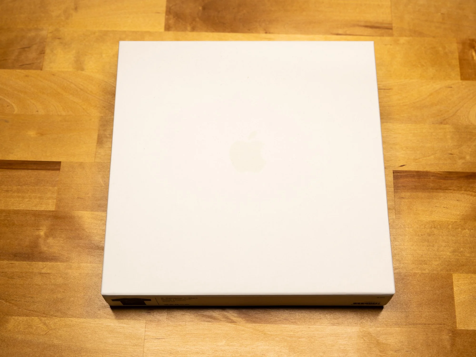
It won’t surprise you to learn that Apple shirts come packaged just like any other Apple accessory: in a plain white box with a varnished Apple logo. A protective plastic wrap covers the shirt itself, which is easily disposed of in the recycling. No manufacturer’s tag is present, but the shirts are made in China, just like Apple’s computers. The design is silkscreened onto a 100% lightweight cotton shirt, so set your durability expectations accordingly. I’d characterize the fit as athletic or slim, though I’m not sure how differently they cut the larger sizes versus the smaller ones. No size chart was available, and with no demo shirts to try on, you’re flying a little blind if you’re an inbetweener like me. I normally wear medium sized men’s T-shirts, and I’d characterize the fit as “exact.” There’s not much wiggle room, and the sleeves are a bit short. A large would be just so slightly too big, but with this style of fabric you’re better off going a size up if you’re unsure. I was allowed to buy a shirt, try it on, and return it if the fit wasn’t right, so I advise you to do the same if you’re an inbetweener.
Are these shirts worth forty clams? …Eh. The reality is no, they’re not—they’re probably the worst value of anything you can buy at the two stores. And unlike with band shirts, you don’t have the excuse that the extra margin goes to support the group. Even Nintendo doesn’t charge that much at their World Store in Rockefeller Center for a Samus Aran shirt, and they’re one step below Apple on the “we love our margins” chart. This is crass consumerism at its finest. But as bad of a value as they are… they’re infinitely cool. You’re paying for the excellence of the designs, not the shirt they’re printed on. Of course, if you think these are expensive, look how much a vintage Apple Garamond Rrainbow letter shirt goes for on eBay—buying new is actually cheaper. Just pick the one design you really like, make sure it fits, and take good care of it. Whether the money is worth it is between you, your bank account, and how much you love a rainbow Apple.


